Statistics Discussion
Copyright © October 2004 Ted Nissen
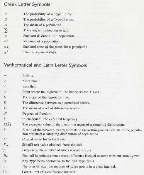
TABLE OF
CONTENTS
2 Review and More Introduction
3 Central Values and the Organization of Data
8 Theoretical Distributions
Including the Normal Distribution
9 Samples and Sampling Distributions
11 The t Distribution and the
t-Test
12 Analysis of Variance: One-Way
Classification
13 Analysis of Variance: Factorial
Design
14 The Chi Square Distribution
16 Vista Formulas and Analysis
1 Introduction
1.1
1.2 Statistics Definition
1.2.1 Algebra and Statistics
1.2.1.1
Algebra
is a generalization of arithmetic in which letters representing numbers are
combined according to the rules of arithmetic
1.2.1.2
The
product of an algebraic expression, which combines several scores, is a
statistic.[1]
1.2.2 Descriptive Statistic
1.2.2.1
1.2.3 Inferential Statistics
1.2.3.1
1.3 Purpose of Statistics
1.3.1
1.4 Terminology
1.4.1
1.4.2 Populations, Samples, and
Subsamples
1.4.2.1
A
population consists of all members of some specified group. Actually, in
statistics, a population consists of the measurements on the members and not
the members themselves. A sample is a subset of a population. A subsample is a
subset of a sample. A population is arbitrarily defined by the investigator and
includes all relevant cases.
1.4.2.2
Investigators
are always interested in some population. Populations are often so large that
not all the members can be measured. The investigator must often resort to
measuring a sample that is small enough to be manageable but still
representative of the population.
1.4.2.3
Samples
are often divided into subsamples and relationships among the subsamples
determined. The investigator would then look for similarities or differences
among the subsamples.
1.4.2.4
Resorting
to the use of samples and subsamples introduces some uncertainty into the
conclusions because different samples from the same population nearly always
differ from one another in some respects. Inferential statistics are used to
determine whether or not such differences should be attributed to chance.
1.4.3 Parameters and Statistics
1.4.3.1
A
parameter is some numerical characteristic of a population. A statistic is some
numerical characteristic of a sample or subsample. A parameter is constant; it
does not change unless the population itself changes. There is only one number
that is the mean of the population; however, it often cannot be computed,
because the population is too large to be measured. Statistics are used as
estimates of parameters, although, as we suggested above, a statistic tends to
differ from one sample to another. If you have five samples from the same
population, you will probably have five different sample means. Remember that
parameters are constant; statistics are variable.
1.4.4 Variables
1.4.4.1
A
variable is something that exists in more than one amount or in more than one
form. Memory is a variable. The Wechsler Memory Scale is used to measure
people’s memory ability, and variation is found among the memory scores of any
group of people. The essence of measurement is the assignment of numbers on the
basis of variation.
1.4.4.2
Most
variables can be classified as quantitative variables. When a quantitative
variable is measured, the scores tell you something about the amount or degree
of the variable. At the very least, a larger score indicates more of the
variable than a smaller score does.
1.4.4.3
A
score has a range consisting of an upper limit and lower limit, which defines
the range. For example, 103=102.5-103.5, the numbers 102.5 and 103.5 are called
the lower limit and the upper limit of the score. The idea is that a score can
take any fractional value between 102.5 and 103.5, but all scores in that range
are rounded off to 103.
1.4.4.4
Some
variables are qualitative variables. With such variables, the scores (number)
are simple used as names; they do not have quantitative meaning. For example,
political affiliation is a qualitative variable.
1.5 Scales of Measurement
1.5.1 Introduction
1.5.1.1
Numbers
mean different things in different situations. Numbers are assigned to objects
according to rules. You need to distinguish clearly between the thing you are
interested in and the number that symbol9izes or stands for the thing. For
example, you have had lots of experience with the numbers 2 and 4. You can
state immediately that 4 is twice as much as 2. That statement is correct if
you are dealing with numbers themselves, but it may or may not be true when
those numbers are symbols for things. The statement is true if the numbers
refer to apples; four apples are twice as many as two apples. The statement is
not true if the numbers refer to the order that runners finish in a race.
Fourth place is not twice anything in relation to second place-not twice as
slow or twice as far behind the first-place runner. The point is that the
numbers 2 and 4 are used to refer to both apples and finish places in a race,
but the numbers mean different things in those two situations.
1.5.1.2
S.
S. Stevens (1946)[2] identified
four different measurement scales that help distinguish different kings of
situation in which numbers are assigned to objects. The four scales are;
nominal, ordinal, interval, and ratio.
1.5.2 Nominal Scale
1.5.2.1
Numbers
are used simply as names and have no real quantitative value. It is the scale
used for qualitative variables. Numerals on sports uniforms are an example;
here, 45 is different from 32, but that is about all we can say. The person
represented by 45 is not “more than” the person represented by 32, and
certainly it would be meaningless to try to add 45 and 32. Designating
different colors, different sexes, or different political parties by numbers
will produce nominal scales. With a nominal scale, you can even reassign the
numbers and still maintain the original meaning, which as only that the
numbered things differ. All things that are alike must have the same number.
1.5.3 Ordinal Scale
1.5.3.1
An
ordinal scale, has the characteristic of the nominal scale (different numbers
mean different things) plus the characteristic of indicating “greater than” or
“less than”. In the ordinal scale, the object with the number 3 has less or
more of something than the object with the number 5. Finish places in a race
are an example of an ordinal scale. The runners finish in rank order, with “1”
assigned to the winner, “2” to the runner-up, and so on. Here, 1 means less
time than 2. Other examples of ordinal scales are house number, Government
Service ranks like GS-5 and GS-7, and statements like “She is a better
mathematician than he is.”
1.5.4 Interval Scale
1.5.4.1
The
interval scale has properties of both the ordinal and nominal scales, plus the
additional property that intervals between the numbers are equal. “Equal
interval” means that the distance between the things represented by ”2” and “3” is the same as the distance
between the things represented by “3” and “4”. The centigrade thermometer is
based on an interval scale. The difference is temperature between 10° and 20°
is the same as the difference between 40° and 50°. The centigrade thermometer,
like all interval scales, has an arbitrary zero point. On the centigrade, this
zero point is the freezing point of water at sea level. Zero degrees on this
scale does not mean the complete absence of heat; it is simply a convenient
starting point. With interval data, we have one restriction; we may not make
simple ratio statements. We may not say that 100° is twice as hot as 50° or
that a person with an IQ of 60 is half as intelligent as a person with an IQ of
120.
1.5.5 Ratio Scale
1.5.5.1
The
fourth kind of scale, the ratio scale, has all the characteristics of the
nominal, ordinal, interval scales, plus one: it has a true zero point, which
indicates a complete absence of the thing measured. On a ratio scale, zero
means “none”. Height, weight, and time are measured with ratio scales. Zero
height, zero weight, and zero time mean thaqt no amount of these variables is
present. With a true zero point, you can make ratio statements like “16
kilograms is four times heavier than 4 kilograms.”
1.5.6 Conclusion
1.5.6.1
Having
illustrated with examples the distinctions among these four scales-it is
sometimes difficult to classify the variables used in the social and behavioural
sciences. Very often they appear to fall between the ordinal and interval
scales. It may happen that a score provides more information than simply rank,
but equal intervals cannot be proved. Intelligence test scores are an example.
In such cases, researchers generally treat the data as if they were based on an
interval scale.
1.5.6.2
The
main reason why this section on scales of measurement is important is that the
kind of descriptive statistics you can compute on your numbers depends to some
extent upon the kind of scale of measurement the numbers represent. For
example, it is not meaningful to compute a mean on nominal data such as the
numbers on football players’ jerseys. If the quarterback’s number is 12 and a
running back’s number is 23, the mean of the two numbers (17.5) has no meaning
at all.
1.6 Statistics and Experimental
Design
1.6.1 Introduction
1.6.1.1
Statistics
involves the manipulation of numbers and the conclusions based on those
manipulations. Experimental design deals with how to get the numbers in the first
place.
1.6.2 Independent and Dependent
Variables
1.6.2.1
In
the design of a typical simple experiment, the experimenter is interested in
the effect that one variable (called the independent variable) has on some
other variable (called the dependent variable). Much research is designed to
discover cause-and-effect relationships. In such research, differences in the
independent variable are the presumed cause for differences in the dependent
variable. The experimenter chooses values for the independent variable, administers
a different value of the independent variable to each group of subjects, and
then measures the dependent variable for each subject. If the scores on the
dependent variable differ as a result of differences in the independent
variable, the experimenter may be able to conclude that there is a
cause-and-effect relationship.
1.6.3 Extraneous (Confounding)
Variables
1.6.3.1
One
of the problems with drawing cause-and-effect conclusions is that you must be
sure that changes in the scores on the dependent variable are the result of
changes in the independent variable and not the result of changes in some other
variables. Variables other than the independent variable that can cause changes
in the dependent variable are called extraneous variables.
1.6.3.2
It
is important, then, that experimenters be aware of and control extraneous
variables that might influence their results. The simplest way to control an
extraneous variable is to be sure all subjects are equal on that variable.
1.6.3.3
Independent
variables are often referred to as treatments because the experimenter
frequently asks “If I treat this group of subjects this way and treat another
group another way, will there be a difference in their behaviour?” The ways
that the subjects are treated constitute the levels of the independent variable
being studied, and experiments typically have two or more levels.
1.7 Brief History of Statistics
1.7.1
2
Review
and More Introduction
2.1 Review of Fundamentals
2.1.1 This section is designed to
provide you with a quick review of the rules of arithmetic and simple algebra.
We recommend that you work the problems as you come to them, keeping the
answers covered while you work. We assume that you once knew all these rules
and procedures but that you need to refresh your memory. Thus, we do not
include much explanation. For a textbook that does include basic explanations,
see Helen M. Walker.[3]
2.1.2 Definitions
2.1.2.1 Sum
2.1.2.1.1 The answer to an addition problem is called a sum. In Chapter 12, you will calculate a sum of squares, a quantity that is obtained by adding together some squared numbers.
2.1.2.2 Difference
2.1.2.2.1 The answer to a subtraction problem is called a difference. Much of what you will learn in statistics deals with differences and the extent to which they are significant. In Chapter 10, you will encounter a statistic called the standard error of a difference. Obviously, this statistic involves subtraction.
2.1.2.3
Product
2.1.2.3.1 The answer to a multiplication problem is called a product. Chapter 7 is about the product-moment correlation coefficient, which requires multiplication. Multiplication problems are indicated either by an x or by parentheses. Thus, 6 x 4 and (6)(4) call for the same operation.
2.1.2.4 Quotient
2.1.2.4.1 The
answer to a division problem is called a quotient. The IQ or intelligence quotient is based on the
division of two numbers. The two ways to indicate a division problem are  and —. Thus, 9
  4 and 9/4 call for
the same operation. It is a good idea to
think of any common fraction as a division problem. The numerator is to be
divided by the denominator.
4 and 9/4 call for
the same operation. It is a good idea to
think of any common fraction as a division problem. The numerator is to be
divided by the denominator.
2.1.3 Decimals
2.1.3.1 Addition and Subtraction of Decimals.
2.1.3.1.1 There is only one rule about the addition and subtraction of numbers that have decimals: keep .the decimal points in a vertical line. The decimal point in the answer goes directly below those in the problem. This rule is illustrated in the five problems below.
2.1.3.1.2 Example #1
2.1.3.1.2.1 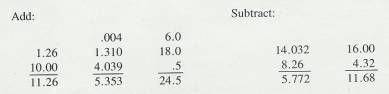
2.1.3.2 Multiplication of Decimals
2.1.3.2.1 The basic rule for multiplying decimals is that the number of decimal places in the answer is found by adding up the number of decimal places in the two numbers that are being multiplied. To place the decimal point in the product, count from the right.
2.1.3.2.2 Example #2
2.1.3.2.2.1 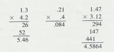
2.1.3.3 Division of Decimals
2.1.3.3.1 Two methods have been used to teach division of decimals. The older method required the student to move the decimal in the divisor (the number you are dividing by) enough places to the right to make the divisor a whole number. The decimal in the dividend was then moved to the right the same number of places, and division was carried out in the usual way. The new decimal places were identified with carets, and the decimal place in the quotient was just above the caret in the dividend. For example,
2.1.3.3.2 Example # 3a&b
2.1.3.3.2.1 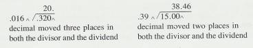
2.1.3.3.2.2 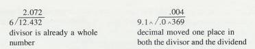
2.1.3.3.3 The newer method of teaching the division of
decimals is to multiply both the divisor and the dividend by the number that
will make both of them whole numbers. (Actually, this is the way the caret
method works also.) For example:
2.1.3.3.4 Example #4
2.1.3.3.4.1 
2.1.3.3.5 Both of these methods work. Use the one you are more familiar with.
2.1.3.4
2.1.4 Fractions
2.1.4.1
In
general, there are two ways to deal with fractions
2.1.4.1.1 Convert the fraction to a decimal and
perform the operations on the decimals
2.1.4.1.2 Work directly with the fractions, using a set of rules for each operation. The rule for addition and subtraction is: convert the fractions to ones with common denominators, add or subtract the numerators, and place the result over the common denominator. The rule for multiplication is: multiply the numerators together to get the numerator of the answer, and multiply the denominators together for the denominator of the answer. The rule for division is: invert the divisor and multiply the fractions.
2.1.4.1.3 For statistics problems, it is usually easier to convert the fractions to decimals and then work with the decimals. Therefore, this is the method that we will illustrate. However, if you are a whiz at working directly with fractions, by all means continue with your method. To convert a fraction to a decimal, divide the lower number into the upper one. Thus, 3/4 = .75, and 13/17 = .765
2.1.4.1.4 Examples Fractions
2.1.4.1.4.1 
2.1.5 Negative Numbers
2.1.5.1
Addition
of Negative numbers
2.1.5.1.1 Any number without a sign is understood to
be positive
2.1.5.1.2 To add a series of negative numbers, add
the numbers in the usual way, and attach a negative sign to the total
2.1.5.1.3 Example #1
2.1.5.1.3.1 
2.1.5.1.4 To add two numbers, one positive and one negative,
subtract the smaller number from the larger and attach the sign of the larger
to the result
2.1.5.1.5 Example #2
2.1.5.1.5.1 
2.1.5.1.6 To add a series of numbers, of which some
are positive and some negative, add all the positive numbers together, all the
negative numbers together (see above) and then combine the two sums (see above)
2.1.5.1.7 Example #3
2.1.5.1.7.1 
2.1.5.2
Subtraction
of Negative Numbers
2.1.5.2.1 To subtract a negative number, change it to
positive and add it. Thus
2.1.5.2.2 Example #4
2.1.5.2.2.1 
2.1.5.3
Multiplication
of Negative Numbers
2.1.5.3.1 When the two numbers to be multiplied are
both negative, the product is positive
2.1.5.3.2 (-3)(-3)=9 (-6)(-8)=48
2.1.5.3.3 When one of the number is negative and the
other is positive, the product is negative
2.1.5.3.4 (-8)(3)=-24 14 X –2= -28
2.1.5.4
Division
of Negative Numbers
2.1.5.4.1 The rule in division is the same as the
rule in multiplication. If the two numbers are both negative, the quotient is
positive
2.1.5.4.2 (-10)  (-2)=-5 (-4)
  (-20)= .20
2.1.5.4.3 If one number is negative and the other
positive, the quotient is negative
2.1.5.4.4 (-10)  2= -5 6
  (-18)= -.33
2.1.5.4.5 14  (-7)= -2 (-12)
  3= -4
3= -4
2.1.6 Proportions and Percents
2.1.6.1 A proportion is a part of a whole and can be expressed as a fraction or as a decimal. Usually, proportions are expressed as decimals. If eight students in a class of 44 received A's, we may express 8 as a proportion of the whole (44). Thus, 8/44, or .18. The proportion that received A's is .18.
2.1.6.2 To convert a proportion to a percent (per one hundred), multiply by 100. Thus: .18 x 100 = 18; 18 percent of the students received A's. As You can see proportions and percents are two ways to express the same idea.
2.1.6.3
If
you know a proportion (or percent) and the size of the original whole, you can
find the number that the proportion represents. If .28 of the students were
absent due to illness,
and there are 50 students in all, then. 28 of the 50 were absent. (.28)(50) = 14 students who were absent. Here are some
more examples.
2.1.6.4
Example
Proportions and Percents
2.1.6.4.1 
2.1.7 Absolute Value
2.1.7.1 The absolute value of a number ignores the sign of the number. Thus, the absolute value of -6 is 6. This is expressed with symbols as |-6| = 6. It is expressed verbally as "the absolute value of negative six is six. " In a similar way, the absolute value of 4 - 7 is 3. That is, |4 – 7| = | - 3| = 3.
2.1.8  Problems
2.1.8.1
A  sign ("plus or minus"
sign) means to both add and subtract. A
sign ("plus or minus"
sign) means to both add and subtract. A  problem always has two answers.
2.1.8.2
Example
Plus-Minus Problems
2.1.8.2.1 
2.1.9 Exponents
2.1.9.1 .In the expression 52, 2 is the exponent. The 2 means that 5 is to be multiplied by itself. Thus, 52 = 5 x 5 = 25.
2.1.9.2
In
elementary statistics, the only exponent used is 2, but it will be used
frequently. When a number has an exponent of 2, the number is said to be
squared. The expression 42 (pronounced "four squared")
means 4 x4, and the product is 16. The squares of whole numbers between 1 and
1000 can be found in Tables in the Appendix of most stats text books.
2.1.9.3
Example
Exponents
2.1.9.3.1 
2.1.10
Complex
Expressions
2.1.10.1
Two
rules will suffice for the kinds of complex expressions encountered in
statistics.
2.1.10.1.1
Perform the
operations within the parentheses first. If there are brackets in the
expression, perform the operations within the parentheses and then the
operations within the brackets.
2.1.10.1.2
Perform the
operations in the numerator and those in the denominator separately, and
finally, carry out the division.
2.1.10.1.3
Example 5
2.1.10.1.3.1
2.1.11
Simple
Algebra
2.1.11.1
To
solve a simple algebra problem, isolate the unknown (x) on one side of the
equal sign and combine the numbers on the other side. To do this, remember that
you can multiply or divide both sides of the equation by the same number without
affecting the value of the unknown. For example,
2.1.11.2
Example
6 a & b
2.1.11.2.1
2.1.11.2.2
2.1.11.3
In
a similar way, the same number can be added to or subtracted from both sides of
the equation without affecting the value of the unknown.
2.1.11.4
Example
7
2.1.11.4.1
2.1.11.5
We
will combine some of these steps in the problems we will work for you. Be sure
you see shat operation is being performed on both sides in each step
2.1.11.6
Example
8
2.1.11.6.1
2.2 Rules, Symbols, and Shortcuts
2.2.1 Rounding Numbers
2.2.1.1
There
are two parts to the rule for rounding a number. If the digit that is to be
dropped is less than 5, simply drop it. If the digit to be dropped is 5 or
greater, increase the number to the left of it by one. These are the rules
built into most electronic calculators. These two rules are illustrated below
2.2.1.2
Example
9 a & B
2.2.1.2.1 
2.2.1.2.2 
2.2.1.3 A reasonable question is "How many decimal places should an answer in statistics have?" A good rule of thumb in statistics is to carry all operations to three decimal places and then, for the final answer, round back to two decimal places.
2.2.1.4
Sometimes this rule of thumb could get
you into trouble, though. For example, if half way through some work you had a
division problem of .0016  .0074, and if you
dutifully rounded those four decimals to three (.002
.0074, and if you
dutifully rounded those four decimals to three (.002  .007), you would get
an answer of .2857, which becomes .29. However, division without rounding gives
you an answer of .2162 or .22. The difference between .22 and .29 may be quite
substantial. We will often give you cues if more than two decimal places are
necessary but you will always need to be alert to the problems of rounding.
.007), you would get
an answer of .2857, which becomes .29. However, division without rounding gives
you an answer of .2162 or .22. The difference between .22 and .29 may be quite
substantial. We will often give you cues if more than two decimal places are
necessary but you will always need to be alert to the problems of rounding.
2.2.2 Square Roots
2.2.2.1 Statistics problems often require that a square root be found. Three possible solutions to this problem are
2.2.2.1.1 A calculator with a square-root key
2.2.2.1.2 The paper-and-pencil method
2.2.2.1.3 Use a Table the back of a statistics book.
2.2.2.2
Of
the three, a calculator provides the quickest and simplest way to find a square
root. If you have a calculator, you're set. The paper -and-pencil method is
tedious and error prone, so we will not discuss it. We'll describe
the use of Tables and we recommend that you use it if you don't have access to
a calculator.
2.2.2.3
Three
Digit Numbers
2.2.2.3.1
If you need the square root of a three-digit number (000 to
999), a table will give it to you directly. Simply look in the left-hand column
for the number and ad the square root in the third column, under  . For example;
the square root of 225 is 15.00, and
. For example;
the square root of 225 is 15.00, and  = 8.37. Square roots
are usually carried (or rounded) to two decimal places.
= 8.37. Square roots
are usually carried (or rounded) to two decimal places.
2.2.2.4
Numbers
between 0 and 10
2.2.2.4.1
For numbers between 0 and 10 that have two decimal places
(.01 to 9.99), The tables will give you the square root. Find your number in the left-hand column by
thinking of its decimal point as two places to the right. Find the square root
in the  column by moving the
decimal point one place to the left. For example,
column by moving the
decimal point one place to the left. For example,  = 1.50. Be sure you understand how these square roots were
found:
= 1.50. Be sure you understand how these square roots were
found:  = 2.52,
  = .66, and
  = .28.
2.2.2.5
Numbers
between 10 and
1000 That Have Decimals
2.2.2.5.1 For
numbers between 10 and 1000 with decimals interpolation is necessary. To
interpolate a value for  , find a value that is half way (.5 of the distance) between
  and
and  . Thus, the square root of 22.5 will be
(approximately) half way between 4.69 and 4.80, which is 4.74. For a second
example, we will find
. Thus, the square root of 22.5 will be
(approximately) half way between 4.69 and 4.80, which is 4.74. For a second
example, we will find  .
.  = 9.17, and
  =9.22.
  will be .35 into the interval between
  and
and
 . That interval is .05 (9.22 - 9.17). Thus' (.35)(.05) = .02, and
  = 9.17 + .02 = 9.19. Interpolation is also necessary with numbers between 100 and 1000 that have decimals;
these can usually be estimated rather quickly because the difference between
the square roots of the whole numbers is so small. Look at the difference
between
= 9.17 + .02 = 9.19. Interpolation is also necessary with numbers between 100 and 1000 that have decimals;
these can usually be estimated rather quickly because the difference between
the square roots of the whole numbers is so small. Look at the difference
between  and
and  , for example.
2.2.2.6 Numbers Larger Than 1000
2.2.2.6.1
For numbers larger than 1000, the square root can be estimated fairly closely by using the
second column in Table A (N 2). Find the large number under N2,
and read the square root from the N column. For example,  = 123, and
  =34. Most large
numbers you encounter will not be found in the N2 column, and you
will just have to estimate the square root as closely as possible.
=34. Most large
numbers you encounter will not be found in the N2 column, and you
will just have to estimate the square root as closely as possible.
2.2.3 Reciprocals
2.2.3.1 This section is about a professional shortcut. This shortcut is efficient if multiplication is easier for you than division. If you prefer to divide rather than multiply, skip this section.
2.2.3.2
A
reciprocal of a number (N) is 1/N. Multiplying a number by 1/N
is equivalent to dividing it by N. For example, 8 2 = 8 x (1/2) = 8 x .5 = 4.0; 25 -7- 5 = 25 x (1/5) = 25 x .20 = 5.0. These examples are
easy, but we can also illustrate with more difficult
problems; 541
2 = 8 x (1/2) = 8 x .5 = 4.0; 25 -7- 5 = 25 x (1/5) = 25 x .20 = 5.0. These examples are
easy, but we can also illustrate with more difficult
problems; 541 98 =
541 x (1/98) = 541 x
.0102 = 5.52. So far, this should be clear, but there
should be one nagging question. How did we know that 1/98 = .01O2? The answer
is the versatile Table A. Table A contains a column 1/N, and, by looking
up 98, you will find that 1/98 = .0102.
98 =
541 x (1/98) = 541 x
.0102 = 5.52. So far, this should be clear, but there
should be one nagging question. How did we know that 1/98 = .01O2? The answer
is the versatile Table A. Table A contains a column 1/N, and, by looking
up 98, you will find that 1/98 = .0102.
2.2.3.3 If you must do many division problems on paper, we recommend reciprocals to you. If you have access to an electronic calculator, on the other hand, you won't need the reciprocals in Table A.
2.2.4 Estimating Answers
2.2.4.1
Just
looking at a problem and making an estimate of the answer before you do any
calculating is a very good idea. This is referred to as eyeballing the data and
Edward Minium (1978) has captured its importance with Minium's First Law of
Statistics: "The eyeball is the statistician's most powerful
instrument."
2.2.4.2
Estimating answers should keep you
from making gross errors, such as misplacing a decimal point. For example,
31.5/5 can be estimated as a little more than 6 If
you make this estimate before you divide, you are likely to recognize that an
answer of 63.or .63 is incorrect.
2.2.4.3
The
estimated answer to the problem (21)(108) is 2000, since (20)(100) = 2000.
2.2.4.4
The
problem (.47)(.20) suggests an estimated answer of .10, since (1/2)(.20) = .10.
With .10 in mind, you are not likely to write.94 for the answer, which is .094.
Estimating answers is also important if you are finding a square root. You can
estimate that  is about
10, since
is about
10, since  = 10;
= 10;  is about 1.
2.2.4.5
To
calculate a mean, eyeball the numbers and estimate the mean. If you estimate a
mean of 30 for a group of numbers that are primarily in the 20s, 30s, and 40s,
a calculated mean of 60 should arouse your suspicion that you have made an
error.
2.2.5 Statistical Symbols
2.2.5.1
Although as far as we know,
there has never been a clinical case of neoiconophobia (An extreme and unreasonable fear of
new symbols) some
students show a mild form of this behavior. Symbols like  ,
,  ,
and
,
and  may cause a
grimace, a frown, or a droopy eyelid. In more severe cases, the behavior
involves avoiding a statistics course entirely. We're rather sure that you
don't have such a severe case, since you have read this far. Even so, if you
are a typical beginning student in statistics, symbols like (
may cause a
grimace, a frown, or a droopy eyelid. In more severe cases, the behavior
involves avoiding a statistics course entirely. We're rather sure that you
don't have such a severe case, since you have read this far. Even so, if you
are a typical beginning student in statistics, symbols like ( ,
,  ,
,
 and
and  are not very meaningful to you, and they may
even elicit feelings, of uneasiness. We also know from our teaching experience
that, by the end of the course, you will know what these symbols mean and be
able to approach them with an unruffled psyche-and perhaps even approach them
joyously. This section should help you over that initial, mild neoiconophobia,
if you suffer from it at all.
are not very meaningful to you, and they may
even elicit feelings, of uneasiness. We also know from our teaching experience
that, by the end of the course, you will know what these symbols mean and be
able to approach them with an unruffled psyche-and perhaps even approach them
joyously. This section should help you over that initial, mild neoiconophobia,
if you suffer from it at all.
2.2.5.2
Below are definitions and
pronunciations of the symbols used in the next two chapters. Additional symbols will be defined
as they occur. Study this list until you know it.
2.2.5.3
Symbols
2.2.5.3.1 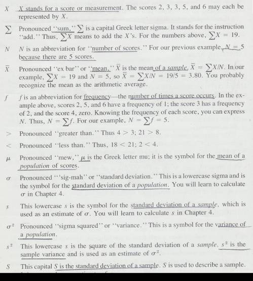
2.2.5.4 Pay careful attention to symbols. They serve as shorthand notations for the ideas and concepts you are learning. So, each time a new symbol is introduced, concentrate on it-learn it-memorize its definition and pronunciation. The more meaning a symbol has for you, the better you understand the concepts it represents and, of course, the easier the course will be.
2.2.5.5
Sometimes
we will need to distinguish between two different ( 's or two X's. We will use subscripts, and the
results will look like
's or two X's. We will use subscripts, and the
results will look like  1 and
1 and  2, or X1 and X2. Later, we will use subscripts other than
numbers to identify a symbol. You will see
2, or X1 and X2. Later, we will use subscripts other than
numbers to identify a symbol. You will see  x and erg. The point to learn here is
that subscripts are for identification purposes only; they never indicate
multiplication.
x and erg. The point to learn here is
that subscripts are for identification purposes only; they never indicate
multiplication. 
 does
not mean (
does
not mean ( )(
)( ).
).
2.2.5.6
Two
additional comments-to encourage and to caution you. We encourage you to do
more in this course than just read the text, work the problems, and pass the
tests, however exciting that may be. We encourage you to occasionally get
beyond this elementary text and read journal articles or short portions of
other statistics textbooks. We will indicate our recommendations with footnotes
at appropriate places. The word of caution that goes with this encouragement is
that reading statistics texts is like reading a Russian novel-the same
characters have different names in different places. For example, the mean of a
sample in some texts is symbolized M rather than  , and, in some texts, S.D.,
  and
and  are used as
symbols for the standard deviation. If you expect such differences, it will be
less difficult for you to make the necessary translations.
are used as
symbols for the standard deviation. If you expect such differences, it will be
less difficult for you to make the necessary translations.
3 Central Values and the Organization of Data
3.1 Summary
3.1.1 A typical or representative
score from the sample population is a measure of central tendency.
3.1.2 Mode (Mo)
3.1.2.1
The
most frequently occurring score in the distribution.
3.1.2.2
Extreme
scores in the distribution do not affect the mode.
3.1.3 Median (Md)
3.1.3.1
This
score cuts the distribution of scores in half. That is half the scores in the
distribution fall above the middle score and half fall below the middle
score. The steps involved in computing
the median are
3.1.3.1.1 Rank the scores from lowest to highest
3.1.3.1.2 In the case of an odd number of scores pick
the middle score that divides the scores so that an equal number of scores are
above that score and an equal number are below that score. Example
3.1.3.1.2.1 2 5 7 8 12 14 18= 8 would be the median in
the aforementioned distribution of scores.
3.1.3.1.3 In the case of an even number of scores
pick the two middle scores which divide the scores so that an equal number of
scores are above those scores and an equal number of scores are below those
scores. Then add the two middle scores and divide the product by two. Example
3.1.3.1.3.1 2 5 7 8 12 14 18 20=8+12=20/2=10 would be
the median in the aforementioned distribution.
3.1.3.2
Extreme
scores in the distribution do not affect the median.
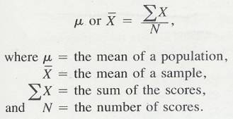
3.1.4 Mean  (Average)
3.1.4.1
The
mean is the sum of scores divided by the number of scores.
3.1.4.1.1 Formula
3.1.4.1.1.1 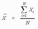
3.1.4.1.1.2 In the above formula X= the sum of the
scores and N= the number of scores.
3.1.4.2
Extreme
scores in the distribution will affect the mean.
3.1.4.3
The
term average is often used to describe the mean and is usually accurate.
Sometimes however the word average is used to describe other measures of
central tendency such as mode and median.
3.2 Introduction
3.2.1
Now that the preliminaries are out of
the way, you are ready to start on the basics of descriptive statistics. The
starting point is an unorganized group of scores or measures, all obtained from
the same test or procedure. In an experiment, the scores are measurements on
the dependent variable. Measures of central value (often called measures of
central tendency) give you one score or measure that represents or is typical
of, the entire group You will recall that in Chapter 1 we discussed the mean
(arithmetic average). This is one of the three central value statistics.
Recall from Chapter 1 that for every statistic there is also a parameter.
Statistics are characteristics of samples and parameters are characteristics of
population. Fortunately, in the case of the mean, the calculation of the parameter is identical to
the calculation of the statistic. This is not true for the standard deviation. (Chapter 4) Throughout this
book, we will refer to the sample mean (a statistic) with the symbol  pronounced
"ex-bar"-and to the population mean a parameter with the symbol
pronounced
"ex-bar"-and to the population mean a parameter with the symbol
 pronounced
"mew."
pronounced
"mew."
3.2.2
However,
a mean based on a population is interpreted differently from a mean based on a sample. For a
population, there is only
one mean,  . Any sample, however, is only
one of many possible samples, and
. Any sample, however, is only
one of many possible samples, and  will vary from sample to
sample. A population mean is obviously better than a sample mean, but often it
is impossible to measure the entire population. Most of the time, then, we must resort to a sample and use
will vary from sample to
sample. A population mean is obviously better than a sample mean, but often it
is impossible to measure the entire population. Most of the time, then, we must resort to a sample and use  as an estimate of
  .
.
3.2.3 In this chapter you will learn to
3.2.3.1 Organize data gathered on a dependent measure,
3.2.3.2 Calculate central values from the organized data and determine whether they are statistics or parameters, and
3.2.3.3 Present the data graphically.
3.3 Finding the mean of Unorganized Data
3.3.1 Table 3.1 presents the scores of 100 fourth-grade students on an arithmetic achievement test. These scores were taken from an alphabetical list of the students' names; therefore, the scores themselves are in no meaningful order. You probably already know how to compute the mean of this set of scores. To find the mean, add the scores and divide that sum by the number of scores.
3.3.2 Formula Mean
3.3.2.1
3.3.3 Table 3.1
3.3.3.1
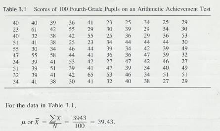
3.3.4
If these 100 scores are a population,
then 39.43 would be a  , but if the 100 scores are a sample from some larger
population, 39.43 would be the sample mean,
, but if the 100 scores are a sample from some larger
population, 39.43 would be the sample mean,  .
.
3.3.5 This mean provides a valuable bit of information. Since a score of 40 on this test is considered average (according to the test manual that accompanies it), this group of youngsters, whose mean score is 39.43, is about average in arithmetic achievement.
3.4 Arranging Scores in Descending
Order and Finding the Median
3.4.1 Look again at Table 3.1. If you knew that a score of 40 were considered average, could you tell just by looking that this group is about average? Probably not. Often, in research, so many measurements are made on so many subjects that just looking at all those numbers is a mind-boggling experience. Although you can do many computations using unorganized data, it is often very helpful to organize the numbers in some way. Meaningful organization will permit you to get some general impressions about characteristics of the scores by simply' 'eyeballing" the data (looking at it carefully). In addition, organization is almost a necessity for finding a second central value-the median.
3.4.2 One way of making some order out of the chaos in Table 3.1 is to rearrange the numbers into a list, from highest to lowest. Table 3.2 presents this rearrangement of the arithmetic achievement scores. (It is usual in statistical tables to put the high numbers at the top and the low numbers at the bottom.) Compare the unorganized data of Table 3.1 with the rearranged data of Table 3.2. The ordering from high to low permits you to quickly gain some insights that would have been very difficult to glean from the unorganized data. For example, by simply looking at the center of the table, you get an idea of what the central value is. The highest and lowest scores are readily apparent and you get the impression that there are large differences in the achievement levels of these children. You can see that some scores (such as 44) were achieved by several people and that some (such as 33) were not achieved by anyone. All this information is gleaned simply by quickly eyeballing the rearranged data.
3.4.3 Table 3.2
3.4.3.1
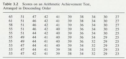
3.4.4 Error Detection
3.4.4.1 Eyeballing data is a valuable means of avoiding large errors. If the answers you calculate differ from what you expect on the basis of eyeballing, wisdom dictates that you try to reconcile the difference. You have either overlooked something when eyeballing or made a mistake in your computations.
3.4.5 This simple rearrangement of data also permits you to find easily another central value statistic, which can be found only with extreme difficulty from Table 3.1. This statistic is called the median. The median is defined as the point (Note that the median, like the mean, is a point and not necessarily an actual score.) on the scale of scores above, which half the scores fall and below which half the scores fall. That is, half of the scores are larger than the median, and half are smaller. Like the mean, the sample median is calculated exactly the same as the population median. Only the interpretations differ.
3.4.6 In Table 3.2 there are 100 scores; therefore, the median will be a point above which there are 50 scores and below which there are 50 scores. This point is somewhere among the scores of 39. Remember from Chapter 1, that any number actually stands for a range of numbers that has a lower and upper limit. This number, 39, has a lower limit of 38.5 and an upper limit of 39.5. To find the exact median somewhere within the range of 38.5-39.5 you use a procedure called interpolation. We will give you the procedure and the reasoning that goes with it at the same time. Study it until you understand it. It will come up again.
3.4.7 There are 42 scores below 39. You will need eight more (50 - 42 = 8) scores to reach the median. Since there are ten scores of 39, you need 8/10 of them to reach the median. Assume that those ten scores of 39 are distributed evenly throughout the interval of 38.5 and 39.5 and that, therefore, the median is 8/10 of the way through the interval. Adding. 8 to the lower limit of the interval, 38.5, gives you 39,3, which is the median for these scores.
3.4.8 There are occasions when you will need the median of a small number of scores. In such cases, the method we have just given you will work, but it usually is not necessary to go through that whole procedure. For example, if N is an odd number and the middle score has a frequency of 1, then it is the median. In the five scores 2, 3, 4, 12, 15, the median is 4. If there had been more than one 4, interpolation would have to be used.
3.4.9 When N is an even number, as in the six scores 2, 3, 4, 5, 12, 15, the point dividing the scores into two equal halves will lie halfway between 4 and 5. The median, then, is 4.5. If there had been more than one 4 or 5, interpolation would have to be used. Sometimes the distance between the two middle numbers will be larger, as in the scores 2, 3, 7, 11. The same principle holds: the median is halfway between 3 and 7. One-way of finding that point is to take the mean of the two numbers: (3 + 7) / 2 = 5, which is the median.
3.4.10 There is no accepted symbol to differentiate the median of a population from the median of a sample. When we need to make this distinction, we do it with words.
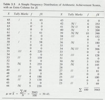
3.5 The Simple Frequency
Distribution
3.5.1 A more common (and often more useful) method of organizing data is to construct a simple frequency distribution. Table 3.3 is a simple frequency distribution for the arithmetic achievement data in Table 3.1.
3.5.2 The most efficient way to reduce unorganized data like Table 3.1 into a simple frequency distribution like Table 3.3 is to follow these steps:
3.5.2.1 Find the highest and lowest scores. In Table 3.1, the highest score is 65 and the lowest score is 23.
3.5.2.2
In column form, write down in
descending order all possible scores between the highest score (65) and the
lowest score (23). Head this column with the letter X.
3.5.2.3
Start
with the number in the upper-left-hand comer of the unorganized scores (a score
of 40 in Table 3.1),
draw a line through it, and place a tally
mark beside 40 in your frequency distribution.
3.5.2.4
Continue
this process through all the scores.
3.5.2.5
Count
the number of tallies by each score and place that number beside the tallies in
the column headed ƒ. Add up the
numbers in the ƒ column to be sure they equal N You
have now constructed a simple frequency distribution.
3.5.2.6 0ften, when simple frequency distributions are presented formally, the tally marks and all scores with a frequency of zero are deleted.
3.5.3 Don't worry about the ƒ X column in Table 3.3 yet. It is not part of a simple frequency distribution, and we will discuss it in the next section.
3.5.4 Table 3.3
3.5.4.1
3.6 Finding Central Values of a
Simple Frequency Distribution
3.6.1 Mean
3.6.1.1
Computation of the mean from a simple
frequency distribution is illustrated in table 3.3. Remember that the numbers
in the ƒ column represent the number of people
making each of the scores. To get N, you must add the numbers in the f
column because that's where the people are represented. If you are a
devotee of shortcut arithmetic, you may already have discovered or may already
know the basic idea behind the procedure: multiplication is shortcut addition.
In Table 3.3, the column headed ƒ X means what it says algebraically: multiply f (the number of
people making a score) times X, (the score they made) for each of the scores.
The reason this is done. is that everyone who made a particular score must be
taken into account in the computation of the mean. Since only one person made a
score of 65, multiply 1 x 65, and put a 65 in the ƒ
X column. No one made a score of 64 and 0 x 64 = 0;
put a zero in the ƒ X column. Since
four people had scores of 55, multiply 4 x 55 to get 220. After ƒX is computed for all scores, obtain  ƒX by adding up the ƒX
column. Notice that
ƒX by adding up the ƒX
column. Notice that  ƒX in the simple frequency distribution is
exactly the same as
ƒX in the simple frequency distribution is
exactly the same as  :X in Table 3.1. To compute the mean from a simple frequency
distribution, use the formula
:X in Table 3.1. To compute the mean from a simple frequency
distribution, use the formula
3.6.1.2
Mean
Frequency distribution
3.6.1.2.1 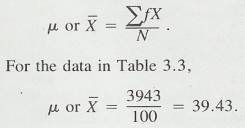
3.6.2 Median
3.6.2.1 The procedure for finding the median of scores arranged in a simple frequency distribution is the same as that for scores arranged in descending order, except that you must now use the frequency column to find the number of people making each score
3.6.2.2 The median is still the point with half the scores above and half below it, and is the same point whether you start from the bottom of the distribution or from the top. If you start from the top of Table 3.3, you find that 48 people have scores of 40 or above. Two more are needed to get to 50, the halfway point in the distribution. There are ten scores of 39, and you need two of them. Thus 2/10 should be subtracted from 39.5 (the lower limit of the score of 40); 39.5 - .2 = 39.3.
3.6.2.3
Error
Detection
3.6.2.3.1 Calculating the median by starting from the
top of the distribution will produce the same answer as calculating it by
starting from the bottom.
3.6.3 Mode
3.6.3.1 You may also find the third central-value statistic from the simple frequency distribution. This statistic is called the mode. The mode is the score made by the greatest number of people-the score with the greatest frequency.
3.6.3.2 Distribution may have more than one mode. A bimodal distribution is one with two high frequency scores separated by one or more low frequency scores. However, although a distribution may have more than one mode, it can have only one mean and one median.
3.6.3.3 A sample mode and a population mode are determined in the same way.
3.6.3.4 In Table 3.3, more people had a score of 39 than any other score, so 39 is the mode. You will note, however, that it was close. Ten people scored 39, but nine scored 34 and eight scored 41. A few lucky guesses by children taking the achievement test could have caused significant changes in the mode. This instability of the mode limits its usefulness. .
3.7 The Grouped Frequency
Distribution
3.7.1 There is a way of condensing the data of Table 3.1 even further. The result of such a condensation is called a grouped frequency distribution and Table 3.4 is an example of such a distribution, again using the arithmetic achievement-test scores.5
3.7.2 A formal grouped frequency
distribution does not include the tally marks or the X and ƒX columns.
3.7.3 The grouping of data began as a-way of simplifying computations in the days before the invention of all these marvellous computational aids such as computers and calculators. Today, most researchers group their data only when they want to construct a graph or when N's are very large. These two occasions happen often enough to make it important for you to learn about it.
3.7.4 In the grouped frequency distribution, X values are grouped into
ranges called class
intervals. In Table 3.4, the entire range of
scores, from 65 to 23 has been reduced to 15 class intervals, each interval
covers three scores and, the size of the interval (the number of scores
covered) is indicated by i. For Table 3.4, i = 3. The midpoint of each interval
represents all scores in that interval for example, there were nine children who
had scores of 33, 34 or 35. The midpoint of the class interval 33-35 is 34. All
nine children are represented by 34. Obviously, this procedure may introduce
some inaccuracy into computations; however, the amount of error introduced is
usually very slight. For example, the mean computed from Table 3.4 is 39.40. The
mean computed from
ungrouped data is 39.43.
3.7.5 Class intervals have upper and lower limits, much like simple scores obtained by measuring a quantitative variable. A class interval of 33-35 has a lower limit of 32.5 and an upper limit of 35.5. Similarly, a class interval of 40-49 has a lower limit of 39.5 and an upper limit of 49.5.
3.7.6 Table 3.4
3.7.6.1
3.7.7 Establishing Class Intervals
3.7.7.1 There are three conventions that are usually followed in establishing class intervals. We call them conventions because they are customs rather than hard-and-fast rules. There are two justifications for these conventions. First, they allow you to get maximum information from your data with minimum effort. Second, they provide some standardization of procedures, which aids in communication among scientists. These conventions are
3.7.7.2
Data
should be grouped into not fewer than 10 and not more than 20 class
intervals.
3.7.7.2.1 The primary purpose of grouping data is to provide a clearer picture of trends in the data and to make computations easier. (For example, Table 3.4 shows that there are normally frequencies near the center of the distribution with fewer and fewer as the upper and lower ends of the distribution are approached. If the data are grouped into fewer than 10 intervals, such trends are not as apparent. In Table 3.5, the same scores are grouped into only five class intervals. The concentration of frequencies in the center of the distribution is not nearly so apparent.
3.7.7.2.2 Another reason for using at least 10 class intervals is that, as you reduce the number of class intervals, the errors caused by grouping increase. With fewer than 10 class intervals, the errors may no longer be minor. For example, the mean computed from Table 3.4 was 39.40-only .03 points away from the exact mean of 39.43 computed from ungrouped data. The mean computed from Table 3.5, however, is 39.00-an error of .43 points.
3.7.7.2.3 On the other hand, the use of more than 20 class intervals may tend to exaggerate fluctuations in the data that are really due. to chance occurrences. . You also sacrifice much of the ease of computation, with little gain in control over errors. So, the convention is: use 10 to 20 class intervals.
3.7.7.3
The size of the class intervals (i)
should be an odd number or 10 or a multiple of 10. (Some writers include i= 2 as acceptable. Some
also object to the use of i= 7 or 9. In actual practice, the most frequently
seen i's are 3, 5, 10, and multiples of 10.)
3.7.7.3.1
The reason for this is simply computational ease. The
midpoint of the interval is used as representative of all scores in the
interval; and if i is an odd number,
the midpoint will be a whole number. If hs an even number, the midpoint will
be a decimal number. In the interval 12-14 (i = 3), the midpoint is the whole
number 13. In an interval 12 to 15 (i = 4), the midpoint is the decimal number
13.5. However, if the range of scores is so great that you cannot include all
of them in 20 groups with i = 9 or less, it is conventional to
place 10 scores or a multiple of 10 in each class interval.
3.7.7.4
Begin each class interval with
a multiple of .i.
3.7.7.4.1 For example, if the lowest score is 44 and i = 5, the first class interval should be 40-44 because 40 is a multiple of 5. This convention is violated fairly often. However, the practice is followed more often than not. A violation that seems to be justified occurs when i = 5. When the interval size is 5, it may be more convenient to begin the interval such that multiples of 5 will fall at the midpoint, since multiples of 5 are easier to manipulate. For example, an interval 23-27 has 25 as its midpoint, while an interval 25-29 has 27 as its midpoint. Multiplying by 25 is easier than multiplying by 27.
3.7.7.4.2 In addition to these three conventions, remember that the highest scores go at the top and the lowest scores at the bottom.
3.7.8 Converting Unorganized Data into
a Grouped Frequency Distribution
3.7.8.1 Now that you know the conventions for establishing class intervals, we will go through the steps for converting a mass of data like that in Table 3.1 into a grouped frequency distribution like Table 3.4:
3.7.8.2 Find the highest and lowest scores. In Table 3.1, the highest score is 65, and the lowest score is 23.
3.7.8.3 Find the range of scores by subtracting the lowest score from the highest and adding 1: 65 - 23 + I = 43. The 1 is added so that the upper limit of the highest score and the lower limit of the lowest score will be included.
3.7.8.4 Determine i by a trial-and-error procedure. Remember that there are to be 10 to 20 class intervals and that the interval size should be odd, 10, or a multiple of 10. Dividing the range by a potential i value tells the number of class intervals that will result. For example, dividing the range of 43 by 5 provides a quotient of 8.60. Thus, i = 5 produces 8.6 or 9 class intervals. That does not satisfy the rule calling for at least 10 intervals, but it is close and might be acceptable. In most such cases, however it is better to use a smaller I and get a larger number of intervals. Dividing the range by 3 (43/3) gives you 14.33 or 15 class intervals. It sometimes happens that this process results in an extra class interval. This occurs when the lowest score is such that extra scores must be added to the bottom of the distribution to start the interval with a multiple of i. For the data in Table 3.1, the most appropriate interval size is 3, resulting in 15 class intervals.
3.7.8.5 Begin the bottom interval with the lowest score. if it is a multiple of i. If the lowest score is not a multiple of i, begin the interval with the next lower number that is a multiple of i. In the data of Table 3.1, the lowest score, 23, is not a multiple of i. Begin the interval with 21. since it is a multiple of 3. The lowest class interval, then, is 21-23. From there on, it's easy. Simply' begin the next interval with the next number and end it such that it includes three numbers (24-26). Look at the class intervals in Table 3.4. Notice that each interval begins with a number evenly divisible by 3.
3.7.8.6
3.7.8.7
Table
3-5
3.7.8.7.1 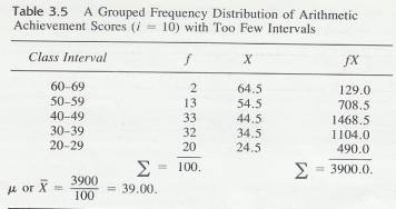
3.7.8.8
The
rest of the process is the same as for a simple frequency distribution. For
each score in the unorganized data, put a tally mark beside its class interval
and cross out the score. Count the tally marks and put the number into the
frequency column. Add the frequency column to be sure that:  ƒ= N.
ƒ= N.
3.7.8.9
Clue
to the Future
3.7.8.9.1 The distributions that you have been
constructing are empirical distributions based on scores actually gathered in
experiments. This chapter and the next two are about these empirical frequency
distributions. Starting with Chapter 8, and throughout the rest of the book,
you will also make use of theoretical distributions-distributions based on
mathematical formulas and logic rather than on actual observations.
3.8 Finding Central Values of a
Grouped Frequency Distribution
3.8.1 Mean
3.8.1.1
The procedure for finding the mean of
a grouped frequency distribution is similar to that for the simple frequency
distribution. In the grouped distribution, however, the midpoint of each
interval represents all the scores in the interval. Look again at Table 3.4.
Notice the column headed with the letter X. The numbers in that column are the
midpoints of the intervals. Assume that the scores in the interval are evenly
distributed throughout the interval. Thus, X is the mean for all scores within
the interval. After the X column is filled, multiply each X by its ƒ value in order to include all frequencies in that interval. Place
the product in the ƒ X column.
Summing the ƒ X ..column
provides  ƒX, which, when
divided-by N, yields the mean. In terms of a formula,
ƒX, which, when
divided-by N, yields the mean. In terms of a formula,
3.8.1.2
Formula
3.8.1.2.1 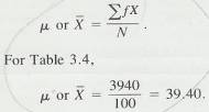
3.8.2 Median
3.8.2.1 Finding the median of a grouped distribution requires interpolation within the interval containing the median. We will use the data in Table 3.4 to illustrate the procedure. Remember that the median is the point in the distribution that has half the frequencies above it and half the frequencies below it. Since N= 100, the median will have 50 frequencies above it and 50 below it. Adding frequencies from the bottom of the distribution, you find that there are 42 who scored below the interval 39-41. You need 8 more frequencies (50 - 42 = 8) to find the median. Since 23 people scored in the interval 39-41, you need 8 of these 23 frequencies or 8/23. Again, you assume that the 23 people in the interval are evenly distributed through the interval. Thus, you need the same proportion of score points in the interval as you have frequencies-that is, 8/23 or, 35 of the 3 score points in the interval. Since .35 x 3 = 1.05, you must go 1.05 score points into the interval to reach the median. Since the lower limit of the interval is 38.5, add 1.05 to find the median, which is 39.55. Figure 3.1 illustrates this procedure.
3.8.2.2 In summary, the steps for finding the median in a grouped frequency distribution are as follows.
3.8.2.3 Divide N by 2
3.8.2.4
Starting at the bottom of the
distribution, add the frequencies until you find the interval containing the
median
3.8.2.5
Subtract
from N/2 the total frequencies of all intervals below the interval
containing the median.
3.8.2.6
Divide
the difference found in step 3 by the number of frequencies in the interval
containing the median.
3.8.2.7
Multiply
the proportion found in step 4 by i
3.8.2.8
Add
the product found in step 5 to the lower limit of the interval containing the
median. That sum is the median.
3.8.2.9
Figure
3.1
3.8.2.9.1 
3.8.3 Mode
3.8.3.1
The third central value, the mode, is
the midpoint of the interval having the greatest number of frequencies. In Table 3.4, the interval 39-41 has the greatest number of frequencies-23. The midpoint of
that interval, 40, is the mode.
3.9 Graphic Presentation of Data
3.9.1
In order to better communicate your
findings to colleagues (and to understand them better yourself), you will often
find it useful to present the results in the form of a graph. It has been said,
with considerable truth, that one picture is worth a thousand words; and a
graph is a type of picture. Almost any data can be presented graphically. The
major purpose of a graph is to get a clear, overall picture of the data.
3.9.2
Graphs are composed of a
horizontal axis (variously called the baseline, X axis or abscissa) and
a vertical axis called the Y-axis or ordinate. We will take
what seems to be the simplest course and use the terms X and Y.
3.9.3 We will describe two kinds of
graphs. The first kind is used to present frequency distributions like those
you have been constructing. Frequency polygons, Histograms, and bar graphs are
examples of this first kind of graph. The second kind we will describe is the
line graph, which is used to present the relationship
between two different variables.
3.9.4 Illustration XY Axis
3.9.4.1
3.9.5 Presenting Frequency
Distributions
3.9.5.1
Whether you use a frequency polygon, a
histogram, or a bar graph to present a frequency distribution depends on the
kind of variable you have measured. A frequency polygon or histogram is used
for quantitative data, and the bar graph is used for qualitative data. It is
not wrong to use a bar graph for quantitative data; but most researchers follow
the rule given above. Qualitative data, however, should not be presented
with a frequency polygon or a histogram. The arithmetic achievement scores
(Table 3.1) are an example of quantitative data.
3.9.5.2
Frequency
Polygon
3.9.5.2.1 Figure
3.2 shows a-frequency polygon based on the frequency distribution in Table 3.4.
We will use it to demonstrate the characteristics of all frequency polygons. On
the X-axis we placed the midpoints of the class intervals. Notice that the
midpoints are spaced at equal intervals, with the smallest midpoint at the left
and the largest midpoint at the right. The Y-axis
is labeled "Frequencies” and is also marked off into equal intervals.
3.9.5.2.2 Graphs are designed to "look right." They look right if the height of the figure is 60 percent to 75 percent of its length. Since the midpoints must be plotted along the X axis, you must divide the Y axis into units that will satisfy this rule. Usually, this requires a little juggling on your part. Darrell Huff (1954) offers an excellent demonstration of the misleading effects that occur when this convention is violated.
3.9.5.2.3 The
intersection of the X and Y axes is
considered the zero point for both variables. For the Y-axis in Figure 3.2, this is indeed the case. The distance on the Y axis is the same from zero to two as
from two to four, and so on. On the X axis, however, that is not the case.
Here, the scale jumps from zero to 19 and then is divided into equal units of
three. It is conventional to indicate a break in the measuring scale by
breaking the axis with slash marks between zero and the lowest score used, as
we did in Figure 3.2. It is also conventional to close a polygon at both ends by
connecting the curve to the X-axis.
3.9.5.2.4 Each point of the frequency polygon represents two numbers; the class midpoint directly below it on the X-axis and the frequency of that class directly across from it on the Y-axis. By looking at the points in Figure 3.2, you can readily see that three people are represented by the midpoint 22, nine people by each of the midpoints 31, 34, and 37, 23 people by the midpoint 40, and so on.
3.9.5.2.5 The
major purpose of the frequency polygon is to gain an overall view of the
distribution of scores. Figure 3.2 makes it clear, for example, that the
frequencies are greater for the lower scores than for the higher ones. It also
illustrates rather dramatically that the greatest number of children scored in
the center of the distribution.
3.9.5.3
Figure
3-2
3.9.5.3.1 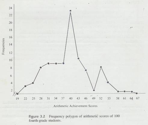
3.9.5.4
Histogram
3.9.5.4.1 Figure 3.3 is a histogram constructed from the same data that were used for the frequency polygon of Figure 3.2. Researchers may choose either of these methods for a given distribution of quantitative data, but the frequency polygon is usually preferred for several reasons: it is easier to construct, gives a generally clearer picture of trends in the data, and can be used to compare different distribution, on the same graph. However frequencies are easier to read from a histogram.
3.9.5.4.2 Figure 3-3
3.9.5.4.2.1
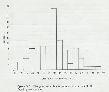
3.9.5.4.3 Actually, the two figures are very
similar. They differ only in that the histogram is made by raising bars from
the X axis to the appropriate frequencies instead of plotting points above the
midpoints. The width of a bar is from the lower to the upper limit of its class
interval. Notice that there is no space between the bars.
3.9.5.5
Bar
Graph
3.9.5.5.1 The third type of graph that presents frequency distributions is the bar graph. A bar graph presents frequencies of the categories of a qualitative variable. An example of a qualitative variable is laundry detergent; the there are many different brands (types of the variable), but the brands don't tell you the order they go in, for example
3.9.5.5.2 With quantitative variables, the measurements
of the variable impose an order on themselves. Arithmetic achievement scores
of 43 and 51 tell you the order they belong in. "Tide" and
"Lux" do not signify any order.
3.9.5.5.3 Figure 3.4 is an example of a bar graph. Notice that each bar is separated by a small space. This bar graph was constructed by a grocery store manager who had a practical problem to solve. One side of an aisle in his store was stocked with laundry detergent, and he had no more space for this kind of product. How much of the available space should he allot for each brand? For one week, he kept a record of the number of boxes of each brand sold. From this frequency distribution of scores on a qualitative variable, he constructed the bar graph in Figure 3.4. (He, of course, used the names of the brands. We wouldn't dare!)
3.9.5.5.4 Brands
E, H, and K are obviously the big sellers and should get the greatest amount of
space. Brands A and D need very little space. The other brands fall between
these. The grocer, of course, would probably consider the relative profits from
the sale of the different brands in order to determine just how much space to
allot to each. Our purpose here is only to illustrate the use of the bar graph
to present qualitative data.
3.9.6 The Line Graph
3.9.6.1 Perhaps the most frequently used graph in scientific books and journal articles is the line graph. A line graph is used to present the relationship between two variables.
3.9.6.2 . A point on a line -graph represents the two scores made by' one person on each of the two variables. Often, the mean of a group is used rather than one person, but the idea is the same: a group with a mean score of X on one variable had a mean score of Y on the other variable. The point on the graph represents the means of that group on both variables.
3.9.6.3
Figure
3-4 & 3-5
3.9.6.3.1 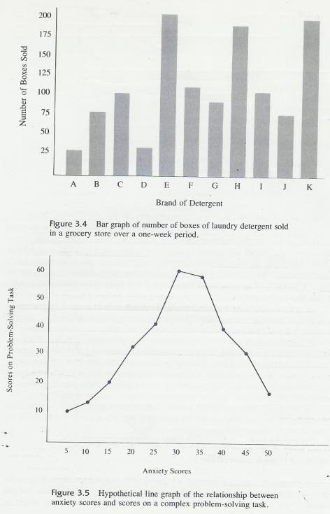
3.9.6.4
Figure
3-6
3.9.6.4.1 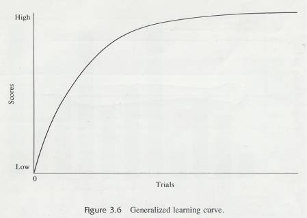
3.9.6.5
Figure
3-7
3.9.6.5.1 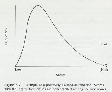
3.9.6.6
Figure
3-8
3.9.6.6.1 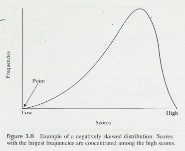
3.9.6.7
Figure 3.5 is an example of a line
graph of the relationship between subjects scores on an anxiety test and their
scores on a difficult problem-solving task. Many studies have discovered this
general relationship. Notice that performance on the task is better and better
for subjects with higher and higher anxiety scores up to the middle range of
anxiety. But as anxiety scores continue to increase, performance scores decrease.
Chapter 5, "Correlation and Regression," will make extensive use of a
version of this type of line graph.
3.9.6.8 A variation of the line graph places performance scores on the Y-axis and some condition of training on the X-axis. Examples of such training conditions are: number of trials, hours of food deprivation, year in school, and: amount of reinforcement. The "score” on the training condition is assigned by the experimenter.
3.9.6.9 Figure 3.6 is a generalized learning curve with a performance measure (scores) on Y axis and number of reinforced trials on the .X axis. Early in training (after only one or two trials), performance is poor. As trials continue, performance improves rapidly at first and then more and more slowly. Finally, at the extreme right-hand portion of the graph, performance has levelled off; continued trials do not produce further changes in the scores.
3.9.6.10 A line graph, then, presents a picture of the relationship between two variables. By looking at the line, you can tell what changes take place in the Y variable as the value of the X variable changes.
3.10 Skewed Distributions
3.10.1 Look back at Table 3.4 graphed as Figure 3.2. Notice that the largest frequencies are found in the middle of the distribution. The same thing is true in Problem 3 of this chapter. These distributions are not badly skewed; they are reasonably symmetrical ln some data, however, the largest frequencies are found at one end of the distribution rather than in the middle. Such distributions are said to he skewed.
3.10.2 The word skew is similar to the word skewer, the name of the cooking implement used !n making shish kebab. A skewer is long and pointed and is thicker at one end than the other (not symmetrical). Although skewed distributions do not function like skewers (you would have a terrible time poking one through a chunk of lamb), the, name does help you remember that a skewed distribution has a thin point on one side.
3.10.3
Figures 3.7 and 3.8 are illustrations
of skewed distributions. Figure 3.7 is positive skewed; the thin point is toward the high scores, and
the most frequent scores are low ones. Figure 3.8 is negatively skewed; the
thin point or skinny end is toward .the low scores and most frequent scores are
high ones.
3.10.4
There
is a mathematical of measuring the degree of skewness that is more precise
than eyeballing, but it is beyond the scope of this book. However, figuring the
relationship of the mean to the median is an objective way to determine the direction
of the skew. When the mean is numerically smaller than the median, there is some amount of negative
skew.
3.10.5
Figure
3-9
3.10.5.1
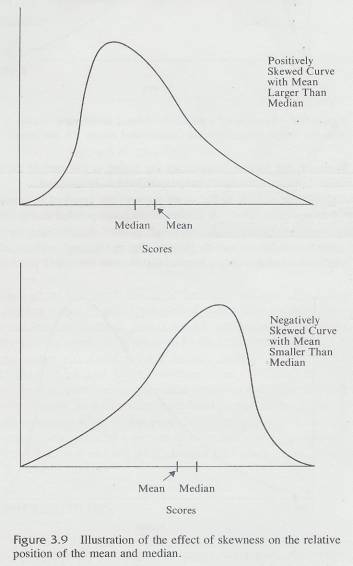
3.10.6 When the mean is larger than the median there is positive skew. The reason for this is that the mean is affected by the size of the numbers and is pulled in the direction of the extreme scores. The median is not influenced by the size of the scores. The relationship between the mean and the median is illustrated by Figure 3.9. The size of the difference between the mean and the median gives you an indication of how much the distribution is skewed.
3.11 The Mean, Median, and Mode Compared
3.11.1
A common question is [Which measure of
central value should I use?" The general answer is "Given a choice,
use the mean. " Sometimes, however, the data give you no choice. For example if the frequency
distribution is for a nominal variable the mode is the
only appropriate measure of central value.
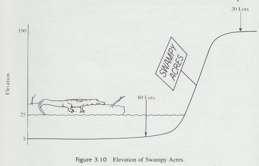
3.11.2 Figure 3-10
3.11.2.1
3.11.3 It is meaningless to find a median or to add up the scores and divide to find a mean for data based on a nominal scale. For the data from the voting-behavior experiment the mode is the only measure of central value that is meaningful. For a frequency distribution of an ordinal variable, the median or the mode is appropriate. For data based on interval or ratio data, the mean, median or mode may be used-you have a choice.
3.11.4 Even if you have interval or ratio data, there are two situations in which the mean is inappropriate because it gives an erroneous impression of the distribution. The first situation is the case of a severely skewed distribution. The following story demonstrates why the mean is inappropriate for severely skewed distributions.
3.11.5 The developer of Swampy Acres Retirement Home sites is attempting, with a computer-selected mailing list, to sell the lots in his southern paradise to northern buyers. The marks express concern that flooding might occur. The developer reassures them by explaining that the average elevation of his lots is 78.5 feet and that the water has never exceeded 25 feet in that area. On the average, he has told the truth; but this average truth is misleading. Look at the actual lay of the land in Figure 3.10 and examine the frequency distribution in Table 3.6, which summarizes the picture.
3.11.6 The mean elevation as the developer said is 78.5 feet; however, only 20 lots, all on a cliff, are out of the flood zone. The other 80 lots are, on the average, under water. The mean, in this case, is misleading. In this instance, the central value that describes the typical case is the median because it is unaffected by the size of the few extreme lots on the cliff. The median elevation is 12.5 feet, well below the high-water mark.
3.11.7 Darrell Huff's delightful and informative book, How to Lie with Statistics (1954) gives a number of such examples. We heartily recommend this book to you. It provides many cautions concerning misinformation conveyed through the use of the inappropriate statistic. A more recent and equally delightful book is Flaws and Fallacies in Statistical Thinking by Stephen Campbell (1974).
3.11.8 There is another instance that requires a median, even though you have a symmetrical distribution. This is when the class interval with the largest (or smallest) scores is not limited. In such a case, you do not nave a midpoint and, therefore, cannot compute a mean. For example, age data are sometimes reported with the highest category as "75 and over. " The mean cannot be computed. Thus, when one or both of the extreme, class intervals is not limited, the median is the appropriate measure of central value. To reiterate: given a choice, use the mean.
3.11.9 Table 3-6
3.11.9.1
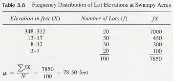
3.12 The Mean of a Set of Means
3.12.1
Occasions arise in which means are
available from several samples taken from the same population. If these means
are combined, the mean of the set of means will give you the best estimate of
the population parameter,  . If every sample has the same N. you can
compute the average mean simply by adding the means and dividing; by the number
of means. If, however, the means to be averaged have varying N 's, it is
essential that you take into account the various sample sizes by multiplying
each mean by its own N
before summing. Table 3.7 illustrates this procedure. Four means. are
presented, along with two hypothetical sample sizes for each mean. In the
left-hand table, the four sample sizes are equal. In the right-hand table, the
four sample sizes are not equal. Notice that 18.50 is the mean of the means
when the separate means are simply added and the sum divided by the number of
means. This gives the correct answer when the sample sizes are equal. However,
when sample sizes differ, 18.50 is wrong. Each mean must be multiplied by its
respective N, and the mean of the means is 17.60. When N 's are
unequal, averaging the means without accounting for sample frequencies always
causes an error.
. If every sample has the same N. you can
compute the average mean simply by adding the means and dividing; by the number
of means. If, however, the means to be averaged have varying N 's, it is
essential that you take into account the various sample sizes by multiplying
each mean by its own N
before summing. Table 3.7 illustrates this procedure. Four means. are
presented, along with two hypothetical sample sizes for each mean. In the
left-hand table, the four sample sizes are equal. In the right-hand table, the
four sample sizes are not equal. Notice that 18.50 is the mean of the means
when the separate means are simply added and the sum divided by the number of
means. This gives the correct answer when the sample sizes are equal. However,
when sample sizes differ, 18.50 is wrong. Each mean must be multiplied by its
respective N, and the mean of the means is 17.60. When N 's are
unequal, averaging the means without accounting for sample frequencies always
causes an error.
3.12.2
Table
3-7
3.12.2.1
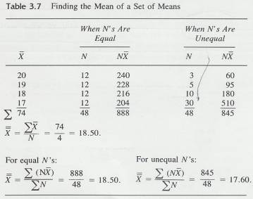
3.12.3
Clue
to The Future
3.12.3.1 In Chapter 9 you will learn a most important concept-a concept called a sampling distribution of the mean. The mean of a set of means is an inherent part of that concept.
3.13 Skewed Distributions and
Measures of Central Tendency
3.13.1
Introduction
3.13.1.1
Distributions
when the mean median and mode are represented graphically may demonstrate
varying degrees of Skewness, which refers to the degree of asymmetry of the
graphical curve.
3.13.2
Symmetrical
Distribution
3.13.2.1
In
a symmetrical distribution the mean, median and mode all fall in the same
point.
3.13.2.2
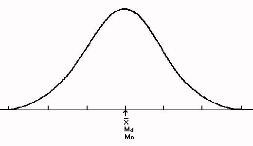
3.13.3
Bimodal
Symmetrical Distribution
3.13.3.1
If
there are two modes (bi-modal) even though the mean, median fall in the same
point the two modes will represent the highest points of the distribution. This
is considered a bimodal symmetrical distribution
3.13.3.2
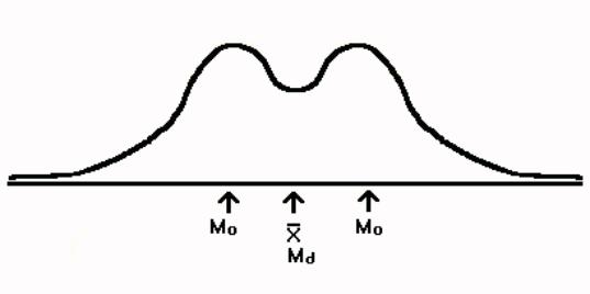
3.13.4
Skewed
Distributions
3.13.4.1
Introduction
3.13.4.1.1
In a
symmetrical distribution the largest frequencies are found in the middle
whereas in a skewed distribution the largest frequencies are found at one end
of the distribution rather than in the middle.
3.13.4.1.2
The word skew
is similar to the word skewer which is long and pointed and is thicker at one
end than the other (not symmetrical). A skewed distribution has a thin point on
one side.
3.13.4.1.3
In a
positively skewed; the thin point is toward the high scores, and the most
frequent scores are low ones. In the negatively skewed, the thin point or
skinny end is toward the low scores, and the most frequent scores are high
ones. There are mathematical ways of measuring the degree of skewness that are
more precise than eyeballing, but you can figure the relationship of the mean
to the median and this provides an objective way to determine the direction of
the skew. When the mean is numerically smaller than the median, there is some
amount of negative skew. When the mean is larger than the median there is
positive skew. The reason for this is that the mean is affected by the size of
the numbers and is pulled in the direction of extreme scores. The median is not
influenced by the size of the scores. The relationship between the mean and the
median is illustrated in the picture below. The size of the difference between
the mean and the median gives you an indication of how much the distribution is
skewed.
3.13.4.2
Illustration
3.13.4.2.1
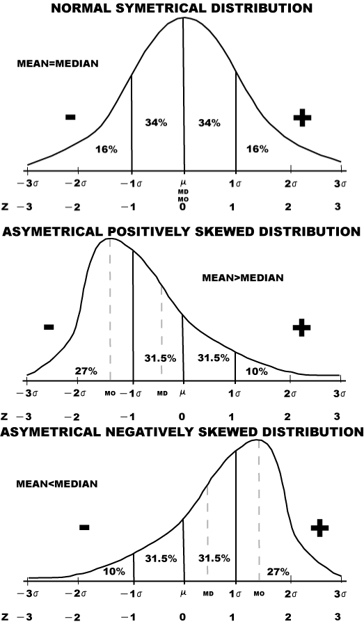
3.13.5
Positively
Skewed Distributions
3.13.5.1
The
positively skewed distribution below demonstrates an asymmetrical pattern. In
this case the mode is smaller than the median, which is smaller than the mean.
3.13.5.2
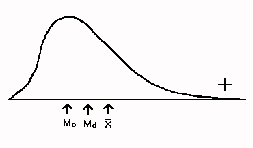
3.13.5.3
This
relationship exists between the mode, median and mean because each statistic describes
the distribution differently.
3.13.5.4
The
mode represents the most frequently occurring score and thus is the highest
point on the X axis in a frequency distribution. The median cuts the
distribution in half so that 50% of the scores are on either side.
3.13.5.5
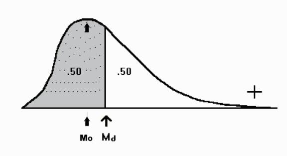
3.13.5.6
The
mean unlike the median and mode is affected by larger scores since it is the
product of the additive score values divided by their number. The mean
represents the balance point in the distribution. Because of this it is drawn
towards the skewness and in positively skewed towards the larger values.
3.13.5.7
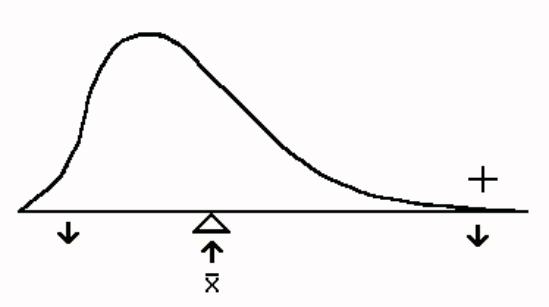
3.13.6
Negatively
Skewed Distribution
3.13.6.1
This
distribution is also asymmetrical but with the opposite order of the mean,
median, and mode. The mean is smaller than the median, which is smaller than
the mode.
3.13.6.2
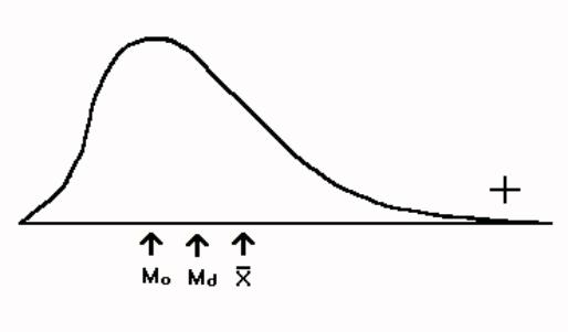
3.13.6.3
The
mode which has the highest value in a frequency distribution points the
skewness in a negative direction.
3.13.6.4
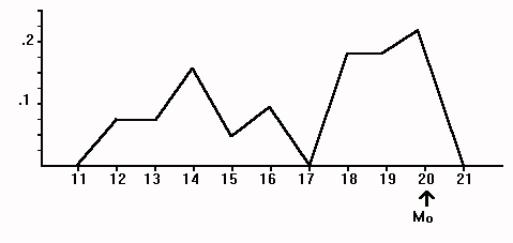
3.14 The Mean of a Set of Means ( )
)
3.14.1
4 START
5 VARIABILITY
5.1 The spread or dispersion of
scores is known as variability. If the distribution of scores fall within a
narrow range there is little variability. Conversely scores that vary widely
connote a distribution that is highly variable.
5.2 Range
5.2.1 The range is the difference
between the largest score and the smallest score.
5.3 Standard Deviation
5.4
5.5 Standard Deviation (s) as an
Estimate of Population Variability
5.5.1
5.5.2 Deviation Scores
5.5.3
5.5.4 Deviation-Score Method of
Computing s from Ungrouped Data
5.5.5
5.5.6 Deviation-Score Method of
Computing s from Grouped Data
5.5.7
5.5.8 The Raw-Score Method of
Computing s from Ungrouped Data
5.5.9
5.5.10
Raw-Score
Method of Computing s from Grouped Data
5.5.11
5.6 The Other Two Standard
Deviations,  and S
and S
5.7
5.8 Variance
5.9
5.10 z Scores
5.10.1
Introduction
5.10.1.1
You
have used measures of central value and measures of variability to describe a
distribution of scores. The next statistic, z, is used to describe a single
score.
5.10.1.2
A
z score is a mathematical way to change a raw score so that it reflects its
relationship to the mean and standard deviation of its fellow scores.
5.10.1.3
Any
distribution of raw scores can be converted to a distribution of z scores; for
each raw score, there is a z score. Raw scores above the mean will have
positive z scores; those below the mean will have negative z scores.
5.10.1.4
A
z score is also called a standard score because it is a deviation score
expressed in standard deviation units. It is the number of standard deviations
a score is above or below the mean. A z score tells you the relative position
of a raw score in the distribution. (z) scores are also used for inferential
purposes. Much larger z scores may occur then.
5.10.2
Formula
and Procedure
5.10.2.1
Formula
5.10.2.1.1
5.10.2.2
Variables
Defined
5.10.2.2.1.1
(z)=z score
5.10.2.2.1.2
S=standard
deviation of a sample of scores
5.10.2.2.1.3
(x)=individual
raw score
5.10.2.2.1.4
 =mean
of a sample
=mean
of a sample
5.10.2.2.2
5.10.2.3
Procedure
5.10.2.3.1
Find the
difference between the raw score and the mean
5.10.2.3.2
Divide that
difference by the standard deviation of the sample
5.10.3
Use
of z Scores
5.10.3.1
(z)
scores are used to compare two scores in the same distribution. They are also
used to compare two scores from different distributions, even when the
distributions are measuring different things.
5.11 Variance and Standard Deviation
5.11.1
Variance
5.11.1.1
S2
is the symbol for variance and is a measure of variability from the mean
of the distribution of scores.
5.11.1.2
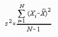
5.11.1.3
Find
the mean of the scores.
5.11.1.4
Subtract
the mean from every score.
5.11.1.5
Square
the results of step two.
5.11.1.6
Sum
the results of step three.
5.11.1.7
Divide
the results of step four by N (The number of scores)-1.
5.11.1.8
Example
5.11.1.8.1
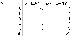
5.11.1.8.2
Find the mean
of the scores.  = 50 / 5
= 10
= 50 / 5
= 10
5.11.1.8.3
Subtract the
mean from every score. The second column above
5.11.1.8.4
Square the
results of step two. The third column above
5.11.1.8.5
Sum the results
of step three. 22
5.11.1.8.6
Divide the
results of step four by N (# of scores)-1. s2 = 22 / (5-1) =
22/4=5.5
5.11.1.8.7
Note that the
sum of column *2* is zero. This must be the case if the calculations are
performed correctly up to that point.
5.11.2
Standard
Deviation
5.11.2.1
S
is the symbol for standard deviation and it is the square root of the variance.
5.11.2.2
The
standard deviation is the preferred measure of variability.
5.11.2.3
Formula
5.11.2.3.1

5.11.2.4
Example
5.11.2.4.1
Take the
square of the variance above. Square root of 5.5=2.35
6 Correlation and Regression
6.1 Introduction
6.1.1 Sir Francis Galton (1822-1911)
in England conducted some of the earliest investigations making use of
statistical analysis. Galton was concerned with the general question of whether
people of the same family were more alike than people of different families.
Galton needed a method that would describe the degree to which, for example,
heights of fathers and their sons were alike. The method he invented for this
purpose is called correlation (co-relation). With it, Galton could also measure
the degree to which the heights of unrelated men were alike. He could then
compare these two results and thus answer his question.
6.1.2 Galton’s student Karl Pearson
(1857-1936), with Galton’s aid, later developed a formula that yielded a
statistic known as a correlation coefficient. Pearson’s product-moment
coefficient, and other correlation coefficients based on Pearson’s work, have
been widely used in statistical studies in psychology, education, sociology,
medicine, and many other areas.
6.2 Concept of Correlation
6.2.1 In order to compute a
correlation, you must have two variables, with values of one variable (X)
paired in some logical way with values of the second variable (Y). Such an
organization of data is referred to as a bivariate (two-variable) distribution.
6.2.2 Examples
6.2.2.1
Same
group of people may take two tests and the score results of both tests can be
compared.
6.2.2.2
Family
relationships may be organized as bivariate distribution such as height of
fathers is one variable, X and height of sons is another variable Y.
6.3 Positive Correlation
6.3.1 In the case of a positive
correlation between two variables, high measurements on one variable tend to be
associated with high measurements on the other and low measurements on one with
low measurements on the other. In other words, the two variables vary together
in the same direction. A perfect positive correlation is 1.00. A scatterplot is
used to visualize this relationship with each point in the scatterplot
representing a pair of scores represented on the X and Y axis of the chart. The
line that runs through the points is called a regression line or “line of best
fit”. When there is perfect correlation (+ -1.00), all points fall exactly on
the line. When the points are scattered away from the line, correlation is less
than perfect and the correlation coefficient falls between .00 (No correlation)
and 1.00 (Perfect correlation). It was when Galton cast his data in the form of
a scatterplot that he conceived the idea of a correlationship between the
variables. It is from the term regression that we get the symbol r for
correlation. Galton chose the term regression because it was descriptive of a
phenomenon that he discovered in his data on inheritance. He found, for
example, that tall fathers had sons somewhat shorter than themselves and that
short fathers had sons somewhat taller than themselves. From such data, he
conceived his “law of universal regression,” which states that there exists a
tendency for each generation to regress, or move toward, the mean of the general
population.
6.3.2 Today, the term regression also
has a second meaning. It refers to a statistical method that is used to fit a
straight line to bivariate data and to predict scores on one variable from
scores on a second variable.
6.3.3 It is not necessary that the numbers
on the two variables be exactly the same in order to have perfect correlation.
The only requirement is that the differences between pairs of scores be all the
same. The relationship must be such that all points in a scatterplot will lie
on the regression line. If this requirement is met, correlation will be
perfect, and an exact prediction can be made.
6.3.4 Nature, of course, is not so
accommodating as to permit such perfect prediction, at least at science’s
present state of knowledge. People cannot peredict their son’ heights
precisely. The points do not all fall on the regression line; some miss it
badly. However, as Galton found , there is some positive relationship; the
correlation coefficient between father and son height is r=.50. The correlation
between math and reading skills is r=.54. Predictions made from these
correlations although far from perfect would be far better than a random guess.
6.4 Negative Correlation
6.4.1 Negative correlation occurs
where high scores of one variable are associated with low scores of the other.
The two variables thus tend to vary together but in opposite directions. The regression line runs from the upper
left of the graph to the lower right. Negative correlation could be changed to
positive by changing the type of score plotted on one of the variables.
6.4.2 Perfect negative correlation
exists, as does perfect positive correlation, when all points are on the
regression line. The correlation coefficient in such a case is –1.00. For
example, there is a perfect negative relationship between the amount of money
in your checking account and the amount of money you have written check for (if
you ignore service charge and deposits). As the amount of money you write
checks for increases, your balance decreases by exactly the same amount.
6.4.3 Other examples of negative
correlation (less than perfect) are;
6.4.3.1
Temperature
and inches of snow at the top of a mountain, measured at noon each day in May
6.4.3.2
Hours
of sunshine and inches of rainfall per day at Miami, Florida
6.4.3.3
Number
of pounds lost and number of calories consumed per day by a person on a strict
diet
6.4.4 Negative correlation permits
prediction in the same way that positive correlation does. With correlation,
positive is not better than negative. In both cases, the size of the
correlation coefficient indicates the strength of the relation ship-the larger
the absolute value of the number, the stronger the relationship. The algebraic
sign (+ or -) indicates the direction of the relationship.
6.5 Zero Correlation
6.5.1 A zero correlation means that
there is no relationship between the two variables. High and low scores on the
two variables are not associated in any predictable manner. In the case of zero
correlation, the best prediction from any X score is the mean of the Y scores.
The regression line, then, runs parallel to the X axis at the height of Y on
the Y axis.
6.6 Computation of the correlation
Coefficient
6.6.1
6.7 Computational Formulas
6.7.1
6.7.2 Blanched Formula
6.7.2.1
This
procedure requires you to find the means and standard deviations of both X and
Y before computing r.
6.7.2.2
Formula
6.7.2.2.1 r=(j(X(each value)*Y(each
value))/N)-((X(Mean))*((Y)(Mean))/(Sx)* (Sy)
6.7.2.3
Variables
Defined
6.7.2.3.1 j=Sum
6.7.2.3.2 XY=Product of each X value multiplied by
its paired Y value
6.7.2.3.3 X(mean)=Mean of variable X
6.7.2.3.4 Y(mean)=Mean of variable Y
6.7.2.3.5 Sx=Standard deviation of
variable X
6.7.2.3.6 Sy= Standard deviation of
variable Y
6.7.2.3.7 N=Number of pairs of observations
6.7.2.4
Procedure
6.7.2.4.1 Multiply each paired X and Y score
6.7.2.4.2 Sum the products of X*Y
6.7.2.4.3 Divide the summed products of X*Y by the
number of paired scores (N)
6.7.2.4.4 Multiply the mean of the X scores X(mean)
by the mean of the Y scores Y(mean)
6.7.2.4.5 Minus the product of X(mean)*Y(mean) from
the product of the division in step 3
6.7.2.4.6 Multiply the standard deviation of X
scores Sx by the standard
deviation of Y scores Sy.
6.7.2.4.7 Divide the product of step 5 by the product
of step 6
6.7.3 Raw Score Formula
6.7.3.1
With
this formula, you start with the raw scores and obtain r without having to
compute means and standard deviations
6.7.3.2
Formula
6.7.3.2.1 r=(N*(j(X(each value)*Y(each value))))-(( jX)(*(
jY))/Square
Root [(N*(jX2 )-( jX)2]*[
(N*(jY2 )-( jY)
2]
6.7.3.3
Variables
Defined
6.7.3.3.1 j=Sum
6.7.3.3.2 XY=Product of each X value multiplied by
its paired Y value
6.7.3.3.3 X(mean)=Mean of variable X
6.7.3.3.4 Y(mean)=Mean of variable Y
6.7.3.3.5 N=Number of pairs of observations
6.7.3.4
Procedure
6.7.3.4.1 Multiply each paired X and Y score
6.7.3.4.2 Sum the products of X*Y
6.7.3.4.3 Multiply the summed products by the number
of paired observations.
6.7.3.4.4 Sum the X scores
6.7.3.4.5 Sum the Y scores
6.7.3.4.6 Multiply the summed X scores by the Summed
Y scores
6.7.3.4.7 Minus the product of step 6 (Summed X
scores*Summed Y scores) from the product of step 4 (summed products*N)
6.7.3.4.8 Square each X score (X2) and sum
the products
6.7.3.4.9 Multiply the product of step 8 (Summed
products of X*X (X2)) by the number of paired scores.
6.7.3.4.10
Sum the X
scores and square the product (jX*jX) or (jX) 2.
6.7.3.4.11
Minus the
product of step 10 ((jX) 2) from the product of step 9
(N*(jX2)
6.7.3.4.12
Square each Y
score (Y 2) and sum the products
6.7.3.4.13
Multiply the
product of step 12 (Summed products of Y*Y (Y 2)) by the number of
paired scores.
6.7.3.4.14
Sum the Y
scores and square the product (jY *j Y) or (jY) 2.
6.7.3.4.15
Minus the
product of step 14 ((jY) 2) from the product of step
13 (N*(j Y 2)
6.7.3.4.16
Multiply the
product of step 15 [N*(j Y 2)- ((jY)
2)] by the product of step 11 [N*(j X 2)- ((jX)
2)]
6.7.3.4.17
Obtain the
square root of step 16 [N*(j X 2)- ((jX)
2)]* [N*(j Y 2)- ((jY)
2)]
6.7.3.4.18
Divide the
product of step 7 [(N*jXY)-(( jX)*( jY))] by the product of step 17 [SQUARE
ROOT[N*(j X 2)- ((jX)
2)]* [N*(j Y 2)- ((jY)
2)]]
6.8 The Meaning Of r
6.8.1 (r)=is a descriptive statistic
or summary index number, like the mean and standard deviation and is used to
describe a set of data.
6.8.2 A correlation coefficient is a
measure of the relationship between two variables. It describes a the tendency
of two variables to vary together (covary); that is, it describes the tendency
of high or low values of one variable to be regularly associated with either
high or low values of the other variable. The absolute size of the coefficient
(from 0 to 1.00) indicates the strength of that tendency to covary.
6.8.3 Illustration
6.8.3.1
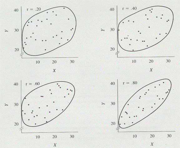
6.8.4 The above scatterplot shows the
correlational relationships of r=.20, .40, .60, and .80. Notice that as the
size of the correlation coefficient gets larger, the points cluster more and
more closely to the regression line; that is, the envelope containing the
points becomes thinner and thinner. This means that a stronger and stronger tendency
to covary exists as r becomes larger and larger. It also means that predictions
made about values of the Y variable from values of the X variable will be more
accurate when r is larger.
6.8.5 The algebraic sign tells the
direction of the covariation. When the sign is positive, high values of X are
associated with high values of Y, and low values of X are associated with low
values of Y. When the sign is negative, high values of X are associated with
low values of Y, and low values of X are associated with high values of Y.
Knowledge of the size and direction of r, then, permits some prediction of the
value of one variable if the value of the other variable is known.
6.8.6 Correlation vs. Causation
6.8.6.1
A
correlation coefficient does not tell you whether or not one of the variables
is causing the variation in the other. Quite possibly some third variable is
responsible for the variation in both.
6.8.6.2
A
correlation coefficient alone cannot establish a causal relationship.
6.8.7 Coefficient of Determination
6.8.7.1
This
is an overall index that specifies the proportion of variance that two
variables have in common.
6.8.7.2
Formula
6.8.7.2.1 COD=r2
6.8.7.3
Variables
Defined
6.8.7.3.1 COD=Coefficient of Determination
6.8.7.3.2 ( r )=Pearson product-moment correlation
coefficient
6.8.7.4
Procedure
6.8.7.4.1 Multiply r * r (r2)
6.8.7.5
It
could be argued that the proportion of variance the two variables have in
common can be attributed to the same cause. Or that this is the percentage of
variance which adheres most closely to the regression line.
6.8.7.6
Note
what happens to a fairly strong correlation of .70 when it is interpreted in
terms of variance. Only 49 % of the variance is held in common.
6.8.7.7
The
coefficient is useful in comparing correlation coefficients. When one compares
an r of .80 with an r of .40, the tendency is to think of the .80 as being
twice as high as .40, but that is not the case. Correlation coefficients are
compared in terms of the amount of common variance. .802=.64, .402=.16,
.64/.16=4 Thus, two variables that are correlated with r=.80 have four times as
much variance as two variables correlated with r=.40
6.8.8 Practical Significance of r
6.8.8.1
How
high must a correlation coefficient be before it is of use? How low must it be
before we conclude it is useless? Correlation is useful if it improves
prediction over guessing. In this sense, any reliable correlation other than
zero, whether positive or negative, is of some value because it will reduce to
some extent the incorrect predictions that might other wise be made. Very low
correlations allow little improvement over guessing in prediction. Such poor
prediction usually is not worth the costs involved in practical situations.
Generally, researchers are satisfied with lower correlations in theoretical
work but require higher ones in practical situations.
6.9 Correlation and Linearity
6.9.1 For r to be a meaningful
statistic, the best fitting line through the scatterplot of points must be a
straight line. If a curved regression line fits the data better than a straight
lie, r will be low, not reflecting the true relationship between the two
variables. The product-moment correlation coefficient is not appropriate as a
measure of curved relationships. Special non-linear correlation techniques for
such relationships do exist and are described elsewhere.[4]
[5]
6.10 Other Kinds of Correlation Coefficients
6.10.1
Dichotomous
Variables
6.10.1.1
Correlations
may be computed on data for which one or both of the variables are dichotomous
(having only two possible values). An example is the correlation of the
dichotomous variable sex and the quantitative variable grade-point average.
6.10.2
Multiple
correlation
6.10.2.1
Several
variables can be combined, and the resulting combination can be correlated with
one variable. With this technique, called multiple correlation a more precise
prediction can be made. Performance in school or on the job can usually be
predicted better by using several measures of a person rather than just one.
6.10.3
Partial
correlation
6.10.3.1
A
technique called partial correlation allows you to separate or partial out the
effects of one variable from the correlation of two other variables. For example,
if we want to know the true correlation between achievement-test scores in two
school subjects it will probably be necessary to partial out the effects of
intelligence since IQ and achievement are correlated.
6.10.4
Rho
for Ranked data
6.10.4.1
Rho
is used when the data are ranks rather than raw scores.
6.10.5
Non-linear
correlation
6.10.5.1
If
the relationship between two variables is curved rather than linear, the
correlation ratio, eta gives the degree of association.
6.10.6
Intermediate-level
statistic text books
6.10.6.1
The
above correlation techniques are covered in intermediate level text books. [6]
[7]
6.11 Correlation and Regression
6.11.1
6.12 Regression Equation 109
6.12.1
6.12.2
Formula
6.12.2.1
Y’
=a+bX
6.12.3
Variables
Defined
6.12.3.1
Y’
=the Y value predicted from a particular X value (Y’ is pronounced
“y prime”).
6.12.3.2
a=the
point at which the regression line intersects the Y axis
6.12.3.3
b=the
slope of the regression line--that is, the amount Y is increasing for each
increase of one unit in X
6.12.3.4
X=the
X value used to predict Y’ .
6.12.3.5
Regression
Coefficients
6.12.3.5.1
The symbols X
and Y can be assigned arbitrarily in correlation, but, in a regression
equation, Y is assigned to the variable you wish to predict. To make
predictions of Y using the regression equation, you need to calculate the
values of the constants a and b, which are called regression coefficients.
6.12.3.5.2
Formula
6.12.3.5.2.1
b=r*(Sy/Sx)
6.12.3.5.3
Variables
Defined
6.12.3.5.3.1
r=correlation
coefficient for X and Y
6.12.3.5.3.2
Sy
=the standard deviation of the Y variable
6.12.3.5.3.3
Sx
=the standard deviation of the X variable
6.12.3.5.3.4
Notice that
for positive correlation b will be a positive number. For negative correlation
b will be negative
6.12.3.5.4
Formula
6.12.3.5.4.1
a=Y(mean)-b*X(mean)
6.12.3.5.5
Variables
Defined
6.12.3.5.5.1
Y(mean)=Mean
of the Y scores
6.12.3.5.5.2
b=regression
coefficient computed above
6.12.3.5.5.3
X(mean)=mean
of the x scores
6.12.4
Procedure
6.12.4.1
Calculate
b
6.12.4.1.1
Divide Sy
(standard deviation of y) by Sx (standard deviation of x)
6.12.4.1.2
Multiply the
product of step 1 (Sy/Sx) by r (correlation coefficient
for X and Y)
6.12.4.2
Calculate
a
6.12.4.2.1
Multiply
X(mean) (mean of the x scores) by b (regression coefficient computed in step 1
above)
6.12.4.2.2
Minus the product
of the previous step above from Y(mean)
(Mean of the Y scores)
6.12.4.3
Calculate
the predicted Y score
6.12.4.3.1
Multiply X
(value used to predict Y’) by b (calculated in step 1 above)
6.12.4.3.2
Add the
product of the previous step above to a (product of step 2 above)
6.12.5
Drawing
a Regression Line
6.12.5.1
6.12.6
Predicting
a Y Score
6.12.6.1
6.13 Rank Order Correlation
6.13.1
6.13.2
Web
6.13.2.1
http://faculty.vassar.edu/lowry/webtext.html
6.13.3
6.14 r Distribution Tables
6.14.1
Web
6.14.1.1
http://www.psychstat.smsu.edu/introbook/rdist.htm
6.14.1.2
7 SCORE TRANSFORMATIONS
7.1 A raw score does not reveal its
relationship to other scores and must be transformed into a score that reveals
these relationships. There are two types of score transformations; percentile
ranks and linear transformations.
7.2 Purpose
7.2.1 A relationship between scores is
revealed increasing the amount of information for analytical interpretation.
7.2.2 Allows two scores to be
compared.
7.3 Percentile Ranks Based On The
Sample
7.3.1 The percentile rank is the
percentage of scores that fall below a given score.
7.3.2 Procedure
7.3.2.1
Rate
the scores from lowest to highest and determine total number of scores.
7.3.2.1.1 Example
7.3.2.1.1.1 33 28 29 37 31 33 25 33 29 32 35
7.3.2.1.1.2 25 28 29 29 31 32 33 33 33 35 37=Total
number of scores=11
7.3.2.2
Determine
the number of scores falling below the selected score
7.3.2.2.1 Example Number=31
7.3.2.2.1.1 Number of scores below=4
7.3.2.3
Determine
the percentage of scores which fall below the selected score by dividing the
number of scores below by the total number of scores and multiplying by 100.
7.3.2.3.1 Example=4/11=.364*100=36.4%
7.3.2.4
Determine
the percentage of scores which fall at the selected score by dividing that
number by the total number of scores and multiplying by 100.
7.3.2.4.1 Example=1/11=.09009*100=9.09
7.3.2.5
Divide
the percentage of scores at the selected score by 2 and add the product to the
percentage of scores below the selected score.
7.3.2.5.1 Example=9.09/2=4.55+36.4=40.95%
7.3.2.5.2 This would mean that the percentage of
scores falling below the score of 31would be 40.95% and that would be the
scores percentile rank.
7.3.2.6
Brief
Summary of Process
7.3.2.6.1 Rank the scores from lowest to highest
7.3.2.6.2 Add the percentage of scores that fall
below the score to one-half the percentage of scores that fall at the score.
7.3.2.6.3 The result is the percentile rank of that
score which is the percentage of scores which fall below the selected score.
7.3.2.7
Another
example=Selected Score=33
7.3.2.7.1 ((6/11)+((3/11)/2))*100=68.18%
7.3.2.7.2 This would mean that the percentage of
scores falling below the score of 33 would be 68.18% and that would be the
scores percentile rank.
7.3.2.8
Example
formula
7.3.2.8.1 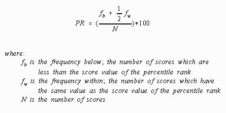
7.3.2.9
Example
of the algebraic procedure applied to the selected numbers of 31 and 33.
7.3.2.9.1 31
7.3.2.9.1.1 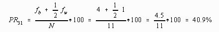
7.3.2.9.2 33
7.3.2.9.2.1 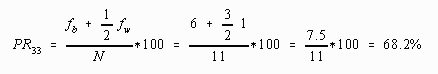
7.4 Percentile Ranks Based On The
Normal Curve
7.4.1
8 LINEAR TRANSFORMATIONS
8.1
8.2 ADDITIVE COMPONENT
8.2.1
8.3 MULTIPLICATIVE COMPONENT
8.3.1
8.4 LINEAR TRANSFORMATIONS - EFFECT
ON MEAN AND STANDARD DEVIATION
8.4.1
8.5 LINEAR TRANSFORMATIONS - FINDING
a AND b GIVEN X (sample mean AND sX'
8.5.1
8.6 STANDARD SCORES OR Z-SCORES
8.6.1 Formula
8.6.1.1
(Mean
(Post Score) – Mean (Pre Score))/(Standard Deviation (Pre Score)/( SQRT Count))
8.7 CONCLUSION AND SUMMARY
8.7.1
9 Theoretical Distributions Including the Normal Distribution
9.1 Definition of Inferential
Statistics
9.1.1 Inferential statistics are
concerned with decision-making. Usually, the decision is whether the difference
between two samples is probably due to chance or probably due to some other
factor. Inferential statistics help you make a decision by giving you the
probability that the difference is due to chance. If the probability is very
high a decision that the difference is due to chance is supported. If the
probability is very low, a decision that the difference is due to some other
factor is supported. Descriptive statistics are also used in these
decision-making processes.
9.2 Introduction
9.2.1 Distributions from observed
scores are called empirical distributions
9.2.2 Theoretical distributions are
based on mathematical formulas and logic rather than on empirical observations.
The probability that the event was due to chance is found by using a
theoretical distribution.
9.2.3 Probability of the occurrence of
any event ranges from .00 (there is no possibility that the event will occur)
to 1.00 (the event is certain to happen). Theoretical distributions are used to
find the probability of an event or a group of evnts.
9.3 Rectangular Distribution
9.3.1 The Histogram below is a
theoretical frequency distribution that shows the types and number of cards in
an ordinary deck of playing cards. Since there are 13 kinds of cards, and the
frequency of each card is four, the theoretical curve is rectangular in shape.
(The line that encloses a frequency polygon is called a curve, even if it is
straight.) The number in the area above each card is the probability of
obtaining that card in a chance draw from the deck. That probability (.077) was
obtained by dividing the number of cards that represent the event (4) by the
total number of cards (52)
9.3.2 Illustration Theoretical Card
Draws
9.3.2.1
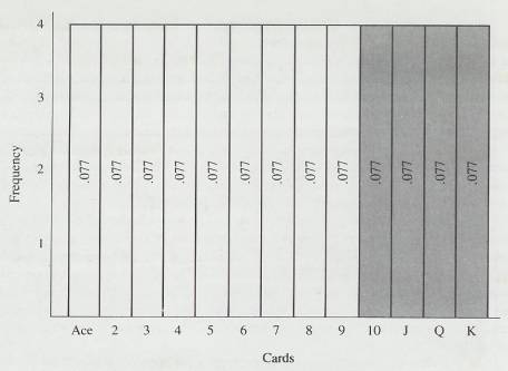
9.3.3 Probabilities are often stated
as “chances in a hundred.” The expression p=.077 means that there are 7.7
chances in 100 of the event in question occurring. Thus from the illustration above
you can tell at a glance that there are 7.7 chances in 100 of drawing an ace
from a deck of cards.
9.3.4 With this theoretical
distribution, you can determine other probabilities. Suppose you wanted to know
your chances of drawing a face card or a 10. These are the darkened areas
above. Simply add the probabilities associated with a 10, jack, queen, and
king. Thus, .077 +077 + 077 + 077=.308. Which means you have 30.8 chances in
100 of drawing one of these face cards or a 10.
9.3.5 One property of the distribution
above is true for all theoretical distributions in that the total area under
the curve is 1.00. In the above illustration there are 13 kinds of events, each
with a probability of .077. Thus, (13)(.077)=1.00. With this arrangement, any
statement about area is also a statement about probability. Of the total area
under the curve, the proportion that signifies “ace” is .077, and that is also
the probability of drawing an ace from the deck.
9.4 Binomial Distribution
9.4.1 The Binomial (two names) is
another example of a theoretical distribution.
9.5 Comparison of Theoretical and
Empirical Distributions
9.5.1 A theoretical curve represents
the “best estimate” of how the events would actually occur. As with all
estimates, the theoretical curve is somewhat inaccurate; but in the world of
real events it is better than any other estimate. A theoretical distribution is
one based on logic and mathematics rather than on observations. It shows you
the probability of each event that is part of the distribution. When it is
similar to an empirical distribution, the probability figures obtained from the
theoretical distribution are accurate predictors of actual events.
9.5.2 There are a number of
theoretical distributions that applied statisticians have found useful. (normal
distribution, t distribution, F distribution, chi square distribution, and U
distribution)
9.6 The Normal Distribution
9.6.1 Early statisticians, who found
that frequency distributions of data gathered from a wide variety of fields
were similar, established the name normal distribution.
9.6.2 The normal distribution is
sometimes called the Gaussian distribution after Carl Friedrich Gauss
(1777-1855) who developed the curve (about 1800 as a way to represent the
random error in astronomy observations. Because this curve was such an accurate
picture of the effects of random variation, early writers referred to the curve
as the law of error.
9.6.3 Description of the Normal
Distribution
9.6.3.1
The
normal distribution is a bell-shaped, symmetrical distribution, a theoretical
distribution based on a mathematical formula rather than on any empirical
observations although empirical curves often look similar to this theoretical
distribution. Empirical distributions usually start to look like the normal
distribution after 100 or more observations. When the theoretical curve is
drawn, the Y-axis is usually omitted. On the X-axis, z scores are used as the
unit of measurement for the standardized norm curve with the following formula.
9.6.3.2
Formula
9.6.3.2.1 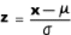
9.6.3.3
The
mean, median, and the mode are the same score-the score on the X-axis at which the
curve is at its peak. If a line were drawn from the peak to the mean score on
the X-axis, the area under the curve to the left of the line would be half the
total area-50%-leaving half the area to the right of the line. The tails of the
curve are asymptotic to the X axis; that is , they never actually cross the
axis but continue in both directions indefinitely with the distance between the
curve and the X axis getting less and less. Although theoretically the curve
never ends, it is convenient to think of (and to draw) the curve as extending
from -3 to +3
to +3 .
.
9.6.3.4
The
two inflection points in the curve are at exactly -1 and +1
 . An
inflection point is where a curve changes from bowed down to bowed up, or vice
versa.
. An
inflection point is where a curve changes from bowed down to bowed up, or vice
versa.
9.6.3.5
Curves
that are not normal distributions are definitely not abnormal but simply
reflect how data is distributed. The use of the word normal is meant to imply
frequently found.
9.6.4 Use of the Normal Distribution
9.6.4.1
The
theoretical normal distribution is used to determine the probability of an
event as the figure below illustrates showing the probabilities associated with
certain areas. The web link below can calculate these areas between the mean
and the z score when you plug in the mean of 0 in the box to the left of the
first applet and the z score in the right box then click between for the area
between the mean and the z score as the illustration below demonstrates. These
probabilities are also found in tables in the back of most statistic textbooks.
9.6.4.2
Web
Normal Distribution Link
9.6.4.2.1 http://www-stat.stanford.edu/~naras/jsm/FindProbability.html
9.6.4.2.2 http://davidmlane.com/hyperstat/z_table.html
9.6.4.3
Illustration
of Normal Distribution
9.6.4.3.1 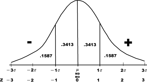
9.6.4.4
Any
normally distributed empirical distribution can be made to correspond to the
standardized normal distribution (a theoretical distribution) by using z
scores. Converting the raw scores of any empirical normal distribution to z
scores will give the distribution a mean equal to zero and a standard deviation
equal to 1.00 and that is exactly the scale used in the theoretical normal
distribution. With this correspondence established, the theoretical normal
distribution can be used to determine the probabilities of empirical events,
whether they are IQ scores, tree diameters, or hourly wages.
9.6.5 Finding What Proportion of a
Population has Scores of a Particular Size or Greater
9.6.5.1
Convert
Raw Scores to z Scores
9.6.5.1.1 Formula
9.6.5.1.1.1 
9.6.5.1.2 Variables Defined
9.6.5.1.2.1 (z)=z score
9.6.5.1.2.2  =standard
deviation of scores
=standard
deviation of scores
9.6.5.1.2.3 (x)=individual raw score
9.6.5.1.2.4  =mean
=mean
9.6.5.1.3 Procedure
9.6.5.1.3.1 Find the difference between the raw score
and the mean
9.6.5.1.3.2 Divide that difference by the standard
deviation
9.6.5.2
Find
the proportion of the distribution between the mean and the z score. (This
gives you the proportion from the mean)
9.6.5.2.1 You can look this up in the back of a
statistics textbook in the table for areas under the normal curve between the
mean and z
9.6.5.2.2 Web Reference
9.6.5.2.2.1 The web link below can calculate these
areas between the mean and the z score when you plug in the mean of 0 in the
box to the left of the first applet and the z score in the right box then click
between for the area between the mean and the z score as the illustration below
demonstrates.
9.6.5.2.2.2 http://www-stat.stanford.edu/~naras/jsm/FindProbability.html
9.6.5.2.2.3 http://davidmlane.com/hyperstat/z_table.html
9.6.5.3
Subtract
the proportion between the mean and your z score from .5000
9.6.5.3.1 .5000 or 50% of the curve lies to the right
of the mean and the proportion you found from the reference in step #2 above is
the proportion between the mean and the z score
9.6.5.3.2 The difference is the proportion above your
z score or the percentage of scores above your raw score expected to be found.
9.6.6 Finding the Score that Separates
the Population into Two Proportions
9.6.6.1
Instead
of starting with a score and calculating proportions, you can also work
backward and answer questions about scores if you are given proportions. If for
example you want to find a score that is required to be in the top 10% of the
population follow the procedure below.
9.6.6.2
Formula
9.6.6.2.1 
9.6.6.3
Variables
Defined
9.6.6.3.1 (z)=z score
9.6.6.3.2  =standard
deviation of scores
=standard
deviation of scores
9.6.6.3.3 (x)=individual raw score
9.6.6.3.4  =mean
=mean
9.6.6.4
Procedure
9.6.6.4.1 Find the difference between the chosen
percentage and .5000. For example .5000-.1000=.4000. (If you wanted to find the
z score that separates the upper 10% of the distribution from the rest.
9.6.6.4.2 The product of step # 1 above is used to
calculate the z score for the above equation. To find the z score use the use
tables in a stats textbook in the table for areas under the normal curve
between the mean and z. Look up the difference in the previous step or its
closest approximation and find the z score associated to plug into the equation
above. You can also use the web reference below to find the z score
9.6.6.4.2.1 Web
Reference
9.6.6.4.2.1.1
The Web
reference below 2nd applet gives you the z score to be used in the
equation above. Pug in a mean of 0 and SD (Standard Deviation) of 1, put in the
percentage in decimals (eg .10=10%, .20=20%) into the shaded area box, and
click the above button to obtain the z score you can use in the above equation.
9.6.6.4.2.1.2
http://davidmlane.com/hyperstat/z_table.html
9.6.6.4.3 Plug the z score found in step # 2 above
into the equation above to find the raw score which separates the two
proportions.
9.6.7 Finding the Proportion
of the Population between Two Scores
9.6.7.1
Convert
Scores to Z scores
9.6.7.1.1 Formula
9.6.7.1.1.1 
9.6.7.1.2 Variables Defined
9.6.7.1.2.1 (z)=z score
9.6.7.1.2.2  =standard
deviation of scores
=standard
deviation of scores
9.6.7.1.2.3 (x)=individual raw score
9.6.7.1.2.4  =mean
=mean
9.6.7.1.3 Procedure
9.6.7.1.3.1 Find the difference between the raw score and
the mean
9.6.7.1.3.2 Divide that difference by the standard
deviation
9.6.7.2
Find
the proportion of the distribution between the mean and the z score. (This
gives you the proportion from the mean) for each of the z scores above.
9.6.7.2.1 You can look this up in the back of a statistics
textbook in the table for areas under the normal curve between the mean and z
9.6.7.2.2 Web Reference
9.6.7.2.2.1 The web link below can calculate these
areas between the mean and the z score when you plug in the mean of 0 in the
box to the left of the first applet and the z score in the right box then click
between for the area between the mean and the z score as the illustration below
demonstrates.
9.6.7.2.2.2 http://www-stat.stanford.edu/~naras/jsm/FindProbability.html
9.6.7.2.2.3 http://davidmlane.com/hyperstat/z_table.html
9.6.7.3
Add
the proportions to find the Proportion of the Population between Two Scores
9.6.8 Finding the Extreme Scores in a
Population
9.6.8.1
This
section outlines how to find extreme scores that divide the population into a
percentage at each tail of the distribution.
9.6.8.2
Formula
9.6.8.2.1 
9.6.8.3
Variables
Defined
9.6.8.3.1 (z)=z score
9.6.8.3.2  =standard
deviation of scores
=standard
deviation of scores
9.6.8.3.3 (x)=individual raw score
9.6.8.3.4  =mean
=mean
9.6.8.4
Procedure
9.6.8.4.1 Divide the percentage by 2
9.6.8.4.2 Find the difference between .5000 and the
halved percentage
9.6.8.4.3 Find the z score from the previous step
9.6.8.4.4 Plug the z score into the above equation
9.7 Comparison of Theoretical and
Empirical Answers
9.7.1 The accuracy of predictions
based on a normal theoretical distribution will depend on how representative
the empirical sample as discussed in the next section
10 Samples and Sampling Distributions
10.1 Introduction
10.1.1
An
understanding of sampling distributions requires an understanding of samples. A
sample, of course, is some part of the whole thing; in statistics the “whole
thing” is a population. The population is always the thing of interest; a
sample is used only to estimate what the population is like. One obvious
problem is to get samples that are representative of the population.
10.1.2
Samples
that are random have the best chance of being representative and a sampling
distribution can tell you how much faith (probability-wise) you can put in
results based on a random sample.
10.1.3
Population
10.1.3.1
Population
means all the members of a specified group. Sometimes the population is one
that could actually be measured, given plenty of time and money. Sometimes,
however, such measurements are logically impossible. Inferential statistics are
used when it is not possible or practical to measure an entire population.
10.1.3.2
So,
using samples and the methods of inferential statistic can make decisions about
immeasurable populations. Unfortunately, there is some peril in this. Samples
are variable, changeable things. Each one produces a different statistic. How
can you be sure that the sample you draw will produce a statistic that will
lead to a correct decision about the population? Unfortunately, you cannot be
absolutely sure. To draw a sample is to agree to accept some uncertainty about
the results. However it is possible to measure this uncertainty. If a great
deal of uncertainty exists, the sensible thing to do is suspend judgment. On
the other hand, if there is very little uncertainty, the sensible thing to do
is reach a conclusion, even though there is a small risk of being wrong.
Restated you must introduce a
hypothesis about a population and then, based on the results of a sample,
decide that the hypothesis is reasonable or that it should be rejected.
10.2 Representative and Nonrepresentative
Samples
10.2.1
Introduction
10.2.1.1
If
you want to know about an unmeasurable population you have to draw a
representative sample by using a method of obtaining samples that is more
likely to produce a representative sample than any other method. How well a
particular method works can be assessed either mathematically or empirically.
For an empirical assessment, start with a population of numbers, the parameter
of which can be easily calculated. The particular method of sampling is
repeatedly used, and the corresponding statistic calculated for each sample.
The mean of these sample statistics can then be compared with the parameter.
10.2.1.2
We
will name two methods of sampling that are most likely to produce a
representative sample, discuss one of them in detail, and then discuss some
ways in which Nonrepresentative samples are obtained when the sampling method
is biased.
10.2.2
Random
Samples
10.2.2.1
A
method called random sampling is commonly used to obtain a sample that is most
likely to be representative of the population. Random has a technical meaning
in statistics and does not mean haphazard or unplanned. A random sample in most
research situations is one in which every potential sample of size N has an
equal probability of being selected. To obtain a random sample, you must
10.2.2.1.1
Define the
population of scores
10.2.2.1.2
Identify
every member of the population
10.2.2.1.3
Select scores
in such a way that every sample has an equal probability of being chosen
10.2.2.2
Another
method is to assign each score a number and use the random number generator
below to pick your sample of numbers.
10.2.2.2.1
Random Number
Generator
10.2.2.2.1.1
http://www.random.org/nform.html
10.2.2.2.1.2
http://www.randomizer.org/
10.2.2.3
We'll
go through these steps with a set of real data-the self-esteem scores of 24
fifth-grade children.2 We define these 24 scores as our population. From these
we will pick a random sample of seven scores.
10.2.2.4
Self
Esteem Scores
10.2.2.4.1
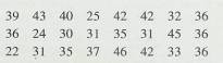
10.2.2.5
.
One method of picking a random sample is to write each self-esteem score on a
slip of paper, put the 24 slips in a box, jumble them around, and draw out
seven. The scores on the chosen slips become a random sample. This method works
fine if the slips are all the same size and there are only a few members of the
population. If there are many members, this method is tedious.
10.2.2.6
Another
(easier) method of getting a random sample is to use a table of random numbers,
such as Table B in the Appendix. To use the table, you must first assign an
identifying number to each of the 24 self-esteem scores, thus:
10.2.2.7
Random
Number Assignment
10.2.2.7.1
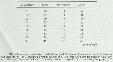
10.2.2.7.2
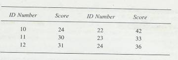
10.2.2.8
Each
score has been identified with a two-digit number. Now turn to Table B and
pick a row and a column in which to start. Any haphazard method will work;
close your eyes and stab a place with your finger. Suppose you started at row
35, columns 70-74. Reading horizontally, the digits are 21105. Since you need
only two digits to identify any member of our population, use the first two
digits, 21. That identifies one score for the sample-a score of 46. From this
point, you can read two-digit numbers in any direction-up, down, or
sideways-but the decision should have been made before you looked at the
numbers. If you had decided to go down, the next number is 33. No self-esteem
score has an identifying number of 33, so skip it and go to 59, which gives you
the saine problem as 33. In fact, the next five numbers are too large. The
sixth number is 07, which identifies the score of 32 for the random sample. The
next usable number is 13, a score of 35. Continue in this way until you arrive
at the bottom. At this point, you can go in any direction. We will skip over
two columns to columns 72 and 73 (you were in columns 70 and 71) and start up.
The first number is 12, which identifies a score of 31. The next usable numbers
are 19, 05, and 10, giving scores of 35, 42, and 24. Thus, the random sample of
seven consists of the following scores: 46, 32, 35, 31, 35, 42, and 24. If
Table B had produced the same identifying number twice, you would have ignored
it the second time.
10.2.2.9
What
is this table of random numbers? In Table B (and in any table of random
lUmbers), the probability of occurrence of any digit from a to 9 at any place
in the table s the same-. 10. Thus, you are just as likely to find 000 as 123
or 381. Incidentally, 'ou cannot generate random numbers out of your head.
Certain sequences begin to _cur, and (unless warned) you will not include
enough repetitions like 666 and 000.
10.2.2.10
Here
are some hints for using a table of random numbers.
10.2.2.10.1
Make a check beside the identifying number of a score when it
is chosen for the sample. This will help prevent duplications.
10.2.2.10.2
If the population is large (over 100), it is more efficient to
get all the identifying numbers from the table first. As you select them, put
them in some rough order. This will help prevent duplications. After you have
all the identifying numbers, go to the population to select the sample.
10.2.2.10.3 If the population has exactly 100 members, let 00 be the identifying number for 100. In this way ,you can use two-digit identifying numbers, each one of which matches a population score. This same technique can be applied to populations of 10 or 1000 members.
10.2.3
Stratified
Samples
10.2.3.1
A
method called stratified sampling is another way to produce a sample that is
very likely to mirror the population. It can be used when an investigator knows
the numerical value of some important characteristic of the population. A
stratified sample is controlled so that it reflects exactly some know
characteristic of the population. Thus, in a stratified sample, not everything
is left to chance.
10.2.3.2
For
example, in a public opinion poll on a sensitive political issue, it is
important that the sample reflect the proportions of the population who
consider themselves Democrat, Republican, and Independent. The investigator
draws the sample so it will reflect the proportions found in the population.
The same may be done for variables such as sex, age, and socio-economic status.
After stratification of the samples has been determined, sampling within each
stratum is usually random.
10.2.3.3
To
justify a stratified sample, the investigator must know what var9iables will
affect the results and what the population characteristics are for those
variables. Some times the investigator has this information (as from census
data), but many times such information is just not available (as in most
research situations).
10.2.4
Biased
Samples
10.2.4.1
A
biased sample is one that is drawn using a method that systematically
underselects or overselects from certain groups within the population. Thus, in
a biased sampling technique, every sample of a given size does not have an
equal opportunity of being selected. With biased sampling techniques, you are
much more likely to get a Nonrepresentative sample than you are with random or
stratified sampling techniques.
10.2.4.2
For
example, it is reasonable to conclude that some results based on mailed
questionnaires are not valid, because the samples are biased since not all of
the recipients will respond and those that do may be different than those that
do. Therefore, the sample is biased. The probability of bias is particularly
high if the questionnaire elicits feelings of pride or despair or disgust or
apathy in some of the recipients.
10.2.4.3
With
a nice random sample you can predict fairly accurately your chance of being
wrong. If it is higher than you would like, you can reduce it by increasing
sample size. With a biased sample, however, you do not have any basis for
assessing your margin of error and you don’t know how much confidence to put in
your predictions. You may be right or you may be very wrong. You may get
generalizable results from such samples, but you cannot be sure. The search for
biased samples in someone else’s research is a popular (and serious) game among
researchers.
10.3 Sampling Distributions
10.3.1
Introduction
10.3.1.1
The
two categories of sampling distributions are: sampling distributions in general
and sampling distributions of the mean.
10.3.1.2
A
sampling distribution is a frequency distribution of sample statistics. Drawing
many random samples from a population and calculating a statistic on each
sample could obtain a sampling distribution. These statistics would be arranged
into a frequency distribution. From such a distribution you could find the
probability of obtaining any particular values of the statistic.
10.3.1.3
Every
sampling distribution is for a particular statistic (such as the mean,
variance, correlation coefficient and so forth). In this section you will learn
only about the sampling distribution of the mean. It will serve as an
introduction to sampling distributions in general, some others of which you
will find out about in later sections.
10.4 The Sampling Distribution of the Mean
10.4.1
Introduction
10.4.1.1
Empirical
Sampling Distribution of the Mean
10.4.1.1.1
An empirical
sampling distribution of the mean is a frequency distribution of sample means
10.4.1.1.1.1
Every sample
is drawn randomly from the same population
10.4.1.1.1.2
The sample
size (N) is the same for all samples
10.4.1.1.1.3
The number of
samples is very large
10.4.1.1.2
Illustration
10.4.1.1.2.1
The following
illustration shows 200 separate random samples, each with N=10 from a
population of 24 self esteem scores. The mean of each group of 10 was calculated,
and arranged in 200 sample means () into
the frequency polygon. The mean (parameter of the 24 self esteem scores is
35.375. In the illustration below most of the statistics (sample means) are
fai8rly good estimates of that parameter. Some of the ’s, of
course, miss the mark widely; but most are pretty close. The illustration below
is an empirical sampling distribution of the mean. Thus, a sampling
distribution of the mean is a frequency distribution of sample means.
10.4.1.1.2.2
Empirical
sampling Distribution of the Means (Frequency Distribution of sample means)
10.4.1.1.2.2.1
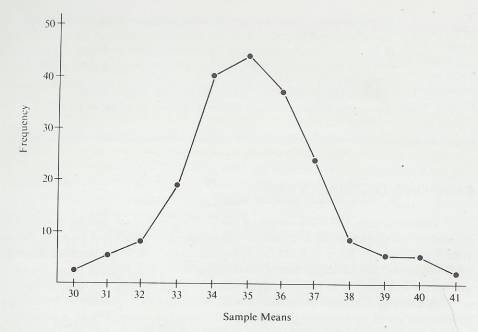
10.4.1.1.3
You will
never use an empirical sampling distribution of the mean in any of your
calculations; you will always use theoretical ones that come from mathematical
formulas. An empirical sampling distribution of the mean is easier to
understand for illustration purposes.
10.4.1.1.4
Central Limit
Theorem
10.4.1.1.4.1
For any
population of scores, regardless of form, the sampling distribution of the mean
will approach a normal distribution as N (sample size) gets larger. Furthermore,
the sampling distribution of the mean will have a mean equal to the  and a standard
deviation equal to
and a standard
deviation equal to  .
.
10.4.1.1.5
Now you know
not only that sampling distributions of the mean are normal curves but also
that, if you know the population parameters  and
and  , you
can determine the parameters of the sampling distribution.
, you
can determine the parameters of the sampling distribution.
10.4.1.1.6
One
qualification is that the sample size (N) be large. How many does it take to
make a large sample? The traditional answer is 30 or more, although, if the
population itself is symmetrical, a sampling distribution of the mean will be
normal with sample sizes much smaller than 30. If the population is severely
skewed samples with 30 (or more) may be required.
10.4.1.1.7
The mean of
the sampling distribution of means will be the same as the population mean,  . The standard deviation of the sampling distribution will be
the standard deviation of the population (
. The standard deviation of the sampling distribution will be
the standard deviation of the population ( )
divided by the square root of the sample size.
)
divided by the square root of the sample size.
10.4.1.1.8
The Central
Limit Theorem works regardless of the form of the original population. Thus,
the sampling distribution of the mean of scores coming from a rectangular or
bimodal population approaches normal if N is large.
10.4.1.1.9
The standard
deviation of any sampling distribution is called the standard error, and the
mean is called the expected value. In this context, and in several others in
statistics, the term error means deviations or random variation. Sometimes,
error refers to a mistake, but most often it is used to indicate deviations or
random variation.
10.4.1.1.10
In the case
of the sampling distribution of the mean, we are dealing with a standard error
of the mean (symbolized  and the expected value of the mean
[symbolized E().Although
E() is
rarely encountered the standard error is commonly used. Be sure that you
understand that it is the standard deviation of the sampling distribution of
some statistic. In this section, it is the standard deviation of a sampling
distribution of the mean.
and the expected value of the mean
[symbolized E().Although
E() is
rarely encountered the standard error is commonly used. Be sure that you
understand that it is the standard deviation of the sampling distribution of
some statistic. In this section, it is the standard deviation of a sampling
distribution of the mean.
10.4.1.1.11
Illustration
Theoretical Sampling Distribution of the Mean, N=10
10.4.1.1.11.1
Population
10.4.1.1.11.1.1 Mean=35.375
10.4.1.1.11.1.2 Standard Deviation=6.304
10.4.1.1.11.2
Sampling
Distribution of the Mean for N=10
10.4.1.1.11.2.1 Mean=35.375
10.4.1.1.11.2.2
Standard Deviation=6.304/ ![]() =1.993
=1.993
10.4.1.1.11.3
Illustration
10.4.1.1.11.3.1
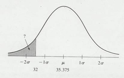
10.4.2
Use
of a Sampling Distribution of the Mean
10.4.2.1
Since
the sampling distribution of the mean is a normal curve, you can apply what you
learned in the last chapter about normally distributed scores to questions
about sample means. In the above illustration notice the question mark points
to the area below a mean of 32 of sample means and asks what proportion of
sample mean scores would fall below that score. First you would find the
standard error of the mean, then the z score which allows you to determine the
proportion.
10.4.2.2
Standard
error of the mean Formula
10.4.2.2.1

10.4.2.3
Procedure
10.4.2.3.1
Divide the
standard deviation of the population by the square root of the number of the
sample size.
10.4.2.4
(z)
score Formula
10.4.2.4.1

10.4.2.5
Variables
Defined
10.4.2.5.1
 =Standard
error of the mean
=Standard
error of the mean
10.4.2.5.2
=Mean
of the sample
10.4.2.5.3
 =Mean of the
population
=Mean of the
population
10.4.2.5.4
z=z score
10.4.2.6
Procedure
10.4.2.6.1
Find the
difference between the population mean and the sample mean
10.4.2.6.2
Divide the
difference found in the previous step by the standard error of the mean to
determine the z score.
10.4.2.6.3
Find the
proportion associated with the z score of the previous step with the Web link
below
10.4.2.6.4
Web Reference
10.4.2.6.4.1
Using the web
reference below, click the below button and type in your z score to find the
proportion of scores which fall below that score. Likewise knowing the z score
you could find scores between the z score and the mean or any other combination
by clicking the appropriate button and inserting your z score.
10.4.2.6.4.2
http://davidmlane.com/hyperstat/z_table.html
10.4.2.7
Using
the Illustration Theoretical Sampling Distribution of the Mean (above) with a z
score of 1.993, you would expect a proportion of .0455
of the means to be less than 32. We can check this prediction by determining
the proportion of those 200 random samples that had means of 32 or less. By
checking the frequency distribution from which the theoretical sampling
distribution was drawn (Empirical sampling Distribution of the Means (Frequency Distribution of
sample means)) (see above) we found the empirical proportion to be .0400.
Missing by ½ of 1 percent isn’t bad, and once again, you find that a
theoretical normal distribution predicts an actual empirical proportion quite
nicely.
10.4.2.8
What
effect does sample size have on a sampling distribution? When the sample size
(N) becomes larger  will become smaller. See the equation above
and illustration below. This illustration shows some sampling distributions of
the mean based on the population of 24 self-esteem scores. The sample sizes are
3, 5, 20, 20. A sample mean of 39 is included in all four figures as a
reference point. Notice that, as
will become smaller. See the equation above
and illustration below. This illustration shows some sampling distributions of
the mean based on the population of 24 self-esteem scores. The sample sizes are
3, 5, 20, 20. A sample mean of 39 is included in all four figures as a
reference point. Notice that, as  becomes smaller, a sample mean of 39 becomes
a rarer and rarer event. The good investigator, with an experiment to do, will
keep in mind what we have just demonstrated about the effect of sample size on
the sampling distribution and will use reasonably large samples.
becomes smaller, a sample mean of 39 becomes
a rarer and rarer event. The good investigator, with an experiment to do, will
keep in mind what we have just demonstrated about the effect of sample size on
the sampling distribution and will use reasonably large samples.
10.4.2.8.1
Illustration
Sampling distributions of the mean for four different sample sizes. All samples
are drawn from the same population. Note how a sample mean of 39 becomes rarer
and rarer as  becomes smaller.
10.4.2.8.1.1
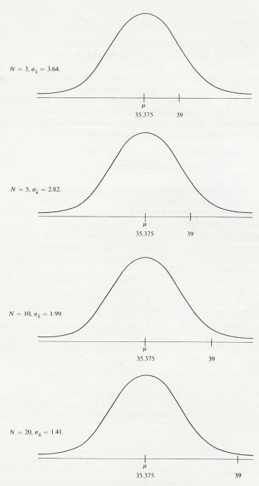
10.5 Calculating a Sampling Distribution when
Parameters are not Available
10.5.1
Introduction
10.5.1.1
All
of the foregoing information is based on the assumption that you have the
population parameters, and, as you know, that is seldom the case. Fortunately,
with a little modification of the formula and no modification of logic, the
random sample you learned to draw can be used for estimating the population
parameters.
10.5.1.2
When
you have only a sample standard deviation with which to estimate the standard
error of the mean, the formula is the following
10.5.1.3
The
statistic s is an
estimate of  , and
, and  is required for use of the normal curve. The
larger the sample size, the more reliable s is. As
a practical matter, s is
considered reliable enough if N is
is required for use of the normal curve. The
larger the sample size, the more reliable s is. As
a practical matter, s is
considered reliable enough if N is  30. As a technical
matter, the normal curve is only appropriate when you know
30. As a technical
matter, the normal curve is only appropriate when you know  and
and  .
.
10.5.2
Standard
Error of the Mean Estimated from a sample
10.5.2.1
Formula
10.5.2.1.1
s =s/
10.5.2.2
Variables
Defined
10.5.2.2.1
s=standard
error of the mean estimated from a sample
10.5.2.2.2
s=standard
deviation of a sample
10.5.2.2.3
N=sample size
10.5.2.3
Procedure
10.5.2.3.1
Divide s by
the square root of N to find s.
10.6
Confidence
Intervals
10.6.1
Introduction
10.6.1.1
Mathematical
statisticians identify two different types of decision-making processes as statistical
inference. The first process is called hypothesis testing, and the second is
called estimation. Hypothesis testing means to hypothesize a value for a
parameter, compare (or test) the parameter with an empirical statistic, and
decide whether the parameter is reasonable. Hypothesis testing is just what you
have been doing so far in this chapter. Hypothesis testing is the more popular
technique of statistical inference.
10.6.1.2
The
other kind of inferential statistics, estimation, can take two forms-parameter
estimation and confidence intervals. Parameter estimation means that one
particular point is estimated to be the parameter of the population. A
confidence interval is a range of values bounded by a lower and an upper limit.
The interval is expected, with a certain degree of confidence, to contain the
parameter. These confidence intervals are based on sampling distributions.
10.6.2
The
Concept of a Confidence Interval
10.6.2.1
A
confidence interval is simply a range of values with a lower and an upper
limit. With a certain degree of confidence (usually 95% or 99%), you can state
that the two limits contain the parameter. The following example shows how the
size of the interval and the degree of confidence are directly related (that
is, as one increases the other increases also).
10.6.2.2
A
sampling distribution can be used to establish both confidence and the
interval. The result is a lower and an upper limit for the unknown population
parameter.
10.6.2.3
Here
is the rationale for confidence intervals. Suppose you define a population of
scores. A random sample is drawn and the mean ()
calculated. Using this mean (and the techniques described in the next section),
a statistic called a confidence interval is calculated. (We will use a 95%
confidence interval in this explanation.) Now, suppose that from this
population many more random samples are drawn and a 95% confidence interval
calculated for each. For most of the samples, will be close to  and
and  will fall within the
confidence interval. Occasionally, of course, a sample will produce an far from
will fall within the
confidence interval. Occasionally, of course, a sample will produce an far from  and the confidence interval about will not contain
  . The method is such, however, that the probability of these
rare events can be measured and held to an acceptable minimum like 5%. The
result of all this is a method that produces confidence intervals, 95% which
contain
. The method is such, however, that the probability of these
rare events can be measured and held to an acceptable minimum like 5%. The
result of all this is a method that produces confidence intervals, 95% which
contain  .
.
10.6.2.4
In real
life situation, you draw one sample and calculate one interval. You do not know
whether or not  lies between the two
limits, but the method you have used makes you 95% confident that it does.
lies between the two
limits, but the method you have used makes you 95% confident that it does.
10.6.3
Calculating
the Limits of a Confidence Interval
10.6.3.1
Introduction
10.6.3.1.1
Having drawn
a random sample and calculated the mean and standard error, the Upper and Lower
limit confidence Interval may be calculated.
10.6.3.1.2
The term
confidence level is used for problems of estimation, such as confidence
intervals, and the term significance level is used for problems of hypothesis
testing.
10.6.3.2
Formulas
10.6.3.2.1
s =s/
10.6.3.2.2
LL=-z*( s)
10.6.3.2.3
UL=+z*( s)
10.6.3.3
Variables
Defined
10.6.3.3.1
s=standard
error of the mean estimated from a sample
10.6.3.3.2
s=standard
deviation of a sample
10.6.3.3.3
N=sample size
10.6.3.3.4
=Mean
of the sample
10.6.3.3.5
z=z score
(1.96=95% 2.58 =99%)
10.6.3.4
Procedure
10.6.3.4.1
Standard
error of the mean estimated from a sample s
10.6.3.4.1.1
Divide s by
the square root of N to find s.
10.6.3.4.2
Lower Limit
10.6.3.4.2.1
Multiply the
z score (based on the confidence interval you want (1.96=95% 2.58 =99%)) by s
10.6.3.4.2.2
Find the
difference between and the product of the previous
step to determine the lower limit score
10.6.3.4.3
Upper Limit
10.6.3.4.3.1
Multiply the
z score (based on the confidence interval you want (1.96=95% 2.58 =99%)) by s
10.6.3.4.3.2
Find the sum
of the and the product of the previous step to
determine the upper limit score
10.7 Other Sampling Distributions
10.7.1
Introduction
10.7.1.1
Now
you have been introduced to the sampling distribution of the mean. The mean is
clearly the most popular statistic among researchers. There are times, however,
when the statistic necessary to answer a researcher’s question is not the mean.
For example, to find the degree of relationship between two variables, you need
a correlation coefficient. To determine whether a treatment causes more
variable responses, you need a standard deviation. Proportions are commonly
used statistics. In each of these cases (and indeed, for any statistic), the
basic hypothesis testing procedure you have just learned is often used by
researchers.
10.7.1.2
Procedure
10.7.1.2.1
Hypothesize a
population parameter
10.7.1.2.2
Draw a random
sample and calculate a statistic
10.7.1.2.3
Compare the
statistic with a sampling distribution of that statistic and decide whether
such a sample statistic is likely if the hypothesized population parameter is
true
10.7.1.3
There
are sampling distributions for statistics other than the mean such as the t
distribution. In addition, some statistics have sampling distributions that are
normal, thus allowing you to use the familiar normal curve.
10.7.1.4
Along
with every sampling distribution comes a standard error. Just as every
statistic has its sampling distribution, every statistic has its standard
error. For example, the standard error of the median is the standard deviation
of the sampling distribution of the median. The standard error of the variance
is the standard deviation of the sampling distribution of the variance. Worst
of all, the standard error of the standard deviation is the standard deviation
of the sampling distribution of the standard deviation. If you followed that
sentence, you probably understand the concept of standard error quite well.
10.7.1.5
The
main points we want to emphasize are that statistics are variable things, that
a picture of that variety is a sampling distribution, and that a sampling
distribution can be used to obtain probability figures.
10.8 A Taste of Reality
10.8.1
Introduction
10.8.1.1
The
techniques of inferential statistics that you are learning in this book are
based on the assumption that a random sample has been drawn. But how often do
you find random samples in actual data analysis? Seldom. However, there are two
justifications for the continued use of non-random samples.
10.8.1.2
In
the first place, every experiment is an exercise in practicality. Any
investigator has a limited amount of time, money, equipment, and personnel to
draw upon. Usually, a truly random sample of a large population is just not
practical, so the experimenter tries to obtain a representative sample, being
careful to balance or eliminate as many sources of bias as possible.
10.8.1.3
In
the second place, the only real test of generalizability is empirical-that is
finding out whether the results based on a sample are also true for other
samples. This kind of check-up is practiced continually. Usually, the results
based on samples that are unsystematic (but not random) are true for other
samples from the same population.
10.8.1.4
Both
of these justifications develop a very hollow ring, however, if someone
demonstrates that one of your samples is biased and that a representative
sample proves your conclusions false.
11 Differences between Means
11.1 Introduction
11.1.1
One
of the best things about statistics is that it helps you to understand
experiments and the experimental method. The experimental method is probably
the most powerful method we have of finding out about natural phenomena. Few
ifs, ands, or buts or other qualifiers need to be attached to conclusions based
on results from a sound experiment.
11.1.2
The
sections below will discuss the simplest kind of experiment and then show how
the statistical techniques you have learned about sampling distributions can be
expanded to answer research questions.
11.2 A Short Lesson on How to Design An
Experiment
11.2.1
The
basic ideas underlying a simple two-group experiment are not very complicated
11.2.1.1
The
logic of an experiment
11.2.1.1.1
Start with
two equivalent groups and treat them exactly alike except for one thing. Then measure
both groups and attribute any difference between the two to the one way in
which they were treated differently.
11.2.1.2
The
above summary of an experiment is described more fully in the table below
11.2.2
Illustration
Summary of simple Experiment Table 8-1
11.2.2.1
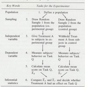
11.2.3
The
fundamental question of the experiment outlined above is “What is the effect of
Treatment A on a person’s ability to perform Task Q” In more formal terms, the
question is “For Task Q scores, is the mean of the population of those who have
had Treatment A different from the mean of the population of those who have not
had Treatment A?” This experiment has an independent variable with two levels
(Treatment A or no Treatment A) and a dependent variable (scores on Task Q). A
population of subjects is defined and two random samples are drawn.
11.2.3.1
An
equivalent statement is that there are two populations to begin with and that
the two population means are equal. On random sample is then drawn from each
population. Actually, when two samples are drawn from on population, the
correct procedure is to randomly assign each subject to a group immediately
after it is drawn from the population. This procedure continues until both
groups are filled.
11.2.4
These
random samples are both representative of the population and (approximately)
equivalent to each other. Treatment A is then administered to one group
(commonly called the experimental group) but not to the other group (commonly
called the control group). Except for Treatment A, both groups are treated
exactly the same way. That is, extraneous variables are held constant or
balanced out for the two groups. Both groups perform Task Q and the mean score
for each group is calculated. The two sample means almost surely will differ.
The question now is whether this observed difference is due to sampling
variation (a chance difference) or to Treatment A. You can answer this question
by using the techniques of inferential statistics. (See illustration above) In
the above example the word treatment refers to different levels of the independent
variable. The illustrations experiment had two treatments.
11.2.5
In
some experimental designs, subjects are assigned to treatments by the
experimenter, in others, the experimenter uses a group of subjects who have
already been “treated” 9for example, being males or being children of
authoritarian parents). In either of these designs, the methods of inferential
statistics are the same, although the interpretation of the first kind of
experiment is usually less open to attack.
11.2.5.1
This
issue is discussed more fully in Research Design and Methodology textbooks.
11.2.6
Inferential
statistics are used to help you decide whether or not a difference between
sample means should be attributed to chance.
11.3
The
Logic of Inferential Statistics (The rationale for using the null hypothesis)
11.3.1
A
decision must be made about the population of those given Treatment A, but is
must be made on the basis of sample data. Accept from the start that because of
your decision to use samples, you can never know for sure whether or not
Treatment A has an effect. Nothing is ever proved through the use of
inferential statistics. You can only state probabilities, which are never
exactly one or zero. The decision-making goes like this. In a well-designed
two-group experiment, all the imaginable results can be reduced to two possible
outcomes: either Treatment A has an effect or it does not. Make a tentative
assumption that Treatment A does not have an effect and then, using the results
of the experiment for guidance, find out how probable it is that the assumption
is correct. If it is not very probable, rule it out and say that Treatment A
has an effect. If the assumption is probable, you are back where you began: you
have the same two possibilities you started with. (Negative inference)
11.3.2
Putting
this into the language of an experiment. Begin with two logical possibilities,
a and b
11.3.2.1
Treatment
A did not have an effect. That is , the mean of the population of scores of
those who received Treatment A is equal to the mean of the population of scores
of those who did not receive Treatment A, and thus the difference between
population means is zero. This possibility is symbolized H0
(pronounced “H sub oh”).
11.3.2.2
Treatment
A did have an effect. That is, the mean of the population of scores of those
who received Treatment a is not equal to the mean of the population of scores
of those who did not receive Treatment A. This possibility is symbolized H1
(pronounced “H sub one”).
11.3.3
Tentatively
assume that Treatment A had no effect (that is, assume H0). If H0
is true, the two random samples should be alike except for the usual variations
in samples. Thus, the difference in the sample means is tentatively assumed to
be due to chance.
11.3.4
Determine
the sampling distribution for these differences in sample means. This sampling
distribution gives you an idea of the differences you can expect if only chance
is at work.
11.3.5
By
subtraction, obtain the actural difference between the experimental group mean
and the control group mean.
11.3.6
Compare
the difference obtained to the differences expected (from Step 3) and conclude
that the difference obtained was:
11.3.6.1
Expected.
Differences of this size are very probable just by chance, and the most
reasonable conclusion is that the difference between the experimental group and
the control group may be attributed to chance. Thus, retain both possibilities
in Step 1.
11.3.6.2
Unexpected.
Differences of this size are highly improbable, and the most reasonable
conclusion is that the difference between the experimental group and the
control group is due to something besides chance. Thus, reject H0
(possibility a in Step 1) and accept H1 (possibility b); that is,
conclude that Treatment A had an effect.
11.3.7
The
basic idea is to assume that there is no difference between the two population
means and then let the data tell you whether the assumption is reasonable. If
the assumption is not reasonable, you are left with only one alternative: the
populations have different means.
11.3.8
The
assumption of no difference is so common in statistics that it has a name: the
null hypothesis, symbolized, as you have already learned, H0. The
null hypothesis is often stated in formal terms:
11.3.8.1
H0:
 1 -
1 - 2 =0
2 =0
11.3.8.2
H0:
 1=
1= 2
2
11.3.9
That
is, the null hypothesis states that the mean of one population is equal to the
mean of a second population.
11.3.9.1
Actually,
the concept of the null hypothesis is broader than simply the assumption of no
difference although that is the only version used in this section. Under some circumstances,
a difference other thatn zero might be the hypothesis tested.
11.3.10 H1 is referred to as
an alternative hypothesis. Actually, there are an infinite number of
alternative hypotheses-that is, the existence of any difference other than
zero. In practice, however, it is usual to choose one of three possible
alternative hypotheses before the data are gathered:
11.3.10.1
H1:
 1
1 
 2
2
11.3.10.1.1
In the
example of the simple experiment, this hypothesis states that Treatment A had
an effect, without stating whether the treatment improves or disrupts
performance on Task Q. Most of the problems in this section use this H1
as the alternative to H0. If you reject H0 and accept
this H1, you must examine the means and decide whether Treatment A
facilitated or disrupted performance on Task Q.
11.3.10.2
H1:
 1 >
1 > 2
2
11.3.10.2.1
The
hypothesis states that Treatment A improves performance on Task Q.
11.3.10.3
H1:
 1 <
1 < 2
2
11.3.10.3.1
The
hypothesis states that Treatment A disrupts performance on Task Q.
11.3.11 The null hypothesis is proposed
and this proposal may meet with one of two fates at the hands of the data. The
null hypothesis may be rejected, which allows you to accept an alternative
hypothesis. Or it may be retained. If it is retained, it is not proved as true;
it is simply retained as one among many possibilities.
11.3.12 Perhaps an analogy will help
with this distinction about terminology. Suppose a masked man has burglarised a
house and stolen all the silver. There are two suspects,H1 and H0. The lawyer
for H0 tries to establish beyond reasonable doubt that her client was out of
state during the time of the robbery. If she can do this, it will exonerate H0
(H0 will be rejected, leaving only H1 as a suspect). However, if she cannot
establish this, the situation will revert to its original state: H1 or H0 could
have stolen the silver away, and both are retained as suspects. So the null
hypothesis can be rejected or retained but it can never be proved with
certainty to be true or false by using the methods of inferential statistics.
Statisticians are usually very careful with words. That is probably because
they are used to mathematical symbols, which are very precise. Regardless of
the reason, this distinction between retained and proved although subtle, is
important.
11.4 Sampling Distribution of a Difference
Between Means
11.4.1
A
difference is simply the answer in a subtraction problem. As explained in the
section on the logic of inferential statistics, the difference that is of
interest is the difference between two means. You evaluate the obtained
difference by comparing it with a sampling distribution of differences between
means (often called a sampling distribution of mean differences).
11.4.2
Recall
that a sampling distribution is a frequency distribution of sample statistics,
all calculated from samples of the same size drawn from the same population;
the standard deviation of that frequency distribution is called a standard
error. Precisely the same logic holds for a sampling distribution of
differences between means.
11.4.3
We
can best explain a sampling distribution of differences between means by
describing the procedure for generating an empirical sampling distribution of
mean differences. Define a population of scores. Randomly draw two samples,
calculate the mean of each, and subtract the second mean from the first. Do
this many times and then arrange all the differences into a frequency
distribution. Such a distribution will consist of a number of scores, each of
which is a difference between two sample means. Think carefully about the mean
of the sampling distribution of mean differences. Stop reading and decide what
the numerical value of this mean will be. The mean of a sampling distribution
of mean differences is zero because, on the average, the sample means will be
close to  , and the differences will be close to zero. These small
positive and negative differences will then cancel each other out.
, and the differences will be close to zero. These small
positive and negative differences will then cancel each other out.
11.4.4
This
sampling distribution of mean differences has a standard deviation called the
standard error of a difference between means.
11.4.5
In
many experiments, it is obvious thaqt there are two populations to begin with.
The question, however, is whether they are equal on the dependent variable. To
generate a sampling distribution of differences between means in this case,
assume that , on the dependent variable, the two population have the same mean,
standard deviation, and form (shape of the distribution), Then draw one sample
from each population, calculate the means, and subtract one from the other.
Continue this many times. Arrange the differences between sample means into a
frequency distribution.
11.4.6
The
sampling distributions of differences between means that you will use will be
theoretical distributions, not the empirical ones we described in the last two
paragraphs. However, a description of the procedures for an empirical
distribution, which is what we’ve just given, is usually easier to understand in
the beginning.
11.4.7
Two
things about a sampling distribution of mean differences are constant: the mean
and the form. The mean is zero, and the form is normal if the sample means are
based on large samples. Again the traditional answer to the question “What is a
large sample?” is “30 or more.”
11.4.8
Example
Experiment
11.4.8.1
The
question of this experiment was “Are the racial attitudes of 9th
graders different from those of 12th graders?” The null hypothesis
was that the population means were equal (H0:  1=
1= 2). The alternative hypothesis was that they were
not equal (H1:
2). The alternative hypothesis was that they were
not equal (H1:  1
1 
 2).
The subjects in this experiment were 9th and 12th grade
black and white students who expressed their attitudes about persons of their
own sex but different race. Higher scores represent more positive attitudes.
The table below shows the summary data. As you can quickly calculate from the
first table below the obtained mean difference between samples of 9th
and 12th graders is 4.10. Now a decision must be made. Should this
difference in samples be ascribed to chance (retain H0; there is no
difference between the population means)? Or should we say that such a difference
is so unlikely that it is due not to chance but to the different
characteristics of 9th and 12th grade students (reject H0
and accept H1; there is a difference between the populations)? Using
a sampling distribution of mean differences (see 2nd illustration
below, a decision can be made.
2).
The subjects in this experiment were 9th and 12th grade
black and white students who expressed their attitudes about persons of their
own sex but different race. Higher scores represent more positive attitudes.
The table below shows the summary data. As you can quickly calculate from the
first table below the obtained mean difference between samples of 9th
and 12th graders is 4.10. Now a decision must be made. Should this
difference in samples be ascribed to chance (retain H0; there is no
difference between the population means)? Or should we say that such a difference
is so unlikely that it is due not to chance but to the different
characteristics of 9th and 12th grade students (reject H0
and accept H1; there is a difference between the populations)? Using
a sampling distribution of mean differences (see 2nd illustration
below, a decision can be made.
11.4.8.2
Data
from an experiment that compared the racial attitudes of 9th and 12th
grad students
11.4.8.2.1
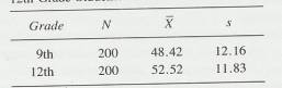
11.4.8.3
Sampling
distribution from the racial attitudes study. It is based on chance and shows z
scores, probabilities of those z scores, and differences between sample
means.(Sampling Distribution Of Differences Between Means)
11.4.8.3.1
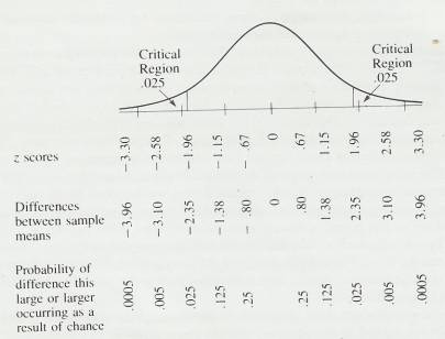
11.4.8.4
The
second illustration above shows a sampling distribution of differences between
means that is based on the assumption that there are no population differences
between 9th and 12th graders-that is, that the true
difference between the population means is zero.. The figure is a normal curve
that shows you z scores, possible differences between sample means in the
racial attitudes study, and probabilities associated with those z scores and
difference scores. Our obtained difference, 4.10, is not even shown on the
distribution. Such events are very rare if only chance is at work. From the
Figure you can see that a difference of 3.96 or more would be expected five
times in 10,000 (.0005). Since a difference of –3.96 or greater also has a
probability of .0005, we can add the two probabilities together to get .001.
Since our difference was 4.10 (less probable than 3.96), we can conclude that
the probability of a difference of  4.10 being due to chance is less than
.001. This probability is very small, indeed, and it seems reasonable to rule
out chance; that is, to reject H0 and, thus, accept H1.
By examining the means of the two groups in table two above we can write a
conclusion using the terms in the experiment. “Twelfth graders have more
positive attitudes toward people of their own sex, but different race than do
ninth graders.”
4.10 being due to chance is less than
.001. This probability is very small, indeed, and it seems reasonable to rule
out chance; that is, to reject H0 and, thus, accept H1.
By examining the means of the two groups in table two above we can write a
conclusion using the terms in the experiment. “Twelfth graders have more
positive attitudes toward people of their own sex, but different race than do
ninth graders.”
11.5 A Problem and Its Accepted
Solution
11.5.1
The
probability that populations of 9th and 12th grade
attitude scores are the same was so small (p< .001) that it was easy to rule
out chance as an explanation for the difference. But what if that probability
had been .01, or .05, or .25, or .50? How to divide this continuum into a group
of events that is “ due to chance” and another that is “not due to chance”-that
is the problem.
11.5.2
It
is probably clear to you that whatever solution is adopted will appear to be an
arbitrary one. Breaking any continuum into two parts will leave you
uncomfortable about the events close to either side of the break. Nevertheless,
a solution does exist.
11.5.3
The
generally accepted solution is to say that the .05 level of probability is the cut-off
between “ due to chance” and “ not due to chance.” The name of the cut-off
point that separates “ due to chance” and “not due to chance” is the level of
significance. If an event has a probability of .05 or less (for example, p=.03,
p=.01, or p=.001), H0 is rejected, and the event is considered
significant ( not due to chance). If an event has a probability of .051 or
greater (for example, p=.06, p=.50, or p=.99), H0 is retained, and
the event is considered not significant (may be due to chance). Here, the word
significant is not synonymous with “important.” A significant event in
statistics is one that is not ascribed to chance.
11.5.4
The
area of the sampling distribution that
covers the events that are “not due to chance” is called the critical region. If
an event falls in the critical region, H0 is rejected. The figure above
identifies the critical region for the .05 level of significance. As you can
see, the difference in means between 9th and 12th grade
racial attitudes (4.10) falls in the critical region, so H0 should
be rejected.
11.5.5
Although
widely adopted, the .05 level of significance is not universal. Some
investigators use the .01 level in their research. When the .01 level is used
and H1:  1
1 
 2,
the critical region consists of .005 in each tail of the sampling distribution.
In the figure above differences greater than –3.10 or 3.10 are required in
order to reject H0 at the .01 level.
2,
the critical region consists of .005 in each tail of the sampling distribution.
In the figure above differences greater than –3.10 or 3.10 are required in
order to reject H0 at the .01 level.
11.5.6
In
textbooks, a lot of lip service is paid to the .05 level of significance as the
cont off point for decision making. In actual research, the practice is to run
the experiment and report any significant differences at the smallest correct
probability value. Thus, in the same report, some differences may be reported
as significant at the .001 level, some at the .01 level, and some at the .05
level. At present, it is uncommon to report probabilities greater than .05 as
significant, although some researcher argue that the.10 or even the .20 level may
be justified in certain situations.
11.6 How to Construct A Sampling Distribution of
Differences Between Means
11.6.1
You
already know two important characteristics of a sampling distribution of
differences between means. The mean is 0, and the form is normal. When we
constructed the illustration above of the sampling distribution of differences
between the racial attitudes of 9th and 12th graders, we
used the normal curve table and a form of the familiar z score.
11.6.2
General
Formula
11.6.2.1
The
formula in the text is the “working model” of the more general Formula. Since
our null hypothesis is that  1-
1- 2=0-, the term in parentheses on the
right is 0, leaving you with the “working model.” This more general formula is of
a form you have seen before and will see again: the difference between a
statistic (1-2)
and a parameter (
2=0-, the term in parentheses on the
right is 0, leaving you with the “working model.” This more general formula is of
a form you have seen before and will see again: the difference between a
statistic (1-2)
and a parameter ( 1-
1- 2) divided by the standard error of the statistic.
11.6.2.2
General
Formula
11.6.2.2.1
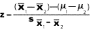
11.6.2.3
Working
(Model) Formula (z Score For Observed Mean Difference)
11.6.2.3.1
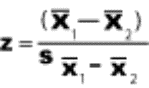
11.6.2.4
Formula
Standard Error of Mean
11.6.2.4.1
s =s/
11.6.2.5
Formula
Standard Error of Difference
11.6.2.5.1

11.6.2.6
Formula
Difference between Sample Means Associated with each z Score
11.6.2.6.1
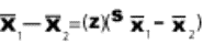
11.6.2.7
Variables
Defined
11.6.2.7.1
(z)=z score
for the observed mean difference
11.6.2.7.2
1=Mean
of one sample
11.6.2.7.3
2=mean
of a second sample
11.6.2.7.4
 =standard
error of a difference
=standard
error of a difference
11.6.2.7.5
s1
=Standard Error of the mean of Sample 1
11.6.2.7.6
s2
= Standard Error of the mean of Sample 2
11.6.2.7.7
(1-2)
=Difference between Sample Means
11.6.2.8
Procedure
11.6.2.8.1
Standard error
of the mean estimated from a sample s
11.6.2.8.1.1
Divide s by
the square root of N to find s.
11.6.2.8.2
Standard
Error of Difference
11.6.2.8.2.1
Square the
Standard Error of the mean of Sample 1 and add it to the square of the Standard
Error of the mean of Sample 2.
11.6.2.8.2.2
Find the square
root of the result of the previous step to find the Standard Error of
Difference
11.6.2.8.3
z Score For
Observed Mean Difference
11.6.2.8.3.1
Find the
difference between the mean of sample 1 and the mean of sample
11.6.2.8.3.2
Divide the
difference found in the previous step by the standard error of difference found
in the previous section.
11.6.2.8.4
Difference
between Sample Means Associated with each z Score
11.6.2.8.4.1
Multiply the
z score found in a stats textbook table or with the Web reference below by the
standard error of a difference to determine the difference between Sample Means
11.6.2.9
Discussion
11.6.2.9.1
Standard
Error of Difference
11.6.2.9.1.1
When creating
a Sampling Distribution Of Differences Between Means as in the illustration
above (see Sampling distribution from the racial attitudes study) the tick
marks at the baseline of the illustration (like the standard deviation)
represents increments of the standard error of difference.
11.6.2.9.2
Probability of Difference this large or
Larger Occurring as a Result of Chance
11.6.2.9.2.1
The
probabilities are; .25 .125 .025 .005 .0005
11.6.2.9.2.2
These
probabilities are displayed in the illustration above (see Sampling
distribution from the racial attitudes study) at the bottom of the chart
11.6.2.9.3
Finding the z
score associated with the probabilities
11.6.2.9.3.1
There are at
least two ways of determining the z score associated with the above
probabilities
11.6.2.9.3.1.1
Look up the z
score in a table in the back of a stats text book. To do this you will need to
subtract the probabilities above from .5000 to find the correct z score which
will give you the proportions
11.6.2.9.3.1.1.1
.25 .375 .475
.495 .4995
11.6.2.9.3.1.1.2
Look these up
in a table in the back of a sts text book to find the z scores listed below
plug oin the following probability figures .25 .125 .025 .005 .0005
11.6.2.9.3.1.2
Using the web
reference below
11.6.2.9.3.1.2.1 Plug in the following probabilities .25 .125 .025 .005 .0005 into the shaded area of the 3rd applet and click the above or below button
11.6.2.9.3.1.2.2 Web Reference
11.6.2.9.3.1.2.2.1 http://davidmlane.com/hyperstat/z_table.html
11.6.2.9.3.1.2.3
The following z
scores are associated
11.6.2.9.3.1.2.3.1
.67 1.15 1.96
2.58 3.30
11.6.2.9.4
Difference
between Sample Means
11.6.2.9.4.1
These scores
are placed between the z scores and probabilities (see illustration above) (see
Sampling distribution from the racial attitudes study)
11.6.2.9.5
z Score For
Observed Mean Difference
11.6.2.9.5.1
This score is
compared in the chart with the statistics in the Sampling Distribution Of
Differences Between Means to determine whether the difference is significant.
11.6.2.10
Simple
z score method (z Score For Observed Mean Difference ) (No Charting)
11.6.2.10.1
Procedure
11.6.2.10.1.1
Simply
determine the z Score For Observed Mean Difference go to the 2nd
applet from the web reference below, and plug in the z score to determine the
proportion above the z score to determine proportion occurring by chance.
11.6.2.10.1.1.1.1 Web Reference
11.6.2.10.1.1.1.1.1 http://davidmlane.com/hyperstat/z_table.html
11.7 An Analysis of Potential
Mistakes
11.7.1
Introduction
11.7.1.1
The
significance level is the probability that the null hypothesis will be rejected
in error when it is true (a decision known as a Type I error). The significance
of a result is also called its p-value; the smaller the p-value, the more
significant the result is said to be.
11.7.1.2
At
first glance, the idea of adopting a significance level of 5% seems
preposterous to some who argue for greater certainty. How about using a level of significance of one in a million,
which reduces uncertainty to almost nothing. It is true that adopting the .05
level of significance leaves some room for mistaking a chance difference for a
real difference. Lowering the level of significance will reduce the probability
of this kind of mistake, but it increases the probability of another kind.
Uncertainty about the conclusion will remain. In this section, we will discuss
the two kinds of mistakes that are possible. You will be able to pick up some
hints on reducing uncertainty, but if you agree to draw a sample, you agree to
accept some uncertainty about the results.
11.7.1.3
Type
I Error
11.7.1.3.1
Rejecting the
Null Hypothesis when it is true. The probability of a Type I error is
symbolized by  (alpha).
11.7.1.4
Type
II Error
11.7.1.4.1
Accepting the
Null Hypothesis when it is false. The probability of a Type II error is
symbolized by  (beta)
11.7.1.5
You
are already somewhat familiar with  from your study of level of significance. When the .05 level of
significance is adopted, the experimenter concludes that and event with p<
.05 is not due to chance. The experimenter could be wrong; if so, a Type I
error has been made. The probability of a Type I error-
from your study of level of significance. When the .05 level of
significance is adopted, the experimenter concludes that and event with p<
.05 is not due to chance. The experimenter could be wrong; if so, a Type I
error has been made. The probability of a Type I error- -is controlled by the level of significance you adopt.
11.7.1.6
A proper way to think of  and a Type I error is
in terms of “in the long run” (see illustration above) (see Sampling distribution from the racial
attitudes study) is a theoretical sampling distribution of mean differences. It
is a picture of repeated sampling (that is, the long run). All those
differences came from sample means that were drawn from the same population,
but some differences were so large they could be expected to occur only 5
percent of the time. In an experiment, however, you have only one difference,
which is based on your two sample means. If this difference is so large that
you conclude that there are two populations whose means are not equal, you may
have made a Type I error. However, the probability of such an error is not more
than .05.
and a Type I error is
in terms of “in the long run” (see illustration above) (see Sampling distribution from the racial
attitudes study) is a theoretical sampling distribution of mean differences. It
is a picture of repeated sampling (that is, the long run). All those
differences came from sample means that were drawn from the same population,
but some differences were so large they could be expected to occur only 5
percent of the time. In an experiment, however, you have only one difference,
which is based on your two sample means. If this difference is so large that
you conclude that there are two populations whose means are not equal, you may
have made a Type I error. However, the probability of such an error is not more
than .05.
11.7.1.7
The
calculation of  is a more complicated matter. For one thing, a Type II error can
be committed only when the two populations have different means. Naturally, the
farther apart the means are, the more likely you are to detect it, and thus the
lower
is a more complicated matter. For one thing, a Type II error can
be committed only when the two populations have different means. Naturally, the
farther apart the means are, the more likely you are to detect it, and thus the
lower  is. We will discuss
other factors that affect
is. We will discuss
other factors that affect  in the last section.
“How to reject the Null Hypothesis.”
in the last section.
“How to reject the Null Hypothesis.”
11.7.1.8
The general relationship between  and
and  is an inverse one. As
 goes down,
  goes up. That is, if
you insist on a larger difference between means before you call the difference
nonchance, you are less likely to detect a real nonchance difference if it is
small. The illustration below demonstrates this relationship.
goes up. That is, if
you insist on a larger difference between means before you call the difference
nonchance, you are less likely to detect a real nonchance difference if it is
small. The illustration below demonstrates this relationship.
11.7.1.9
Illustration Frequency distribution of
raw scores when H0 is false
11.7.1.9.1
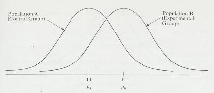
11.7.1.10
The
illustration above is a picture of two populations. Since these are
populations, the “truth” is that the mean of the experimental group is four
points higher than that of the control group. Such “truth” is available only in
hypothetical examples in textbooks. In the real world of experimentation you do
not know population parameters. This example, however, should help you
understand the relation of  to
to  . If a sample is drawn from each population, there is only
one correct decision: reject H0. However, will the investigator make
the correct decision? Would a difference of four be expected between sample
means from Populations A and B (14-10=4)? To evaluate the probability of a
difference of four, see if it falls in the critical region of the sampling
distribution of mean differences, shown in the illustration below. (We
arbitrarily picked this sampling distribution so we could illustrate the points
below.)
. If a sample is drawn from each population, there is only
one correct decision: reject H0. However, will the investigator make
the correct decision? Would a difference of four be expected between sample
means from Populations A and B (14-10=4)? To evaluate the probability of a
difference of four, see if it falls in the critical region of the sampling
distribution of mean differences, shown in the illustration below. (We
arbitrarily picked this sampling distribution so we could illustrate the points
below.)
11.7.1.11
Illustration Sampling distribution of
differences between means from Populations A and B if H0 were true
11.7.1.11.1
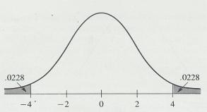
11.7.1.12
As
you can see in the illustration above, a difference of  4 score points would be expected 4.56 percent of the time. If
 had been set at .05,
you would correctly reject H0, since the probability of the obtained difference
(.0456) is less than .05. However, if
had been set at .05,
you would correctly reject H0, since the probability of the obtained difference
(.0456) is less than .05. However, if  had been set at .01,
you would not reject H0, since the obtained probability
(.0456) is not less than .01. Failure to reject H0 in this case is a Type II
error.
had been set at .01,
you would not reject H0, since the obtained probability
(.0456) is not less than .01. Failure to reject H0 in this case is a Type II
error.
11.7.1.13
At
this point, we can return to our discussion of setting the significance level.
The suggestion was “Why not reduce the significance level to one in a million?”
From the analysis of the potential mistakes, you can answer that when you
decrease  , you increase
  . So protection from one error is
traded for liability to another kind of error.
. So protection from one error is
traded for liability to another kind of error.
11.7.1.14
Most persons who use statistics as a
tool set  (usually at .05) and let
  fall where it may. The actual calculation of
  , although important, is beyond the scope of this discussion.
11.8 One-Tailed and Two-Tailed Tests
11.8.1
Introduction
11.8.1.1
Earlier,
we discussed the fact that in practice it is usual to choose one of three
possible alternative hypotheses before the data are gathered.
11.8.1.1.1
H1:
 1
1
 2= This hypothesis simply says that the
population means differ but makes no statement about the direction of the
difference.
2= This hypothesis simply says that the
population means differ but makes no statement about the direction of the
difference.
11.8.1.1.2
H2:
 1
1

 2=
Here, the hypothesis is made that the mean of the first population is greater
than the mean of the second population
2=
Here, the hypothesis is made that the mean of the first population is greater
than the mean of the second population
11.8.1.1.3
H3:
 1
1

 2=The
mean of the first population is smaller than the mean of the second population
2=The
mean of the first population is smaller than the mean of the second population
11.8.1.2
So
far in this section, you have been working with the first H1.You
have tested the null hypothesis,  1=
1= 2, against the alternative hypothesis
  1
1
 2. The null hypothesis was rejected when you found large positive
deviations (1>2)
or large negative deviations (1<2).
When
2. The null hypothesis was rejected when you found large positive
deviations (1>2)
or large negative deviations (1<2).
When  was set at .05, the
.05 was divided into .025 in each tail of the sampling distribution, as seen in the illustration below.
was set at .05, the
.05 was divided into .025 in each tail of the sampling distribution, as seen in the illustration below.
11.8.1.2.1
Illustration
11.8.1.2.1.1
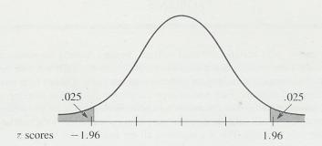
11.8.1.3
In
a similar way, you found the probability of a difference by multiplying by 2
the probability obtained from the z score. With such a test, you can reject H0
and accept either of the possible alternative hypotheses,  1
1 
 2 or
2 or  1
1 
 2.
This is called a two-tailed test of significance, for reasons that should be
obvious from the illustration above.
2.
This is called a two-tailed test of significance, for reasons that should be
obvious from the illustration above.
11.8.1.4
Sometimes,
however, an investigator is concerned only with deviations in one direction;
that is, the alternative hypothesis of interest is either  1
1 
 2 or
2 or  1
1 
 2. In
either case, a one-tailed test is appropriate. The illustration below is a
p;icture of the sampling distribution for a one-tailed test, for
2. In
either case, a one-tailed test is appropriate. The illustration below is a
p;icture of the sampling distribution for a one-tailed test, for  1
1 
 2.
2.
11.8.1.4.1
Illustration
11.8.1.4.1.1
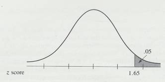
11.8.1.5
For
a one-tailed test, the critical region is all in one end of the sampling
distribution. The only outcome that allows you to reject H0 is one
in which  1 is so much larger than
  2 that the z score is 1.65 or more. Notice in the above
illustration that if you are running a one-tailed test there is no way to
conclude that
2 that the z score is 1.65 or more. Notice in the above
illustration that if you are running a one-tailed test there is no way to
conclude that  1 is less than
  2, even if 2
is many times the size of 1.
In a one-tailed test, you are interested in only one kind of difference.
One-tailed tests are usually used when an investigator knows a great deal about
the particular research area or when practical reasons dictate an interest in
establishing
2, even if 2
is many times the size of 1.
In a one-tailed test, you are interested in only one kind of difference.
One-tailed tests are usually used when an investigator knows a great deal about
the particular research area or when practical reasons dictate an interest in
establishing  1
1 
 2 but
not
2 but
not  1
1 
 2.
2.
11.8.1.6
There
is some controversy about the use of one or two-tailed test. When in doubt use
a two-tailed test. The decision to use a one-tailed or a two-tailed test should
be made before the data are gathered.
11.9 Significant Results and Important Results
11.9.1
The
word “significant” has a precise technical meaning in statistics and other
meanings in other contexts.
11.9.2
A
study that has statistically significant results may or may not have important
results. You have to decide about the importance without the help of
inferential statistics.
11.10
How
To Reject the Null Hypothesis
11.10.1 To reject H0 is to be left with
only one alternative, H1, from which a conclusion can be drawn. To retain H0 is
to be left up in the air. You don’t know whether the null hypothesis is really
true or whether it is false and you just failed to detect it. So, if you are
going to design and run an experiment, you should maximise your chances of
rejecting H0. There are three factors to consider actual difference, standard
error, and  .
.
11.10.2 In order to get this discussion
out of the realm of the hypothetical and into the realm of the practical,
consider the following problem. Supposing you want to select a research project
which seeks to reject H0. You decide to try to show that widgets are different
from controls. Accept for a moment the idea that widgets are different-that H0
should be rejected. What are the factors that determine whether you will
conclude from your experiment that widgets are different?
11.10.2.1
Actual
Difference
11.10.2.1.1
The larger
the actual difference between widgets and controls, the more likely you are to
reject H0. There is a practical limit, though. If the difference is too large,
other people will call your experiment trivial, saying that it demonstrates the
obvious and that anyone can see that widgets are different. On the other hand,
small differences can be difficult to detect. Pre-experiment estimations of
actual differences are usually based on your own experience.
11.10.2.2
The
Standard Error of a Difference
11.10.2.2.1
Review the
formula below
11.10.2.2.1.1

11.10.2.2.2
You can see
that as  gets smaller, z gets larger, and you are more
likely to reject H0. This is true, of course, only if widgets are really
different from controls. Here are two ways you can reduce the size of
gets smaller, z gets larger, and you are more
likely to reject H0. This is true, of course, only if widgets are really
different from controls. Here are two ways you can reduce the size of  .
.
11.10.2.2.2.1
Sample Size
11.10.2.2.2.1.1 The larger the sample, the smaller the standard error of the difference. (See Illustration) This illustration shows that the larger the sample size, the smaller the standard error of the mean. The same relationship is true for the standard error of a difference.
11.10.2.2.2.1.2 Some Texts [8] show you how to calculate the sample size required to reject H0. In order to do this calculation, you must make assumptions about the size of the actual difference. Many times, the size of the sample is dictated by practical consideration-time, money, or the availability of widgets.
11.10.2.2.2.2
Sample
variability
11.10.2.2.2.2.1
Reducing the variability in the sample will produce a smaller ![]() . You
can reduce variability by using reliable measuring instruments, recording data
correctly, and, in short, reducing the “noise” or random error in your
experiment.
. You
can reduce variability by using reliable measuring instruments, recording data
correctly, and, in short, reducing the “noise” or random error in your
experiment.
11.10.2.3
Alpha
11.10.2.3.1
The larger  is, the more likely
you are to reject H0. The limit to this factor is your colleagues’ sneer when
you report that widgets are “significantly different at the .40 level.”
Everyone believes that such differences should be attributed to chance.
Sometimes practical considerations may permit the use of
is, the more likely
you are to reject H0. The limit to this factor is your colleagues’ sneer when
you report that widgets are “significantly different at the .40 level.”
Everyone believes that such differences should be attributed to chance.
Sometimes practical considerations may permit the use of  =.10. If wegetws and controls both could be used to treat a
deadly illness and both have the same side effects, but “widgets are
significantly better at the .10 level,” then widgets will be used. (Also, more
data will then be gathered [sample size increased] to see whether the
difference between widgets and controls is reliable.)
=.10. If wegetws and controls both could be used to treat a
deadly illness and both have the same side effects, but “widgets are
significantly better at the .10 level,” then widgets will be used. (Also, more
data will then be gathered [sample size increased] to see whether the
difference between widgets and controls is reliable.)
11.10.3 We will close this section on
how to reject the null hypothesis by telling you that these three factors are
discussed in intermediate-level texts under the topic power. The power of a
statistical test is defined as 1- . The more powerful the test, the more likely it is to detect
any actual difference between widgets and controls.
. The more powerful the test, the more likely it is to detect
any actual difference between widgets and controls.
12 The t Distribution and the t-Test [9]
12.1 Introduction
12.1.1
The techniques you have learned so for
require the use of the normal distribution to assess probabilities. These
probabilities will be accurate if you have used  in your calculations or if N is so large that
s is a reliable estimate of
in your calculations or if N is so large that
s is a reliable estimate of  . In
this section, you will learn about a distribution that will give you accurate
probabilities when you do not know
. In
this section, you will learn about a distribution that will give you accurate
probabilities when you do not know  and N is not large. The logic you have used,
however, will be used again. That is, you assume the null hypothesis, draw
random samples, introduce the independent variable, and calculate a mean
difference on the dependent variable. If these differences cannot be attributed
to chance, reject the null hypothesis and interpret the results.
and N is not large. The logic you have used,
however, will be used again. That is, you assume the null hypothesis, draw
random samples, introduce the independent variable, and calculate a mean
difference on the dependent variable. If these differences cannot be attributed
to chance, reject the null hypothesis and interpret the results.
12.1.2 At this point you may suspect that the normal curve is an indispensable part of modern statistical living. Up until now, in this tract, it has been. However, in the next sections you will encounter several sampling distributions, none of which is normal, but all of which can be used to determine the probability that a particular event occurred by chance. Deciding which distribution to use is not a difficult task but it does require some practise. Remember that a theoretical distribution is accurate if the assumptions on which it is based are true for the data from the experiment. By knowing the assumptions a distribution requires and the nature of your data, you can pick an appropriate distribution.
12.1.3
This section is about a theoretical
distribution called the t distribution. The t is a lowercase one; capital T has
entirely different meanings. The t distribution is used to find answers to the
four kinds of problems listed below. The t distribution is used when  is not known and
sample sizes are too small to ensure that s is a reliable estimate or
is not known and
sample sizes are too small to ensure that s is a reliable estimate or  . Problems 1, 2, and 4 are problems of hypothesis testing.
Problem 3 requires the establishment of a confidence interval.
. Problems 1, 2, and 4 are problems of hypothesis testing.
Problem 3 requires the establishment of a confidence interval.
12.1.3.1
Did a sample with a mean come from a population with a mean  ?
?
12.1.3.2
Did two samples, with means 1
and 2
come from the same population?
12.1.3.3 What is the confidence interval about the difference between two sample means?
12.1.3.4 Did a Pearson product-moment correlation coefficient, based on sample data, come from a population with a true correlation of .00 for the two variables?
12.1.4 W. S. Gosset (1876-1937) invented the t distribution in 1908 after he was hired in 1899 by Arthur Guinness, Son & Company, a brewery in Dublin, Ireland to determine if a new strain of barley, developed by botanical scientists, had a greater yield than the old barley standard.
12.1.5 For more information, see "Gosset, W. S.," in Dictionary of National Biography, 1931-40, London: Oxford University Press, 1949, or L. McMullen & E. S. Pearson, "William Sealy Gosset, 1876-1937," Biometrika, 1939,205-253.
12.1.6 Prohibited by the company to publish in Biometrika a journal founded in 1901 by Francis Galton, Gosset published his new mathematical statistics under the pseudonym “Student” which became known as “Student’s t.” (No one seems to know why the letter t was chosen. E. S. Pearson surmises that t was simply a "free letter"-that is, no one had yet used t to designate a statistic.) Since he worked for the Guinness Company all his life, Gosset continued to use the pseudonym "Student" for his publications in mathematical statistics. Gosset was very devoted to his company, working hard and rising through the ranks. He was appointed head brewer a few months before his death in 1937.
12.1.7
Gosset was confronted with the problem
of gathering, in a limited amount of time, data about the brewing process. He
recognized that the sample sizes were so small that s was not an accurate
estimate of  and thus the normal-curve
model was not appropriate. After working out the mathematics of distributions
based on s, which is a statistic and, therefore, variable, rather than on
and thus the normal-curve
model was not appropriate. After working out the mathematics of distributions
based on s, which is a statistic and, therefore, variable, rather than on  , which is a parameter and, therefore, constant, Gosset found that
the theoretical distribution depended upon sample size, a different
distribution for each N. These distributions make up a family of curves
that have come to be called the t distribution.
, which is a parameter and, therefore, constant, Gosset found that
the theoretical distribution depended upon sample size, a different
distribution for each N. These distributions make up a family of curves
that have come to be called the t distribution.
12.1.8 In Gosset's work, you again see how a practical question forced the development of a statistical tool. (Remember that Francis Galton invented the concept of the correlation coefficient in order to assess the degree to which characteristics of fathers are found in their sons.) In Gosset's case, an example of a practical question was "Will this new strain of barley, developed by the botanical scientists, have a greater yield than our old standard?" Such questions were answered with data from experiments carried out on the ten farms maintained by the Guinness Company in the principal barley-growing regions of Ireland. A typical experiment might involve two one-acre plots (one planted with the old barley, one with the new) on each of the ten farms. Gosset then was confronted with ten one-acre yields for the old barley and ten for the new. Was the difference in yields due to sampling fluctuation, or was it a reliable difference between the two strains? He made the decision using his newly derived t distribution.
12.1.9 We will describe some characteristics of the t distribution and then compare t with the normal distribution. The following two sections are on hypothesis testing: one section on samples that are independent of each other and one on samples that are correlated. Next, you will use the t distribution to establish confidence intervals about a mean difference. Then you will learn the assumptions that are required if you choose to use a t test to analyse your data. Finally, you will learn how to determine whether a correlation coefficient is statistically significant. Problems 1-4, mentioned above, will be dealt with in order.
12.2 The t Distribution
12.2.1
Rather than just one t distribution,
there are many t distributions. In fact, there is a t distribution
for each sample size from 1 to  . These different t distributions are described as having
different degrees of freedom, and there is a different t distribution
for each degree of freedom. Degrees of freedom is abbreviated df (which
is a simple symbol; do not multiply d times f). We'll start with
a definition of degrees of freedom as sample size minus 1. Thus, df =
N - 1. If the sample consists of 12 members, df = 11.
. These different t distributions are described as having
different degrees of freedom, and there is a different t distribution
for each degree of freedom. Degrees of freedom is abbreviated df (which
is a simple symbol; do not multiply d times f). We'll start with
a definition of degrees of freedom as sample size minus 1. Thus, df =
N - 1. If the sample consists of 12 members, df = 11.
12.2.2 Figure 9.1 is a picture of four of these t distributions, each based on a different number of degrees of freedom. You can see that, as the degrees of freedom become fewer, a larger proportion of the curve is contained in the tails.
12.2.3 You know from your work with the normal curve that a theoretical distribution is used to determine a probability and that, on the basis of the probability; the null-hypothesis is retained or rejected. You will be glad to learn that the logic of using the t distribution to make a decision is just like the logic of using the normal distribution.
12.2.4 Z Formula
12.2.4.1
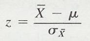
12.2.5
Recall that z is normally distributed. You
probably also recall that, if z =  1. 96, the chances are only 5 in 100 that the mean came from the population with mean
  .
.
12.2.6 Figure 9-1
12.2.6.1
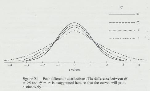
12.2.7 In a similar way, if the samples are small, you can calculate a t value from the formula
12.2.8 t Formula
12.2.8.1
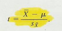
12.2.9 The number of degrees of freedom (df) determines which t distribution is appropriate, and from it you can find a t value that would be expected to occur by chance 5 times in 100. Figure 9.2 separates the t distributions of Figure 9.1. The t values in Figure 9.2 are those associated with the interval that contains 95 percent of the cases, leaving 2.5 percent in each tail. Look at each of the four curves.
12.2.10
If you looked at Figure 9.2 carefully,
you may have been suspicious that the t distribution for df =  is a normal curve. It
is. As df approaches
is a normal curve. It
is. As df approaches  the t
distribution approaches the normal distribution. When df = 30, the t distribution
is almost normal. Now you understand why we repeatedly cautioned, in chapters
that used the normal curve, that N must be at least 30 (unless you know
the t
distribution approaches the normal distribution. When df = 30, the t distribution
is almost normal. Now you understand why we repeatedly cautioned, in chapters
that used the normal curve, that N must be at least 30 (unless you know  or that the
distribution of the population is symmetrical). Even when N = 30, the t
distribution is more accurate than the normal distribution for assessing
probabilities and so, in most research studies (that use samples), t is
used rather than z.
or that the
distribution of the population is symmetrical). Even when N = 30, the t
distribution is more accurate than the normal distribution for assessing
probabilities and so, in most research studies (that use samples), t is
used rather than z.
12.2.11
A reasonable question now is
"Where did those t values of  4.30,
4.30,  2.26,
2.26,
 2.06, and
  1.96 come from?" The answer is Table D. Table D is
really a condensed version of 34 t distributions. Look at Table D and
note that there are 34 different degrees of freedom in the left-hand column.
1.96 come from?" The answer is Table D. Table D is
really a condensed version of 34 t distributions. Look at Table D and
note that there are 34 different degrees of freedom in the left-hand column.
12.2.12 Table D
12.2.12.1
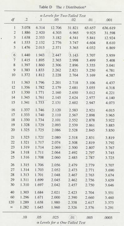
12.2.13
Across the top under “ Levels for Two-Tailed Test" you will see six
selected probability figures, .20, .10, .05, .02, .01, and .001.
Levels for Two-Tailed Test" you will see six
selected probability figures, .20, .10, .05, .02, .01, and .001.
12.2.14
Follow
the .05 column down to df = 2, 9, 25, and  and you will find t values of 4.30, 2.26, 2.06, and 1.96.
12.2.15 Table D differs in several ways from the normal-curve table. In the normal-curve table, the z scores are on the margin of the table and the probability figures are in the body of the table.
12.2.16 Illustration of Normal
Distribution
12.2.16.1
12.2.17 Figure 9-2
12.2.17.1
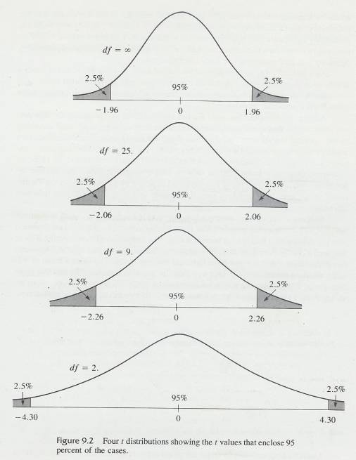
12.2.18 In the t-distribution table, the
opposite is true; the t
values are in the body of the table and the
probability figures are on the top and bottom margins. Also, in the
normal-curve table, you can find the exact probability of any z score;
in Table D, the exact probability is given for only six t values. These six are
commonly chosen as  levels by experimenters. Finally, if you
wish to conduct a one-tailed test, use the probability figures shown under that
heading at the bottom of Table D. Note that the probability figures are one-half
those for a two-tailed test. You might draw a t distribution, put in
values for a two-tailed test, and see for yourself that reducing the
probability figure by
one-half is appropriate for a one-tailed test.
levels by experimenters. Finally, if you
wish to conduct a one-tailed test, use the probability figures shown under that
heading at the bottom of Table D. Note that the probability figures are one-half
those for a two-tailed test. You might draw a t distribution, put in
values for a two-tailed test, and see for yourself that reducing the
probability figure by
one-half is appropriate for a one-tailed test.
12.2.19 As a general rule, researchers run two-tailed tests. If a one-tailed test is used, a justification is usually given. In this text we will routinely use two-tailed tests.
12.2.20 We'll use student's t distribution to decide whether a particular sample mean came from a particular population.
12.2.21 A Belgian, Adolphe Quetelet ('Ka-tle) (1796-1874), is regarded as the first person to recognize that social and biological measurements may be distributed according to the "normal law of error" (the normal distribution). Quetelet made this discovery while developing actuarial (life expectancy) tables for a Brussels life insurance company. Later, he began making anthropometric (body) measurements and, in 1836, he developed Quetelet's Index (QI), a ratio in which weight in grams was divided by height in centimetres. This index was supposed to permit evaluation of a person's nutritional status: very large numbers indicated obesity and very small numbers indicated starvation.
12.2.22
Suppose a present-day anthropologist
read that Quetelet had found a mean QI value of 375 on the entire population of
French army conscripts. No standard deviation was given because it had not yet
been invented. Our anthropologist, wondering if there has been a change during
the last hundred years, obtains a random sample of 20 present day Frenchmen who
have just been inducted into the Army. She finds a mean of 400 and a standard
deviation of 60. One now familiar question remains, "Should this mean
increase of 25 QI points be attributed to chance or not?" To answer this
question, we will perform a t test. As usual, we will require p  .05 to reject
chance as an explanation.
.05 to reject
chance as an explanation.
12.2.23 t Formula Logic
12.2.23.1
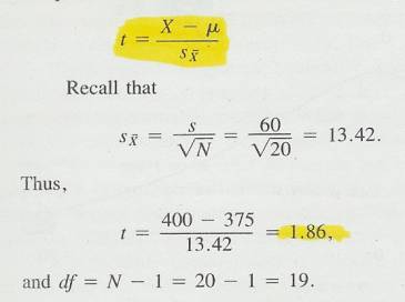
12.2.24
Upon looking in Table D under the
column for a two-tailed test with  = .05 at the
row for 19 df, you'll find a t value of 2.09. Our
anthropologist's t is less than 2.09 so the null hypothesis should be
retained and the difference between present-day soldiers and those of old
should be attributed to chance.
= .05 at the
row for 19 df, you'll find a t value of 2.09. Our
anthropologist's t is less than 2.09 so the null hypothesis should be
retained and the difference between present-day soldiers and those of old
should be attributed to chance.
12.2.25 Quetelet's Index is not currently used by anthropologists. There were several later attempts to develop a more reliable index of nutrition and most of those attempts were successful. Some of Quetelet's ideas are still around, though. For example, it was from Quetelet, it seems, that Francis Galton got the idea that the phenomenon of genius could be treated mathematically, an idea that led to correlation. (Galton seems to turn up in many stories about important concepts.)
12.3 Degrees of Freedom
12.3.1 Summary
12.3.1.1 The number of degrees of freedom is always equal to the number of observations minus the number of necessary relations obtaining among these observations OR The number of degrees of freedom is equal to the number of original observations minus the number of parameters estimated from the observations
12.3.2
You have been determining “degrees of
freedom" by a rule-of-thumb technique: N - 1. Now it is time for us
to explain the concept more thoroughly, in order to prepare you for
statistical techniques in which df  N - 1.
12.3.3 It is somewhat difficult to obtain an intuitive understanding of the concept of degrees of freedom without the use of mathematics. If the following explanation leaves you scratching your head, you might read Helen Walker's [10] excellent article in the Journal of Educational Psychology (Walker, 1940).
12.3.4
The freedom in degrees of
freedom refers to freedom of a number to have any possible value. If you
were asked to pick two numbers, and there were no restrictions, both numbers
would be free to vary (take any value) and you would have two degrees of
freedom. If, however, a restriction is imposed-namely, that  X = 20-one degree of freedom is lost because of that
restriction. That is, when you now pick the two numbers, only one of them is
free to vary. As an example, if you choose 3 for the first number, the second
number must be 17. The second number is not free to vary, because of the
restriction that
X = 20-one degree of freedom is lost because of that
restriction. That is, when you now pick the two numbers, only one of them is
free to vary. As an example, if you choose 3 for the first number, the second
number must be 17. The second number is not free to vary, because of the
restriction that  X = 20.
12.3.5
In a similar way, if you were to pick
five numbers, with a restriction that  X = 20, you would have four degrees of freedom. Once four numbers
are chosen (say, -5,3, 16, and 8), the last number (-2) is determined.
X = 20, you would have four degrees of freedom. Once four numbers
are chosen (say, -5,3, 16, and 8), the last number (-2) is determined.
12.3.6
The
restriction that  X = 20 may seem to you to be an "out-of-the-blue"
example and unrelated
to your earlier work in statistics; in a way it is, but some of the statistics
you have calculated have had a similar restriction built in. For example, when
you found s, as required in the formula for t,
you used some algebraic version of
X = 20 may seem to you to be an "out-of-the-blue"
example and unrelated
to your earlier work in statistics; in a way it is, but some of the statistics
you have calculated have had a similar restriction built in. For example, when
you found s, as required in the formula for t,
you used some algebraic version of
12.3.7 Formula Standard Error of Mean for a Sample
12.3.7.1
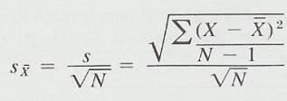
12.3.8
The restriction that is built in is
that  (X - X) is always zero and, in order to meet that requirement, one of the X's
is determined. All X's are free to vary except one, and the degrees of freedom
for s is N - 1. Thus, for the
problem of using the t distribution to determine whether a sample came from a
population with a mean
(X - X) is always zero and, in order to meet that requirement, one of the X's
is determined. All X's are free to vary except one, and the degrees of freedom
for s is N - 1. Thus, for the
problem of using the t distribution to determine whether a sample came from a
population with a mean  , df =
N - 1. Walker (1940) summarizes the reasoning
above by stating: "A universal rule holds: The number of degrees of
freedom is always equal to the number of observations minus the number of
necessary relations obtaining among these observations. " A necessary
relationship for s is that
, df =
N - 1. Walker (1940) summarizes the reasoning
above by stating: "A universal rule holds: The number of degrees of
freedom is always equal to the number of observations minus the number of
necessary relations obtaining among these observations. " A necessary
relationship for s is that  (X - X) = O. Another
way of stating this rule is that the number of degrees of freedom is equal to
the number of original observations minus the number of parameters estimated
from the observations. In the case of s, one degree of freedom is subtracted because is used as an estimate of
(X - X) = O. Another
way of stating this rule is that the number of degrees of freedom is equal to
the number of original observations minus the number of parameters estimated
from the observations. In the case of s, one degree of freedom is subtracted because is used as an estimate of  .
.
12.4 Independent-Samples and Correlated-Samples Designs
12.4.1
Now
we switch from the question of whether a sample came from a population
with a mean,  , to the more common question of whether two samples
came from populations with identical means. That is, the mean of one group is
compared with the mean of another group, and the difference is attributed to
chance (null hypothesis retained) or to a treatment (null hypothesis
rejected).
, to the more common question of whether two samples
came from populations with identical means. That is, the mean of one group is
compared with the mean of another group, and the difference is attributed to
chance (null hypothesis retained) or to a treatment (null hypothesis
rejected).
12.4.2
However
there are two kinds of two-groups designs. With an independent samples design, the subjects serve in only
one of the two groups, and there is no reason to believe that there is any correlation
between the scores of the two groups. With a correlated-samples design, there is a correlational relationship between
the scores of the two
groups. The difference between these designs is important because the calculation
of the t value for independent samples is different from the calculation
for correlated samples. You may not be able to tell which design has been used
just by looking at the numbers; instead, you must be able to identify the
design from the description of the procedures in the experiment. The design
dictates which formula for t to use. The purpose of both designs,
however, is to determine the probability that the two samples have a common population mean.
12.4.3 Clue to the Future
12.4.3.1 Most of the rest of this chapter is organized around independent-samples and correlated-samples designs. Three-fourths of Chapter 15 (Nonparametric Statistics) is also organized around these "two designs. In Chapters 12 (Analysis of Variance: One-Way Classification) and 13 (Analysis of Variance: Factorial Design), though, the procedures you will learn are appropriate only for independent samples.
12.4.4 Correlated-samples experiments are designed so that there are pairs of scores. One member of the pair is in one group, and the other member is in the second group. For example, you might ask whether fathers are shorter than their sons (or more religious, or more racially prejudiced, or whatever).
12.4.5 Table 9-1
12.4.5.1
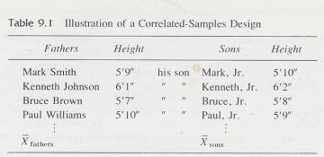
12.4.6 Table 9-2
12.4.6.1
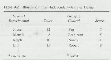
12.4.7
The null hypothesis is  fathers =
  sons. In this design, there is a logical pairing of father and son
scores, as seen in Table 9.1. Sometimes the researcher pairs up two subjects on
some objective basis. Subjects with similar grade-point averages may be paired,
and then one assigned to the experimental group and one to the control group.
A third example of a correlated-samples design is a before-and-after
experiment, with the dependent variable measured before and after the same
treatment. Again, pairing is appropriate: the' 'before" score is paired
with the "after" score for each individual.
sons. In this design, there is a logical pairing of father and son
scores, as seen in Table 9.1. Sometimes the researcher pairs up two subjects on
some objective basis. Subjects with similar grade-point averages may be paired,
and then one assigned to the experimental group and one to the control group.
A third example of a correlated-samples design is a before-and-after
experiment, with the dependent variable measured before and after the same
treatment. Again, pairing is appropriate: the' 'before" score is paired
with the "after" score for each individual.
12.4.8
Did you notice that Table 9.1 is the
same as Table 5.1, which outlined the basic requirement for the calculation of
a correlation coefficient? As you will soon see, that correlation coefficient
is a part of determining whether  fathers =
  sons.
sons.
12.4.9
In the independent-samples design,
the subjects are often assigned randomly to one of the two groups, and there is
no logical reason to pair a score in one group with a score in the other group.
The independent-samples design corresponds to the experimental design outlined
in Table 8.1.
An example of an independent-samples design is shown in Table 9.2. The null
hypothesis to be tested is  experimental =
  control.
12.4.10 Both of these designs utilize random sampling, but, with an independent-samples design, the subjects are randomly selected from a population of individuals. In a correlated-samples design, pairs are randomly selected from a population of pairs.
12.5 Using the t Distribution for Independent Samples
12.5.1 The experiments in this section are similar to those in Chapter 10, except that now you are confronted with data for which the normal curve is not appropriate because N is too small. As before, the two samples are independent of each other. "Independent" means that there is no relationship between the groups before the independent variable is introduced. Independence is often achieved by random assignment of subjects to one or the other of the groups. Some textbooks express this lack of relationship by calling this design a "noncorrelated design" or an "uncorrelated design. "
12.5.2
Using the t distribution to
test a hypothesis is very similar to using the normal distribution. The null
hypothesis is that the two populations have the same mean, and thus any
difference between the two sample means is due to chance. The t distribution
tells you the probability that the difference you observe is due to chance if
the null hypothesis is true. You simply establish an  level, and if your
observed difference is less probable than
level, and if your
observed difference is less probable than  , reject the null hypothesis and conclude that the two means
came from populations with different means. If your observed difference is more
probable than
, reject the null hypothesis and conclude that the two means
came from populations with different means. If your observed difference is more
probable than  , retain the null hypothesis. Does this sound familiar? We
hope so.
, retain the null hypothesis. Does this sound familiar? We
hope so.
12.5.3 The way to find the probability of the observed difference is to use a t test. The probability of the resulting t value can be found in Table D. For an independent-samples design, the formula for the t test is
12.5.4 Independent-samples t Test
12.5.4.1
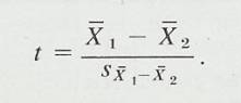
12.5.5 The t test, like many other statistical tests, is a ratio of
a statistic over a measure of variability. 1 - 2 is a statistic and, of course,
S1- 2 is a measure of variability. You have seen this basic form before and you will see it again. .
12.5.6
Table
9.3 shows several formulas for calculating , S1- 2. Use formulas in the top half of the table
when the two samples have an unequal number of scores. In the special situation where N1 = N2, the formulas simplify into those shown in
the bottom half of Table 9.3. The deviation-score
formulas are included in case you have to solve a problem without a calculator.
If you have a calculator, you can work the problems more quickly by using the
raw-score formulas.
12.5.7
The
formula for degrees of freedom for independent samples is df = N1 + N2 - 2. The reasoning is as follows. For each
sample, the number of degrees of freedom is N - 1, since,
for each sample,  (X - ) = O. Thus, the total degrees of
freedom is (N1 - 1) + (N2 - 1) = N1 + N2 - 2.
(X - ) = O. Thus, the total degrees of
freedom is (N1 - 1) + (N2 - 1) = N1 + N2 - 2.
12.5.8 Table 9-3
12.5.8.1
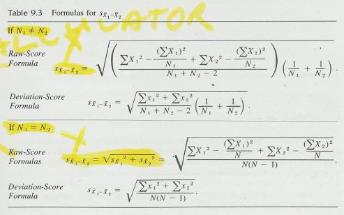
12.5.9 Table 9-4
12.5.9.1
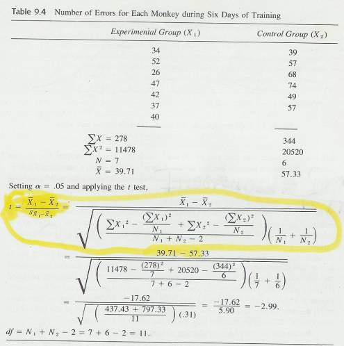
12.5.10 Here is an example of an experiment in which the results were analysed with an independent-samples t test. Thirteen monkeys were randomly assigned to either an experimental group (drug) or a control group (placebo). (Monkey research is very expensive, so experiments are carried out with small N's. Thus, small sample statistical techniques are a must.) The experimental group (N = 7) was given the drug for eight days, while the control group (N = 6) was given a placebo (an inert substance). After eight days of injections, training began on a complex problem-solving task. Training and shots were continued for six days, after which the number of errors was tabulated. The number of errors each animal made and the t test are presented in Table 9.4.
12.5.11 Figure 9-3
12.5.11.1 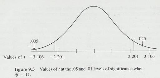
12.5.12 The null hypothesis is that the drug made no difference-that the
difference obtained was due just to chance. Since the N's are unequal
for the two samples, the longer formula for the standard error must be used.
Consulting Table D
for 11 df, you'll find that a t = 2.20 is required in order to
reject the null hypothesis with a = .05. Since the obtained t =
-2.99, reject the null hypothesis. The final (and perhaps most important) step
is to interpret the results. Since the experimental group, on the average, made
fewer errors (39.71 vs. 57.33), we may conclude that the drug treatment
facilitated learning. We will often express tabled t values as t.O5
(11 df) = 2.20. This gives you the critical value of t (2.20) for a
particular df (11) and level of significance ( = .05).)
12.5.13 Notice that the absolute value of the obtained t ( |t| = |- 2.99 | = 2.99) is larger than the tabled t (2.20). In order to reject the null hypothesis, the absolute value of the obtained t must be as great as, or greater than, the tabled t. The larger the obtained | t I, the smaller the probability that the difference between means occurred by chance. Figure 9.3 should help you see why this is so. Notice in Figure 9.3 that, as the values of | t I become larger, less and less of the area of the curve remains in the tails of the distribution. Remember that the area under the curve is a probability.
12.5.14 Recall that we have been conducting a two-tailed test. That is, the probability figure for a particular t value is the probability of + t or larger plus the probability of - t or smaller. In Figure 9.3, t ,05 (11 df) = 2.201. This means that, if the null hypothesis is true, a t value of +2.201 would occur 2 1/2 percent of the time and a t value of -2.201 would occur 2 1/2 percent of the time.
12.5.15 If you are working these problems with paper and pencil, Table A, "Squares, Square Roots, and Reciprocals," will be an aid to you. For example, 1/7 + 1/6 is easily converted into .143 + .167 with the reciprocals column; I/N. Adding decimals is easier than adding fractions.
12.5.16 Formulas and Procedure
12.5.16.1 Standard error of the difference between means
12.5.16.1.1
N1 N2
N2
12.5.16.1.1.1 Formula
12.5.16.1.1.1.1 Raw Score Formulas
12.5.16.1.1.1.1.1
12.5.16.1.1.1.2 Deviation Score Formulas
12.5.16.1.1.1.2.1
12.5.16.1.1.2 Procedure
12.5.16.1.1.2.1
12.5.16.1.1.3 Variables Defined
12.5.16.1.1.3.1
12.5.16.1.2 N1=N2
12.5.16.1.2.1 Formula
12.5.16.1.2.1.1 Raw Score Formulas
12.5.16.1.2.1.1.1
12.5.16.1.2.1.2 Deviation Score Formulas
12.5.16.1.2.1.2.1
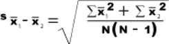
12.5.16.1.2.2 Variables Defined
12.5.16.1.2.2.1
![]() =Standard
error of the difference between means
=Standard
error of the difference between means
12.5.16.1.2.3 Procedure
12.5.16.1.2.3.1
12.6 Using the t Distribution for Correlated Samples (Some texts use the term dependent samples instead of correlated sample)s
12.6.1
A correlated-samples design may
come about in a number of ways. Fortunately, the actual arithmetic in
calculating a t value is the same for any of the three correlated
samples designs. The three types of designs are natural pairs, matched pairs, and repeated
measures.
12.6.2 Natural Pairs
12.6.2.1 In a natural-pairs investigation, the experimenter does not assign the subjects to one group or the other-the pairing occurs prior to the investigation. Table 9.1 identifies one way in which natural pairs may occur-father and son. Problems 8 and 13 describe experiments utilizing natural pairs.
12.6.3 Matched Pairs
12.6.3.1 In some situations, the experimenter has control over the ways pairs are formed. Matched pairs can be formed in several ways. One way is for two subjects to be paired on the basis of similar scores on a pretest that is related to the dependent variable. For example, a hypnotic susceptibility test might be given to a group of subjects. Two examples of hypnotic suggestibility pre-tests are ;[11] [12] Subjects with similar scores could be paired and then one member of each pair randomly assigned to either the experimental or control group. The result is two groups equivalent in hypnotizability.
12.6.3.2 Another variation of matched pairs is the split-litter technique used with nonhuman animals. Half of a litter is assigned randomly to each group. In this way, the genetics of one group is matched with that of the other. The same technique has been used in human experiments with twins or siblings. Student's barley experiments and the experiment described in Problem 9 are examples of starting with two similar subjects and assigning them at random to one of two treatments.
12.6.3.3 Still another example of the matched-pairs technique is the treatment of each member of the control group according to what happens to its paired member in the experimental group. Because of the forced correspondence, this is called .a yoked control design. Problem 11 describes a yoked-control design.
12.6.3.4 The difference between the matched-pairs design and a natural-pairs design is that, with the matched pairs, the investigator can randomly assign one member of the pair to a treatment. In the natural-pairs design, the investigator has no control over assignment. Although the statistics are the same, the natural-pairs design is usually open to more interpretations than the matched-pairs design.
12.6.4 Repeated Measures
12.6.4.1
A third kind of correlated-samples
design is called a repeated-measures design because more than one measure is
taken on each subject. This design often takes the form of a before and-after
experiment. A pretest is given, some treatment is administered, and a
post-test is given. The mean of the scores on the post-test is compared with
the mean of the scores on the pretest to determine the effectiveness of the
treatment. Clearly, there are two scores that should be paired: the pretest and
the post-test scores of each subject. In such an experiment, each person is
said to serve as his or her own control. .
12.6.4.2 All three of these methods of forming groups have one thing in common: a meaningful correlation may be calculated for the data. The name correlated samples comes from this fact. With a correlated-samples design, one variable is designated X, the other Y.
12.6.5 Calculating a t Value for Correlated Samples
12.6.5.1
. The formula for t when the data come from correlated samples
has a familiar theme: a difference between means divided by the standard error
of the difference. The standard error of the difference between means of
correlated samples is symbolized  . One formula for a
t test between correlated samples is
. One formula for a
t test between correlated samples is
12.6.5.2

12.6.5.3 where
12.6.5.4
=
12.6.5.5 df=N-1, where N= the number of pairs
12.6.5.6 The number of degrees of freedom in a correlated-samples case is the number of pairs minus one. Although each pair has two values, once one value is determined, the
12.6.5.7
other is restricted to a similar
value. (After all, they are called correlated samples.) In addition,
another degree of freedom is subtracted when is calculated. This loss is similar to
the loss of 1 df when s is
calculated.
is
calculated.
12.6.5.8
As you can see by comparing the
denominator of the correlated-samples t test with that of the
t test on for independent samples (when N1 =N2),
the difference lies in the term 2rxy (S )(S
)(S ). Of
course, when rxy = 0, this term drops out of the
formula, and the standard error is the same as for independent samples.
). Of
course, when rxy = 0, this term drops out of the
formula, and the standard error is the same as for independent samples.
12.6.5.9 Also notice what happens to the standard-error term in the correlated-samples case where r > 0: the standard error is reduced. Such a reduction will increase the size of t. Whether this reduction will increase the likelihood of rejecting the null hypothesis depends on how much t is increased, since the degrees of freedom in a correlated samples design are fewer than in the independent-samples design.
12.6.5.10
The formula = is
used only for illustration purposes. There is an algebraically equivalent but
arithmetically easier calculation called the direct-difference method,
which does not require you to calculate r. To find the by the direct-difference method, find the
difference between each pair of scores, calculate the standard deviation
of these difference scores, and divide the standard deviation by the square
root of the number of pairs.
is
used only for illustration purposes. There is an algebraically equivalent but
arithmetically easier calculation called the direct-difference method,
which does not require you to calculate r. To find the by the direct-difference method, find the
difference between each pair of scores, calculate the standard deviation
of these difference scores, and divide the standard deviation by the square
root of the number of pairs.
12.6.5.11 To find a t value using the direct-difference method,
12.6.5.12 T value using Direct Difference Method
12.6.5.12.1
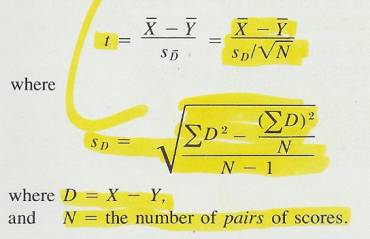
12.6.5.13 Here is an example of a correlated-samples design and a t-test analysis. Suppose you were interested in the effects of interracial contact on racial attitudes. You have a fairly reliable test of racial attitudes, in which high scores indicate more positive attitudes. You administer the test one Monday morning to a biracial group of fourteen 12year-old boys who do not know each other but who have signed up for a weeklong community day camp. The campers then spend the next week taking nature walks, playing ball, eating lunch, swimming, and doing the kinds of things that camp directors dream up to keep 12-year-old boys busy. On Saturday morning, the boys are again given the racial-attitude test. Thus, the data consist of 14 pairs of before-and-after scores. The null hypothesis is that the mean of the population of "before" scores .is equal to the mean of the population of "after" scores or, in terms of the specific experiment, that a week of interracial contact has no effect on racial attitudes.
12.6.5.14
Suppose the data in Table 9.5 were
obtained. We will set  = .01 and perform the analysis. Using the sum of the D
and D2 columns in Table 9.5, we can find .
= .01 and perform the analysis. Using the sum of the D
and D2 columns in Table 9.5, we can find .
12.6.5.15 Table 9-5
12.6.5.15.1
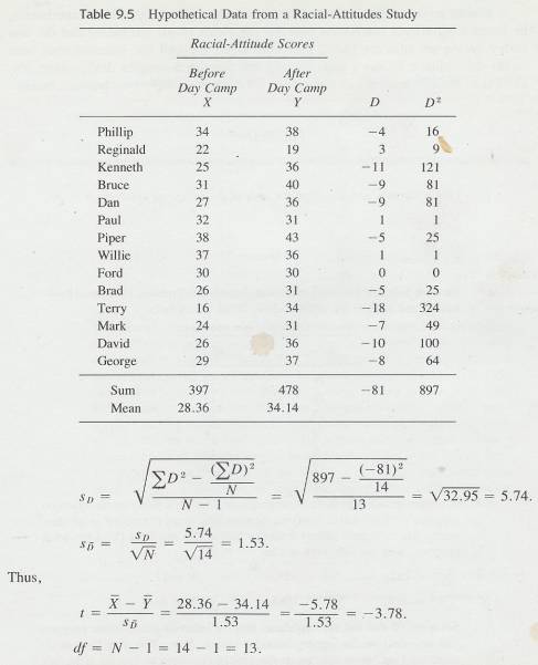
12.6.5.16
Since t.01 (13 df)
= 3.01, this
difference is significant beyond the .01 level. That is, p < .01, The
"after" mean was larger than the "before" mean; therefore,
we may conclude that, after the week of camp, racial attitudes were
significantly more positive than before.
12.6.5.17
You
might note that  -
-  =
=  , the
mean of the difference scores. In the problem above,
, the
mean of the difference scores. In the problem above,  D = -8l and N = 14, so
  =
=  D/N = -81i14 = -5.78.
12.6.5.18 Gosset preferred the correlated-samples design. In his agriculture experiments, he found a significant correlation between the yields of the old barley and the new barley grown on adjacent plots. This correlation reduced the standard-error term in the denominator of the t test, making the correlated-samples design more sensitive than the independent-samples design for detecting a difference between means.
12.6.5.19 Illustration Formulas
12.6.5.19.1 Formula (Illustration formula)
12.6.5.19.1.1

12.6.5.19.2 Variables Defined
12.6.5.19.2.1
=standard error of the difference between
correlated means (direct-difference method)
12.6.5.19.2.1.1.1
![]() =
=![]()
12.6.5.19.2.2 df=N-1
12.6.5.19.2.3 N=number of pairs
12.6.5.19.2.4
s or s
or s =Standard
Error of Mean (see formula below)
=Standard
Error of Mean (see formula below)
12.6.5.19.2.5
 =Correlation
between X & Y
=Correlation
between X & Y
12.6.5.19.3
Formula
Standard Error of Mean
12.6.5.19.3.1
s =s/
12.6.5.19.4
Variables
Defined Standard Error of Mean
12.6.5.19.4.1
s or s =standard error of the mean of X or Y
scores
=standard error of the mean of X or Y
scores
12.6.5.19.4.2
s=standard
deviation of a sample
12.6.5.19.4.3
N=sample size
12.6.5.19.5
Procedure
12.6.5.19.5.1
s or s
or s =Standard
Error of Mean
=Standard
Error of Mean
12.6.5.19.5.1.1
s![]()
12.6.5.19.5.1.1.1 Determine the standard deviation of X scores
12.6.5.19.5.1.1.2 Determine the square root of the total number of scores
12.6.5.19.5.1.1.3 Divide the product of step #1 (standard deviation of X scores) by the product of step #2 (square root of the number of X scores)
12.6.5.19.5.1.2
s![]()
12.6.5.19.5.1.2.1 Determine the standard deviation of Y scores
12.6.5.19.5.1.2.2 Determine the square root of the total number of scores
12.6.5.19.5.1.2.3 Divide the product of step #1 (standard deviation of Y scores) by the product of step #2 (square root of the number of Y scores)
12.6.5.19.5.1.3
![]()
12.6.5.19.5.1.3.1
Square s![]() (multiply it by itself)
(multiply it by itself)
12.6.5.19.5.1.3.2
Square s![]() (multiply it by itself)
(multiply it by itself)
12.6.5.19.5.1.3.3
Add Squared s![]() to
Squared s
to
Squared s![]()
12.6.5.19.5.1.3.4
Determine the ![]() (Correlation between X & Y)
(Correlation between X & Y)
12.6.5.19.5.1.3.5
Multiply the ![]() by 2
by 2
12.6.5.19.5.1.3.6
Multiply s![]() by s
by s![]()
12.6.5.19.5.1.3.7
Multiply the product of step #6 (s![]() Xs s
Xs s![]() ) by the
product of step #5 (
) by the
product of step #5 (![]() Xs 2)
Xs 2)
12.6.5.19.5.1.3.8
Subtract the product of step #7 ((![]() Xs
2) Xs (s
Xs
2) Xs (s![]() Xs s
Xs s![]() )) from
the product of step #3 (Squared s
)) from
the product of step #3 (Squared s![]() +
Squared s
+
Squared s![]() )
)
12.6.5.19.5.1.3.9
Obtain the square root of step #8 to obtain the ![]() score
score
12.6.5.19.5.2 (t) value
12.6.5.19.5.2.1
12.6.5.20 Computation Formula (Direct-Difference Method)
12.6.5.20.1 Formula
12.6.5.20.1.1
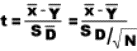
12.6.5.20.2 Variables Defined
12.6.5.20.2.1
=
standard error of the difference between correlated means (direct-difference
method)
12.6.5.20.2.1.1
![]() =
=![]()
12.6.5.20.2.2
 =Standard
deviation of the distribution of differences between correlated scores
(direct-difference method)
=Standard
deviation of the distribution of differences between correlated scores
(direct-difference method)
12.6.5.20.2.2.1
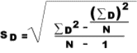
12.6.5.20.2.3 D=X-Y
12.6.5.20.2.4 N=Number of pairs of scores
12.6.5.20.3 Procedure
12.6.5.20.3.1
()
Standard deviation of the distribution of differences between correlated scores
(direct-difference method)
12.6.5.20.3.1.1 Create a column with the difference between the means. That is find the difference between each pretest and posttest score (minus the posttest from the pretest) and put that number in a column
12.6.5.20.3.1.2 Create a column with the squared differences between the means. That is multiply the difference between the means by itself
12.6.5.20.3.1.3 Sum the column of squared differences (the column created in step 2)
12.6.5.20.3.1.4 Sum the column of differences (step1) and square the sum (multiply it by itself). Then divide this product by the number of score pairs.
12.6.5.20.3.1.5 Minus the product of the previous step (step 4) from the sum of the squared differences (step 3)
12.6.5.20.3.1.6 Take the number of score pairs and minus 1 from that number
12.6.5.20.3.1.7
Divide the product of step 5 by the product of step 6 to
determine the (![]() ) score
) score
12.6.5.20.3.2 (t) Score
12.6.5.20.3.2.1
Find the difference between ![]() and
and ![]()
12.6.5.20.3.2.2 Obtain the square root of the number of score pairs
12.6.5.20.3.2.3
Divide ![]() by the product of step 2 to obtain the t
score
by the product of step 2 to obtain the t
score
12.6.5.20.3.2.4
12.7 Using the t Distribution to Establish a Confidence Interval about a Mean Difference
12.7.1 Introduction
12.7.1.1
This
involves using the t Distribution to establish a confidence interval about a
mean difference
12.7.1.2
Establishes
an upper and lower limit of the difference between the means usually with a 95%
degree of confidence which would still allow for the rejection of the null
hypothesis.
12.7.1.3 As you probably recall from Chapter 9 (Samples and Sampling Distributions), a confidence interval is a range of values within which a parameter is expected to be. A confidence interval is established for a specified degree of confidence, usually 95 percent or 99 percent.
12.7.1.4 In this section, you will learn how to establish a confidence interval about a mean difference. The problems here are similar to those dealt with in Chapter 9, except that
12.7.1.4.1
Probabilities
will be established with the t distribution rather than with the normal distribution.
12.7.1.4.2
2. The parameter
of interest is a difference between two population means rather than a population mean.
12.7.1.5
The first point can be dispensed
with rather quickly. You have already practiced using the t distribution
to establish probabilities; you will use Table D in this section, too.
12.7.1.6
The
second point will require a little more explanation. The questions you have
been answering so far in this chapter have been hypothesis-testing questions,
of the form "Does 1 -
1 - 2 =0?" You answered each question by drawing two samples, calculating the means, and finding
the difference. If the probability of the difference was very small, the hypothesis H0:
2 =0?" You answered each question by drawing two samples, calculating the means, and finding
the difference. If the probability of the difference was very small, the hypothesis H0:  1 -
1 - 2 =0 was rejected. Suppose you have rejected the null hypothesis but someone
wants more information than that and asks, “What is the real difference between
2 =0 was rejected. Suppose you have rejected the null hypothesis but someone
wants more information than that and asks, “What is the real difference between
 1 and
1 and
 2?" The person recognizes that the real difference is not zero but
wonders what it is. You are being asked to make an estimate of
2?" The person recognizes that the real difference is not zero but
wonders what it is. You are being asked to make an estimate of  1 -
1 - 2. You establish
a confidence interval about the difference between
2. You establish
a confidence interval about the difference between  1 and
1 and  2 or
2 or  and
and  , you can state with a specified degree of
confidence that
, you can state with a specified degree of
confidence that  1 -
1 - 2 falls within the interval.
12.7.2 Confidence Intervals for Independent Samples
12.7.2.1
The sampling distribution of  1 -
1 -  2 is a t distribution with N1 + N 2 - 2 degrees of freedom. The lower and upper limits
of the confidence interval about a mean difference are found with the following
formulas:
2 is a t distribution with N1 + N 2 - 2 degrees of freedom. The lower and upper limits
of the confidence interval about a mean difference are found with the following
formulas:
12.7.2.2
Confidence
Interval Upper and Lower Limits
12.7.2.2.1
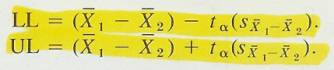
12.7.2.3
For
a 95 percent confidence interval, use the t value in Table D associated with  =.
05. For 99 percent confidence change
=.
05. For 99 percent confidence change  to .01.
12.7.2.4
For
an example, we will use the calculations you worked up in Problem 16 on the
time required to do problems on the two different brands of desk
calculators. We will establish a 95 percent confidence interval about the
difference found.
12.7.2.5 As your calculations revealed,
12.7.2.6 Confidence Interval Calculation
12.7.2.6.1
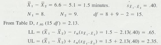
12.7.2.7 Thus, .65 and 2.35 are the lower and upper limits of a 95 percent confidence interval for the mean difference between the two kinds of calculators.
12.7.2.8
One of the benefits of establishing a
confidence interval about a mean difference is that you also test the null hypothesis,  1 -
1 - 2 =0, in the process (see
Natrella, 1960)[13]. If 0 were
outside the confidence interval, then the null hypothesis would be rejected
using hypothesis-testing procedures. In the example we just worked, the
confidence interval was .65 to 2.35 minutes; a value of 0 falls outside this
interval. Thus, we can reject H0:
2 =0, in the process (see
Natrella, 1960)[13]. If 0 were
outside the confidence interval, then the null hypothesis would be rejected
using hypothesis-testing procedures. In the example we just worked, the
confidence interval was .65 to 2.35 minutes; a value of 0 falls outside this
interval. Thus, we can reject H0:  1 -
1 - 2 =0 at the .05 level.
12.7.2.9 Sometimes, hypothesis testing is not sufficient and the extra information of confidence intervals is desirable. Here is one example of how this “extra information" on confidence intervals might be put to work in this calculator-purchasing problem. Suppose that the new brand is faster, but it is also more expensive. Is it still a better buy?
12.7.2.10 Through cost-benefit-analysis procedures, the purchasing agent can show that, given a machine life of five years, a reduction of time per problem of 1.7 minutes justifies the increased cost. If she has the confidence interval you just worked out, she can see immediately that such a difference in machines (1.7 minutes) is within the confidence interval. The new machines are the better buy.
12.7.3 Confidence Intervals for Correlated Samples
12.7.3.1
The sampling distribution of  -
-  is also a t distribution. The
number of degrees of freedom is N - 1. As in the section on hypothesis
testing of correlated samples, N is the number of pairs of
scores. The lower and upper limits of the confidence interval about a mean
difference between correlated samples are
is also a t distribution. The
number of degrees of freedom is N - 1. As in the section on hypothesis
testing of correlated samples, N is the number of pairs of
scores. The lower and upper limits of the confidence interval about a mean
difference between correlated samples are
12.7.3.2 Confidence Interval Correlated Samples
12.7.3.2.1
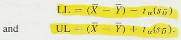
12.7.3.3 A word of caution is appropriate here. For confidence intervals for either independent or correlated samples, use a t value from Table D, not one calculated from the data.
12.7.3.4 The interpretation of a confidence interval about a difference between means is very similar to the interpretation you made of confidence intervals about a sample mean. Again, the method is such that repeated sampling from two populations will produce a series of confidence intervals, 95 (or 99) percent of which will contain the true difference between the population means. You have sampled only once so the proper interpretation is that you are 95 (or 99) percent confident that the true difference falls between your lower and upper limits. It would probably be helpful to you to reread the material on interpreting a confidence interval about a mean, (Confidence Intervals).
12.7.3.5
Degrees
of Freedom
12.7.3.5.1
N-1
12.7.3.6
t
score
12.7.3.6.1
Use the t
score from the table at alpha .05
12.7.3.7
Formulas
12.7.3.7.1
Upper Limit
(UL)
12.7.3.7.1.1
(( (mean)-
  (mean))+t*()
12.7.3.7.2
Lower Limit
(LL)
12.7.3.7.2.1
(( -
-  )-(t*())
12.7.3.7.3
Variables Defined
12.7.3.7.3.1
=
standard error of the difference between correlated means (direct-difference
method)
12.7.3.7.3.1.1
![]() =
=![]()
12.7.3.7.3.2
 =Mean of
X scores
=Mean of
X scores
12.7.3.7.3.3
 = Mean
of Y scores
= Mean
of Y scores
12.7.3.7.3.4
(t)=This is the t value form the back of a statistics textbook
(t distribution table) or from a t value calculator from the Web
12.7.3.7.3.5
N=number of
pairs of scores
12.7.3.7.3.6
df=the degrees of freedom for this equation is N-1
12.7.3.7.3.6.1 Example
12.7.3.7.3.6.1.1 http://www.psychstat.smsu.edu/introbook/tdist.htm
12.7.3.7.4
Procedure
12.7.3.7.4.1
Upper
Confidence Interval Calculation
12.7.3.7.4.1.1 Subtract the Mean of Y scores from the Mean of X scores
12.7.3.7.4.1.2
Multiply ![]() by the t score found in the table. Look
across from the degrees of freedom (N-1) and under the alpha level .05. .02,
.001 ect
by the t score found in the table. Look
across from the degrees of freedom (N-1) and under the alpha level .05. .02,
.001 ect
12.7.3.7.4.1.3 Add the product of step #1 to the product of step #2 for the upper limit confidence interval
12.7.3.7.4.2
Lower
Confidence Interval Calculation
12.7.3.7.4.2.1 Subtract the Mean of Y scores from the Mean of X scores
12.7.3.7.4.2.2
Multiply ![]() by the t score found in the table. Look
across from the degrees of freedom (N-1) and under the alpha level .05. .02,
.001 ect
by the t score found in the table. Look
across from the degrees of freedom (N-1) and under the alpha level .05. .02,
.001 ect
12.7.3.7.4.2.3 Subtract the product of step #1 to the product of step #2 for the lower limit confidence interval
12.7.3.7.4.3
12.8 Assumptions for Using the t Distribution
12.8.1 You can perform a t test on the difference between means on any two-group data you have or any that you can beg, borrow, buy, or steal. No doubt about it, you can easily come up with a t value using
12.8.2 Independent-samples t Test
12.8.2.1

12.8.3 You can then attach a probability figure to your t value by deciding that the t distribution is an appropriate model of your empirical situation.
12.8.4 In a similar way, you can calculate a confidence interval about the difference between means in any two-group experiment. By deciding that the t distribution is an accurate model, you can claim you are “99 percent confident that the true difference between the population means is between thus and so."
12.8.5
But should you decide to use the t distribution?
When is it an accurate reflection of the empirical probabilities?
12.8.6 The t distribution will give correct results when the assumptions it is based on are true for the populations being analysed. The t distribution, like the normal curve, is a theoretical distribution. In deriving the t distribution, mathematical statisticians make three assumptions.
12.8.6.1
The
dependent-variable scores for both populations are nonnal1y distributed.
12.8.6.2
The
variances of the dependent-variable scores for the two populations are equal.
12.8.6.3
The scores
on the dependent variable are random samples from the population.
12.8.7 Assumption 3 requires three explanations. First, in a correlated-samples design, the pairs of scores should be random samples from the population you are interested in.
12.8.8 Second, Assumption 3 ensures that any sampling errors will fall equally into both groups and that you may generalize from sample to population. Many times it is a physical impossibility to sample randomly from the population. In these cases, you should randomly assign the subjects available to one of the two groups. This will randomise errors, but your generalization to the population will be on less secure grounds than if you had obtained a truly random sample.
12.8.9 Third, Assumption 3 ensures the independence of the scores. That is, knowing one score within a group does not help you predict other scores in that same group. Either random sampling from the population or random assignment of subjects to groups-will serve to achieve this independence.
12.8.10 Now we can return to the major question of this section: "When will the t distribution produce accurate probabilities?" The answer is "When random samples are obtained from populations that are normally distributed and have equal variances. "
12.8.11 This may appear to be a tall order. It is, and in practice no one is able to demonstrate these characteristics exactly. The next question becomes “Suppose I am not sure my data have these characteristics. Am I likely to reach the wrong conclusion if I use Table D?" The answer to this question, fortunately, is "No."
12.8.12 The t test is a "robust" test, which means that the t distribution leads to fairly accurate probabilities, even when the data do not meet Assumptions 1 and 2. Boneau (1960)[14] used a computer to generate distributions when these two assumptions were violated. For the most part, he found that, even if the populations violate the assumptions, the t distribution reflects the actual probabilities. Boneau's most serious warning is that, when sample sizes are different (for example, N1 = 5 and N2 = 15), then a large violation of Assumption 2 (for example, one variance being four times the size of the other) produces a t value for which the tabled t distribution is a poor model. Under such circumstances, you may reject H0 when you should not.
12.8.13 Chapter 15 will give you other statistics with other distributions that you may use to test the difference between two samples when the first two assumptions of the t test are not valid.
12.9 Using the t Distribution to Test the Significance of a Correlation Coefficient
12.9.1 In Chapter 5, you learned to calculate Pearson product-moment correlation coefficients. This section is on testing the statistical significance of these coefficients. The question is whether an obtained r, based on a sample, could have come from a population of pairs of scores for which the parameter correlation is .00. The answer to this question is based on the size of a t value that is calculated from the correlation coefficient. The t value is found using the formula
12.9.2 (t) Value Using Correlation Coefficient
12.9.2.1
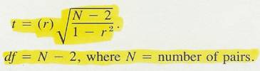
12.9.2.2
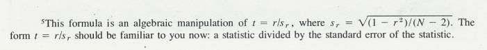
12.9.3 The null hypothesis is that the population correlation is .00. Samples are drawn, and an r is calculated. The t distribution is then used to determine whether the obtained r is significantly different from .00.
12.9.4 As an example, suppose you had obtained an r = .40 with 22 pairs of scores.
12.9.5 Does such a correlation indicate a significant relationship between the two variables, or should it be attributed to chance?
12.9.6 (t) Value Example
12.9.6.1
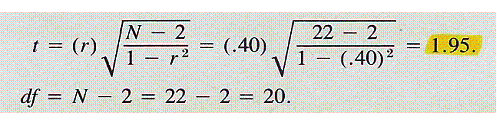
12.9.7 Table D shows that, for 20 df, a t value of 2.09 is required to reject the null hypothesis. The obtained t for r = .40, where N = 22, is less than the tabled t, so the null hypothesis is retained. That is, a coefficient of .40 would be expected by chance alone more than 5 times in 100.
12.9.8 In fact, for N = 22, an r = .43 is required for significance at the .05 level and an r = .54 for the .01 level. As you can see, even medium-sized correlations can be expected by chance alone for samples as small as 22. Most researchers strive for N's of 30 or more for correlation problems.
12.10 START
12.10.1 Sometimes you may wish to determine whether the difference between two correlations is statistically significant. Several texts discuss this test (Ferguson, 1976, p. 184 [15] and Guilford & Fruchter, 1978, p. 163) [16].
12.11 Purpose
12.11.1 This test assesses whether the means of two groups are statistically different from one another. The t-test could be used to assess the effectiveness of a treatment by comparing the means of the treatment and control groups or alternately to compare the means of the same group pre and post treatment to assess the effectiveness of treatment. In any case this test is indicated when you want to compare the means of two groups especially in the analysis for the posttest-only two-group randomized experimental design.
12.11.2 T-Test for the Significance of the Difference between the Means of Two Correlated Samples
12.11.2.1 http://faculty.vassar.edu/lowry/webtext.html
12.11.2.2
12.11.3 Example
12.11.3.1
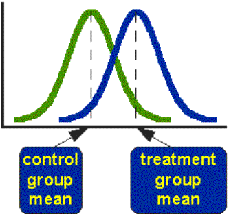
12.11.3.2 You could substitute the control group mean with pre treatment group mean and the treatment group with the post treatment group mean. In either case the above example shows the means of the two groups and the T- test determines whether the difference between these means is statistically significant.
12.11.4 Along with assessing the difference of means the T-Test also relates that difference to the spread or variability of their scores.
12.11.5 Example
12.11.5.1
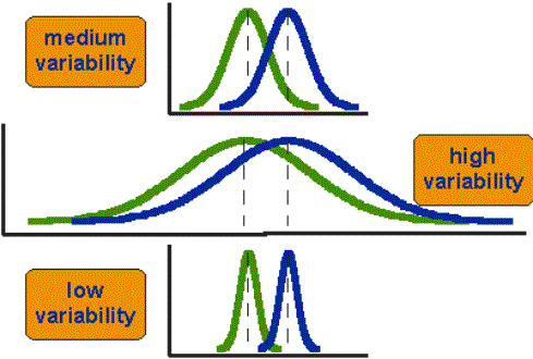
12.11.5.2 In the above example the difference between the means in all three groups is the same. Yet with low variability the difference between the groups is greater than in the groups with high variability.
12.12 Alternate T-Test Formula
12.12.1 Example
12.12.2
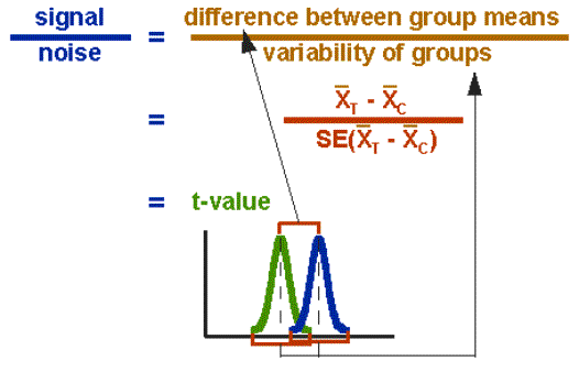
12.12.3 This is a ratio between the differences of means on the top divided by the measure of variability on the bottom. The above example of the signal to noise metaphor where the difference between the means is the signal we want to measure and the noise that makes it more difficult to measure group difference.
12.12.4 Computation Procedure
12.12.4.1 Example Computation Formula Standard Error
12.12.4.1.1
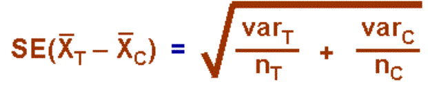
12.12.4.2 Find the difference between the mean of the posttest treatment group and the pre-test treatment group.
12.12.4.3 Determine the variance for each group.
12.12.4.4 Divide the respective variances by the number of individuals in each group
12.12.4.5 Add these numbers together
12.12.4.6 Take the square root of this number and this is the Standard Error
12.12.4.7 Divide the difference between the means by the standard error to find the t value.
12.12.4.8 Example complete computation formula for T- Test
12.12.4.8.1
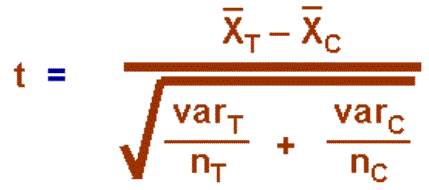
12.12.4.9 Determine whether the ratio is large enough to say that the difference between the groups is not likely to have been a chance finding.
12.12.4.9.1 Set the risk or alpha level
12.12.4.9.1.1 .05=most commonly used
12.12.4.9.1.1.1 This means that five times out of a hundred you would find a statistically significant difference between the means even if there were none (i.e., by "chance").
12.12.4.9.1.2 .02=2 chances in 100
12.12.4.9.1.3 .01=1 chances in 100
12.12.4.9.1.4 .001=1 chance in a 1000
12.12.4.9.2 Set the degrees of freedom (DF)
12.12.4.9.2.1 The degrees of freedom are the sum of the persons in both groups minus 2.
12.12.4.9.3 Given the alpha level, the df, and the t-value, you can look the t-value up in a standard table of significance (available as an appendix in the back of most statistics texts) to determine whether the t-value is large enough to be significant. If it is, you can conclude that the difference between the means for the two groups is different (even given the variability).
12.13
Example
12.13.1 T-Test
12.13.1.1
Count=60
each group pre and post.
12.13.1.2
df=(60+60)-2=118
12.13.1.3
T=9.8993713
12.13.1.4
Table
D [17]
DF=120
12.13.1.4.1 .05=1.980
12.13.1.4.2 .02=2.358
12.13.1.4.3 .01=2.617
12.13.1.4.4
.001=3.373
12.14
T
Distribution Tables
12.14.1 Internet Site
12.14.1.1
http://www.psychstat.smsu.edu/introbook/tdist.htm
12.15 Paired t-Test
12.15.1 Defined
12.15.1.1
http://mathworld.wolfram.com/Pairedt-Test.html
12.15.1.2
13 Analysis of Variance: One-Way Classification
13.1 Introduction
13.1.1 The t test is a very efficient method of testing the significance of the difference between two means. Its limitation that it is inappropriate for dealing with more than two means at once-something experimenters often want to do. If an experimental question can be answered using two treatment conditions, the t test is the method to use; but what if you need to use three or four or more treatment conditions?
13.1.2 The answer to this problem is a technique called the analysis of variance (ANOVA for short, pronounced uh-`nove-uh) was invented by Sir Ronald Fisher, an Englishman, and it is appropriate for both small and large samples, just as t is. In fact, it is a close relative of t.
13.1.3 So the transition this time is from a comparison of two means (with the t test) to a comparison of two or more means with a technique calld analysis of variance. The following will show you how to use ANOVA to make comparisons among two or more groups and subsequent sections will show you that the ANOVA technique can be extended to the analysis of experiments in which there are two independent variables, each of which may have two or more levels of treatment..
13.1.4 The analysis of variance is one of the most widely used statistical techniques and the following sections are devoted to an introduction to its more elementary forms. Many advanced books are available that explain more sophisticated (and complicated) analysis-of-variance designs.
13.1.5 The following sections ouline the most simple of analysis-of-variance designs. You will learn to use ANOVA to examine the effects of two or more treatment levels in a single experiment. Such experiments are common in all disciplines that use statistics
13.1.6 Examples
13.1.6.1 Samples of lower, middle, and upper class persons were compared on attitudes toward religion.
13.1.6.2 An experimenter determined the effect of 10, 20, 40, and 80 grams of reinforcement on the rate of response of four groups of rats.
13.1.6.3 Three methods of teaching Spanish were compared on their effectiveness with fourth graders.
13.1.6.4 Five species of honeybees were observed to determine which would produce the greatest number of kilograms of honey.
13.1.7 These experiments are all similar to those whose results you analysed with the independent samples t test in the previous Chapter. Again, there is an independent variable and a dependent variable. Again, the subjects in each group are independent of subjects in the other groups. Again, the null hypothesis is that the population mean is the same for all samples. The only difference is that, instead of only two levels of the independent variable, there are two or more. The name of this design is one-way ANOVA because three is only on independent variable. Some writers prefer to call this a completely randomized design.
13.1.8
In Example 1, above, the independent
variable is social class, and it has three levels. The dependent variable is
attitudes toward religion. The null hypothesis is that the religious attitudes
are the same in all three populations of social classes, that is, H0:  lower=
 middle=
 upper.
13.1.9
A
common reaction when confronted with three or more means is to run t tests on
all possible combinations. For three means, three t tests would be required for
four means, six tests, and so on. The formula for the number of combinations of
n things taken two at a time is n(n-1)/2. This will not work. The reason is
that, if you perform more than one t test involving a particular mean, you will
increase the chance of making a Type 1 error. That is, if you run several
tests, each with  =.05, the overall probability of making a Type 1 error is
greater than .05. If you had an experiment with 15 groups, 105 t tests would be
required in order to compare each group with every other. If all 15 groups came
from populations with the same mean, and you set
=.05, the overall probability of making a Type 1 error is
greater than .05. If you had an experiment with 15 groups, 105 t tests would be
required in order to compare each group with every other. If all 15 groups came
from populations with the same mean, and you set  =.05 for each test, you would expect five t tests to be
significant just by chance. Remember that, if
=.05 for each test, you would expect five t tests to be
significant just by chance. Remember that, if  =.05, and the null hypothesis is true, then five times in a
hundred you will wrongly reject the null hypothesis on the basis of sample
data. If you then pulled those five tests out and claimed they were
significant, you would be violating the spirit of inferential statistics. What
is needed in the case of more than two groups is a sampling distribution that
gives the probability that the several means could have come from identical
populations. This is exactly what Sir Ronald Fisher produced with the analysis
of variance.
=.05, and the null hypothesis is true, then five times in a
hundred you will wrongly reject the null hypothesis on the basis of sample
data. If you then pulled those five tests out and claimed they were
significant, you would be violating the spirit of inferential statistics. What
is needed in the case of more than two groups is a sampling distribution that
gives the probability that the several means could have come from identical
populations. This is exactly what Sir Ronald Fisher produced with the analysis
of variance.
13.1.10 Fisher (1890-1962) was an Englishman whose important contributions in genetics are overshadowed by his fundamental work in statistics. In genetics, he explained how a recessive gene produced by mutation can become established in a population. For these experiments, he chose wild jungle fowl and their domesticated descendants, poultry.
13.1.11 In statistics, Fisher developed the techniques you will be studying in the following sections, discovered the exact sampling distribution of r, and developed a way to find the exact probability of results from a particular small-sample design. His Statistical Methods for Research Workers, first published in 1925, went into a 14th edition in 1973. Before getting into genetics and statistics in such a big way, Fisher worked for an investment company for two years and taught in a public school for four years.
13.2 Rationale of ANOVA
13.2.1
The question to be answered by ANOVA
is whether the samples all came from populations with the same mean  or whether at least one of the samples came
from a population with a different mean. The assumption is made that if more
than one population is involved, the variances in the populations are equal.
or whether at least one of the samples came
from a population with a different mean. The assumption is made that if more
than one population is involved, the variances in the populations are equal.
13.2.2 Fisher, who was a friend of Gosset, is said to have looked at Student’s t and realized that it used a principle that was applicable to experiments having several groups, not just two. The principle is that of dividing one estimate of the population variability by another. In the case of t;
13.2.2.1 Illustration
13.2.2.1.1
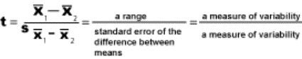
13.2.3 The sampling distribution that Fisher derived is the F distribution. As will be shown, F values that make up the F distribution are obtained by dividing one estimate of the population variance by a second estimate. Thus;
13.2.3.1 Illustration
13.2.3.1.1
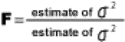
13.2.4
These two estimates of  2
are obtained by different methods. The numerator is obtained by a method that
accurately estimates
2
are obtained by different methods. The numerator is obtained by a method that
accurately estimates  2
only when H0 is true. If H0 is false, the estimate of
2
only when H0 is true. If H0 is false, the estimate of  2
in the numerator will be too large
2
in the numerator will be too large
13.2.5
The denominator is obtained by a
method that is unaffected by the truth or falsity of H0. Thus, when
the null hypothesis is true, the expected value of F is about 1.00, since both
methods are good estimators of  2,
and
2,
and  2/
2/ 2
=1.00. Values some what larger and smaller than 1.00 are to be expected because
of sampling fluctuation, but, if an F value is too large, there is cause to
suspect that H0 is false.
2
=1.00. Values some what larger and smaller than 1.00 are to be expected because
of sampling fluctuation, but, if an F value is too large, there is cause to
suspect that H0 is false.
13.2.6
We’ll take these two estimates of  2
one at a time and discuss them. The estimate of
2
one at a time and discuss them. The estimate of  2
in the numerator is obtained from the two or more sample means. The conceptual
steps are as follows. (Computational steps will come later.)
2
in the numerator is obtained from the two or more sample means. The conceptual
steps are as follows. (Computational steps will come later.)
13.2.6.1
Find the standard deviation of the two
or more sample means. This standard deviation of sample means is an old friend
of yours, the standard error of the mean, s.
13.2.6.2
Since s=s/ , squaring both sides gives s2
=s2/
, squaring both sides gives s2
=s2/ . Multiplying both sides by N and rearranging, s2=Ns2.
13.2.6.3
s2
is, of course, an estimate of  2.
2.
13.2.7
Thus, to find this S2, you
need to multiply the sample size (N) by the variance of the sample means, both
of which you can calculate. This estimate of  2
is called the between-means estimate (or the between-groups estimate). Notice
that this between-means estimate of
2
is called the between-means estimate (or the between-groups estimate). Notice
that this between-means estimate of  2
is accurate only if the sample means are all drawn from the same population. If
one or more means come from a population with a larger or smaller mean, the
variance of the sample means will be larger.
2
is accurate only if the sample means are all drawn from the same population. If
one or more means come from a population with a larger or smaller mean, the
variance of the sample means will be larger.
13.2.8
The other estimate of  2
(the denominator of the F ratio) is obtained from the variability within each
of the samples. Each sample variance is an independent estimate of
2
(the denominator of the F ratio) is obtained from the variability within each
of the samples. Each sample variance is an independent estimate of  2,
so, by averaging them, an even better estimate can be made. This estimate is
called the within-groups estimate, and it is an unbiased estimate even if the
null hypothesis is false. Once calculated, the two estimates can be compared.
If the between-means estimate is much larger than the within-groups estimate,
the null hypothesis is rejected.
2,
so, by averaging them, an even better estimate can be made. This estimate is
called the within-groups estimate, and it is an unbiased estimate even if the
null hypothesis is false. Once calculated, the two estimates can be compared.
If the between-means estimate is much larger than the within-groups estimate,
the null hypothesis is rejected.
13.2.9 The following pictures illustrate the above concepts
13.2.9.1
H0 is true. The normal
curves are the populations from which the four samples are drawn. The sample
means are all estimates of the common population mean,  .
.
13.2.9.1.1
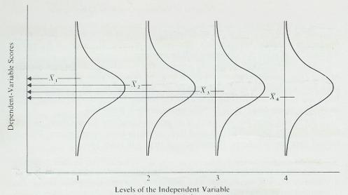
13.2.9.1.2 This figure illustrates the situation when the null hypothesis is true. Four samples have been drawn from identical populations and a mean calculated for each sample. As the projection of the four sample means on the vertical axis shows, the means are fairly close, and, therefore, the variability of these four means (the between-means estimate) will be small.
13.2.9.2
H0 is false. Three of the
samples are drawn from populations with the same mean,  . The fourth sample is drawn from a population with a
different mean.
. The fourth sample is drawn from a population with a
different mean.
13.2.9.2.1
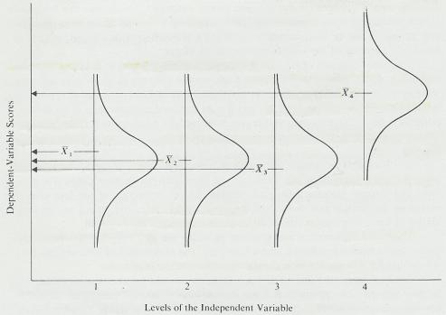
13.2.9.2.2
This figure illustrates one situation in which the null
hypothesis is false (one group comes from a population with a larger  ). The projection of the means this time shows that 4
will greatly increase the variability of the four means.
). The projection of the means this time shows that 4
will greatly increase the variability of the four means.
13.2.9.3 H0 is true. The normal curves are the populations from which the four samples are drawn. The populations have more variability than those in the first figure above.
13.2.9.3.1
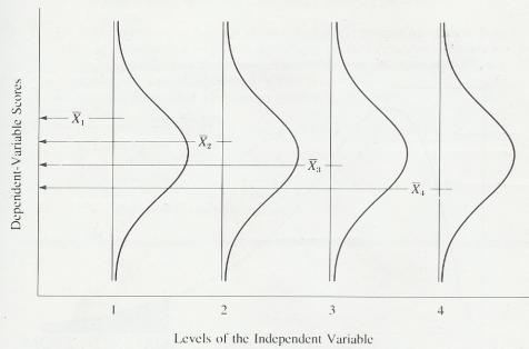
13.2.9.3.2 Study the first two figures. They illustrate how the between-means estimate is larger when the null hypothesis is false. So, if you have a small amount of variability between means, retain H0. If you have a large amount of variability between means, reject H0. Small and large, however, are relative terms and, in this case, relative to the population variance. A comparison fo the above figure and the first figure illustrates how the amount of between-means variability depends upon the population variance. In both of these figures, the null hypothesis is true, but notice the projection of the sample means on the vertical axis. There is more variability amount the means that come from populations with greater variability. The above figure, then, shows a large between-means estimate that is the result of large population variances and not the result of a false null hypothesis.
13.2.10 So, in order to decide whether a large between-means estimate is due to a false null hypothesis or to a large population variance, you need another estimate of the population variance. The best such estimate is the average of the sample variances.
13.2.11 All of this discussion brings us back to the principle that Fisher found Gosset to be using in the t test: dividing one estimate of the population variability by another. In the case of ANOVA, if the null hypothesis is true, the two estimates should be very similar, and dividing one by the other should produce a value close to 1.0. If the null hypothesis is false, dividing the between-means estimate by the within-groups estimate will produce a value greater than 1.0
13.2.12 Be sure you understand this rationale of ANOVA. It is the basic rationale underlying the procedures to be explained in this chapter and the next.
13.2.13 Sir Ronald Fisher developed a mathematical way to express the reasoning we have just outlined. He worked out a sampling distribution that was later named F in his honor.
13.2.14 As is the case with t, there is more than one F distribution. There is, in fact, a different distribution for every possible combination of degrees of freedom for the two Variance estimates. All F distributions are positively skewed. The fewer the degrees of freedom, the greater the skew. When the numbers of degrees of freedom for both variance estimates are very large, the distribution approaches the shape of the normal distribution. The figure below demonstrates the shape of one F distribution (when one variance estimate has 9 degrees of freedom and the other estimate has 15).
13.2.14.1 Form of the F distribution for df1=9 and df2=15
13.2.14.1.1
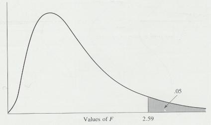
13.2.15 F tables in the back of statistic test books or at the Web reference below are developed from sampling distributions of different F ratios. The existence of the F table permits experimenters to simply compare the F value obtained in an experiment with those listed in the table at the appropriate degrees of freedom to determine significance at the .05 and .01 levels. If the obtained F value is as large or larger than the tabled value, the null hypothesis can be rejected. If the F value is not that large, the null hypothesis may not be rejected. (example)
13.2.16 The F distribution and the t distribution are closely related, both mathematically and conceptually. The mathematical relation is t2=F for a two-group experiment. Theoretically, ANOVA made the t test obsolete; but t continues to be widely used.
13.2.17 This section completes our explanation of the rationale of ANOVA. Soon you will learn how to actually compute an F value and interpret it.
13.3 More New Terms
13.3.1 Sum of Squares
13.3.1.1
In the computation of the standard
deviation, certain values were obtained that would be important in future
discussions. The term  x2 (the numerat0or of the basic formula for the standard
deviation) is called the sum of squares (abbreviated SS). So, SS=
x2 (the numerat0or of the basic formula for the standard
deviation) is called the sum of squares (abbreviated SS). So, SS= x2 =
x2 = (X-)2.
A more descriptive name for sum of squares is “sum of the squared deviations.”
(X-)2.
A more descriptive name for sum of squares is “sum of the squared deviations.”
13.3.2 Mean Square
13.3.2.1 Mean square (MS) is the ANOVA term for a variance S2. The mean square is a sum of squares divided by its degrees of freedom.
13.3.3 Grand Mean
13.3.3.1 The grand mean is the mean of all the scores; it is computed without regard for the fact that the scores come from different groups (samples).
13.3.4 tot
13.3.4.1
The subscript tot after a symbol makes
the symbol stand for all such numbers in the experiment; for example,  x tot is the sum of all scores.
13.3.5 g
13.3.5.1
The subscript g after a symbol means
that that symbol applies to a group; for example,  (
( Xg)2 tells you to sum the scores in
each group, square each sum, and then sum these squared values.
Xg)2 tells you to sum the scores in
each group, square each sum, and then sum these squared values.
13.3.6 K
13.3.6.1 K is the number of groups in the experiment. This is the same as the number of levels of the independent variable.
13.4 Sums of Squares
13.4.1 Analysis of variance is based on the fact that the variability of all the scores in an experiment can be attributed to two or more sources. In the case of simple analysis of variance, just two sources contribute all the variability to the scores. One source is the variability between groups, and the other source is variability within each group. The sum of these two sources is equal to the total variability. Thus, the total variability of all the scores when measured by the sum of squares comes from two sources: the between-groups sum of squares and the within-groups sum of squares. Each of these can be computed separately as shown below.
13.4.2 First, we’ll focus on the total variability as measured by the total sum of squares. Actually, as you will see, you are already familiar with the total sum of squares (SStot). To find (SStot), subtract the grand mean from each score. Square these deviation scores and sum them up.
13.4.3 Total Sum of Squares (SStot)
13.4.3.1 Introduction
13.4.3.1.1
Computationally, (SStot) is more readily (and
accurately) obtained using the raw-score formula which you may recognize as the
numerator of the raw-score formula for s. This formula is equivalent to ( x2). Its computation requires you to square each
score and sum those squared values to obtain (
x2). Its computation requires you to square each
score and sum those squared values to obtain ( tot x2). Next, the scores are summed
and the sum squared. That squared value is divided by the total number of
scores to obtain ((
tot x2). Next, the scores are summed
and the sum squared. That squared value is divided by the total number of
scores to obtain (( tot)2/N tot) from (
 tot2) yields the total sum of squares.
13.4.3.2 Illustration Formula
13.4.3.2.1

13.4.3.3 Raw Score Formula
13.4.3.3.1
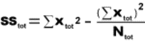
13.4.3.4 Procedure
13.4.3.4.1
( X tot2
13.4.3.4.1.1 Square the scores for each group and add the squared scores together
13.4.3.4.1.2 Add the sum of squared scores for each group together
13.4.3.4.2
( X tot)2
13.4.3.4.2.1 Add the scores for each group together
13.4.3.4.2.2 Add the summed scores for each group together and square the sum
13.4.3.4.3 Add the total number of scores for each group (N tot) and divide the sum of the previous step by that sum (N tot)
13.4.3.4.4 The figure obtained in the above step is the Total Sum of Squares (SStot)
13.4.4 Between–Groups Sum of Squares (SSbg)
13.4.4.1 Introduction
13.4.4.1.1
This formula tells you to sum the scores for each group and
square the sum. Each squared sum is then divided by the number of scores in
that group. These values (one for each group) are then summed, giving you ( [(
[( X g)2/Ng]. From this sum is
subtracted the value (
X g)2/Ng]. From this sum is
subtracted the value ( X tot)2/Ntot], Which was obtained
in the computation of (SStot).
X tot)2/Ntot], Which was obtained
in the computation of (SStot).
13.4.4.1.2 When describing experiments in general, the term (SStot) is used. In a specific analysis, between groups is changed to a summary word for the independent variable.
13.4.4.2 Illustration Formula
13.4.4.2.1

13.4.4.3 Raw Score Formula
13.4.4.3.1
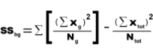
13.4.4.4 Procedure
13.4.4.4.1 Sum the scores for each group, square the sum and then divide each squared sum by the number of scores for that group
13.4.4.4.2 Add the quotients from the previous step
13.4.4.4.3 Add the summed scores for each group and square the sum and divide by the total number of scores for all the groups
13.4.4.4.4 Find the difference between the sum in step # 2 and the quotient in step # 3
13.4.5 Within-Groups Sum of Squares (SSwg)
13.4.5.1 Introduction
13.4.5.1.1
Finally, we will focus on the within-groups sum of squares (SSwg),
which is the sum of the variability in each of the groups or the sum of the
squared deviations of each score from the mean of its group added to the sum of
the squared deviations from all other groups for the experiment. As with the
other SS’s, there is an arrangement of the arithmetic that is easiest as
illustrated in the raw score formula below. This formula tells you to square
each score in a group and sum them ( X g2). Subtract from this a value that
you obtain by summing the scores, squaring the sum, and dividing by the number
of scores in the group: (
X g2). Subtract from this a value that
you obtain by summing the scores, squaring the sum, and dividing by the number
of scores in the group: ( X g)2/Ng). For each group, a
value is calculated, and these values are summed to get (SSwg).
X g)2/Ng). For each group, a
value is calculated, and these values are summed to get (SSwg).
13.4.5.2 Illustration Formula
13.4.5.2.1

13.4.5.3 Raw Score Formula
13.4.5.3.1
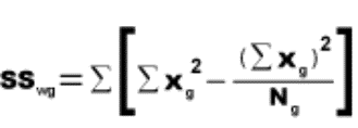
13.4.5.4 Procedure
13.4.5.4.1
( X g2)
X g2)
13.4.5.4.1.1 Square each score in a group and sum them
13.4.5.4.2
( X g)2/Ng)
13.4.5.4.2.1 Add the scores for each group, square the sum and divide by their number
13.4.5.4.3
( X g2)- (
 X g)2/Ng)
13.4.5.4.3.1 Subtract the quotient from the previous step from the sum of the squared scores of the first step
13.4.5.4.4 Add the differences of the previous step to find the Within-Groups Sum of Squares (SSwg)
13.4.6 Total Variability
13.4.6.1 Introduction
13.4.6.1.1 If you work with SS as a measure of variability, the total variability is the sum of the variability of the parts.
13.4.6.2 Formula
13.4.6.2.1 SStot= SSbg+ SSwg.
13.4.6.3 Procedure
13.4.6.3.1 Add the Between–Groups Sum of Squares (SSbg) to the Within-Groups Sum of Squares (SSwg) which should equal the Total Sum of Squares (SStot)
13.5 Mean Squares and Degrees of Freedom
13.5.1
The next step in an analysis of
variance is to find the mean squares. A mean square is simply a sum of squares
divided by its degrees of freedom. It is an estimate of the population
variance,  2.
2.
13.5.2 Formula Degrees of Freedom
13.5.2.1 dftot=Ntot-1
13.5.2.2 dfbg=K-1
13.5.2.3 dfwg=Ntot-K
13.5.2.4 dftot= dfbg + dfwg (Degrees of freedom are always positive)
13.5.3 Formula Mean Squares
13.5.3.1 Mean Squares Between Group
13.5.3.1.1

13.5.3.2 Mean Squares Within Group
13.5.3.2.1
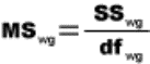
13.5.4 Variables Defined
13.5.4.1 Ntot=Total Number of Scores
13.5.4.2 dftot=Total Degrees of Freedom
13.5.4.3 dfbg=Between Group Degrees of Freedom
13.5.4.4 dfwg=Within Group Degrees of Freedom
13.5.4.5 K= K is the number of groups in the experiment. This is the same as the number of levels of the independent variable.
13.5.4.6 MSbg=Mean Square Between Group
13.5.4.7 SSbg= Sum of Squares Between Group
13.5.4.8 MSwg= Mean Square Within Group
13.5.4.9 SSwg=Sum of Squares Within Group
13.5.5 Procedure
13.5.5.1 Mean Squares Between Group
13.5.5.1.1 Find the difference between the total number of groups and 1 which is dfbg
13.5.5.1.2 Divide the SSbg by the difference found in the previous step and the quotient is the MSbg
13.5.5.2 Mean Squares Within Group
13.5.5.2.1 Find the difference between the total number of scores (Ntot) and the total number of groups (K) which is dfwg
13.5.5.2.2 Divide the SSwg by the difference found in the previous step and the quotient is the MSwg
13.5.6 Notice that, although SStot= SSbg + SSwg and dftot= dfbg + dfwg , mean squares are not additive
13.6 Calculation and Interpretation of F values using the F distribution
13.6.1 We said earlier that F is a ratio of two estimates of the population variance. MSbg is an estimate based on the variabi8lity between means. MSwg is an estimate based on the sample variances. An F test consists of dividing MSbg by MSwg to obtain an F value.
13.6.2 Formula
13.6.2.1
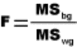
13.6.3 Variables Defined
13.6.3.1 MSbg=Mean Square Between Group
13.6.3.2 MSwg= Mean Square Within Group
13.6.3.3 F=A ratio of the between-means estimate to the within-groups estimate of the population variance; a sampling distribution of such ratios
13.6.4 Procedure
13.6.4.1 Divide the (MSbg) by the (MSwg) score to obtain the F value
13.6.4.2 Determine the Between Group Degrees of Freedom (dfbg) (Numerator) and Within Group Degrees of Freedom (dfwg) (Denominator) per instructions in the previous section
13.6.4.3 Look up the significance level in an F table in the back of a statistics text book or use the Web link below
13.6.5 F Distribution Web References
13.6.5.1 Tables
13.6.5.1.1 Introduction
13.6.5.1.1.1 This reference can be used just as a table in the back of a statistics text book
13.6.5.1.2 .05 Level
13.6.5.1.2.1 http://www.ento.vt.edu/~sharov/PopEcol/tables/f005.html
13.6.5.1.3 .01 Level
13.6.5.1.3.1 http://www.ento.vt.edu/~sharov/PopEcol/tables/f001.html
13.6.5.2 Calculating p Value
13.6.5.2.1 Introduction
13.6.5.2.1.1 This Web reference takes your F score and degrees of freedom and determines a p-value which is the probability that the difference between groups is due to chance alone
13.6.5.2.2 Instructions
13.6.5.2.2.1 Place the F score into the parameter box, the (dfbg) (Numerator) into the degrees of freedom box and the (dfwg) (Denominator) into the number of cases box in the F test generator link below. Click the F-value button which will then return the p-value.
13.6.5.2.2.2 Example
13.6.5.2.2.2.1 For example, if you are interested in the question if the females are more diverse in their responses to a particular question, and you have 50 females and 75 males, the standard deviation for females equals 7 and for males 5, then the input for the f-test is: F: 1.96 [(7*7)/(5*5)]; df numerator: 49; df denominator 74. 'Click' the f-value button, p-value=0.004321362254108618, males and females are significantly different in the "richness" of their response.
13.6.5.2.2.3 The p-value is the probability that the difference between groups is due to chance alone
13.6.5.2.2.4 If the p value is lower than .05 you can reject the null hypothesis.
13.6.5.2.2.4.1 Generally, one rejects the null hypothesis if the p-value is smaller than or equal to the significance level Significance Level, often represented by the Greek letter α (alpha). If the level is 0.05, then the results are only 5% likely to be as extraordinary as just seen, given that the null hypothesis is true.
13.6.5.2.2.4.2 INCORRECT (I think) If this score is greater than .05 or .01 you can reject the null hypothesis
13.6.5.2.3 Help Reference
13.6.5.2.3.1 http://home.clara.net/sisa/signhlp.htm
13.6.5.2.4 F Test Generator
13.6.5.2.4.1 http://home.clara.net/sisa/signif.htm
13.6.6 Once an F value has been calculated and the probability due to chance calculated (p-value), your interpretation must stop. An ANOVA does not tell you which of the population means is greater than or less than the others. Such an interpretation requires a further statistical analysis, which is the topic of the last part of this chapter.
13.6.7 It is customary to summarize the results of an ANOVA in a summary table per example below
13.6.8 Summary Table
13.6.8.1
13.7 Learning Experiment
13.7.1
13.8 Comparisons Among Means
13.8.1 Introduction
13.8.1.1 Since ANOVA does not tell you which of the population means is greater than or less than the others, we must make further comparisons among the means. The problem is, we cannot just take all possible pairs of means and run routine t tests on them.
13.8.1.2 The problem of making several comparisons after an F test has been troublesome for statisticians. Several different solutions exist and each has its advantages and disadvantages. B. F. Winer (19 71)[18] and Roger E. Kirk (1968)[19] have excellent summaries of several of these methods. We will present only two methods here.
13.8.1.3 First a distinction must be made between a priori (ah prie òre ee) and a posteriori (ah post ,tear ee ore ee) comparison among means. A priori comparisons are those that are planned before data are collected. They are usually planned on the basis of some rational or theoretical considerations.
13.8.1.4 A posteriori comparisons are sometimes referred to as “data snooping” and are made when the experimenter notices one or more differences among the means and realizes that such differences, if significant, are important. Thus, a posteriori comparisons begin with the data rather than with rational or theoretical considerations.
13.8.1.5 In this section we will explain two methods of comparing means after an ANOVA. The first is an a priori method called orthogonal comparisons. The second is an a posteriori method called the Scheffé test.
13.8.2 A Priori Orthogonal Comparisons
13.8.2.1 The orthogonal comparisons method permits you to make a few preselected comparisons among the means. The number and kind of comparisons are limited. These comparisons result in a t value that is interpreted using a t distribution.
13.8.2.2 The basic idea is to take the total variability among the means and partition it into orthogonal components. The word orthogonal means independent or uncorrelated in this context. Once the variability has been partitioned into orthogonal components, comparisons can be made between the components. These comparisons will test for significance between groups, which was the initial goal. The number of orthogonal comparisons that can be made is K-1.
13.8.2.3
The first table below illustrates how
to determine orthogonality for any three-group experiment. The body of this
table consists of coefficients (a number that serves as a measure of some
property or characteristic), which are weights that are assigned to the means.
If a mean is not part of a comparison, its weight is 0. Set A shows two
comparisons that can be made. The first, 1 vs. 2, tests the null hypothesis H0:  1 -
1 - 2 =0. The second, 3 vs. 1 and 2, tests the null
hypothesis H0:
2 =0. The second, 3 vs. 1 and 2, tests the null
hypothesis H0:  3 -
3 - 1 +
1 +  2/2=0
2/2=0
13.8.2.4 Two requirements must be met for comparisons to be orthogonal
13.8.2.4.1 For each comparison the sum of the coefficients is zero. Thus, in Set A, (1) + (-1) + (0)=0 and (-1) + (-1) + (2)=0
13.8.2.4.2 The sum of the products of the coefficients is zero. Thus, in Set a, (1)(-1) + (-1)(-1) + (0)(2) =0
13.8.2.5 Therefore, the two comparisons in Set A are orthogonal and might be used in an a priori test, subsequent to ANOVA.
13.8.2.6 Sets B and C in the table below show two other ways to analyse data from a three-group experiment. You could choose A, B, or C, depending on which set made the most sense for you particular experiment. Note that you can only use one of the three possible sets.
13.8.2.7 Set D in the first table below is an example of coefficients that are not orthogonal. Notice that the sum of the products of corresponding coefficients does not equal zero. (1)(0) + (-1)(1) + (0)(-1)= -1
13.8.2.8 The nonzero sum of products means that these two comparisons involve overlapping information and are, therefore, not independent. They should not be used as a priori comparisons. You could choose to do either one of the comparisons in Set D, but not both.
13.8.2.9 Examples of Orthogonal and Nonorthogonal Coefficients for any Three-Group Experiment
13.8.2.9.1
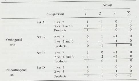
13.8.2.10 The table below gives examples of orthogonal coefficients that may be used in any four-group experiment. In four-group experiments, K-1=3. Three a priori comparisons, then, can be made in four-group experiments. The orthogonality requirement for three or more comparisons is referred to as mutual orthogonality. This means that every comparison must be orthogonal with every other comparison. Look at Set A in the Table below.
13.8.2.11 When the coefficients for the first two comparisons are multiplied and summed across the four groups, the sum is zero. (1)(0) + (-1)(0) + (0)(1) + (0)(-1)=0
13.8.2.12 For the first and third comparisons, (1)(1) + (-1)(1) + (0)(-1) + (0)(-1)=0.
13.8.2.13 For the second and third comparisons, (0)(1) + (0)(1) + (1)(-1) + (-1)(-1)=0.
13.8.2.14 These three comparisons, then, are mutually orthogonal.
13.8.2.15 Further information about orthogonal comparisons may be found in Kirk[20], Winer[21], and Edwards[22].
13.8.2.16 Examples of Orthogonal Coefficients for Comparisons in any Four-Group Experiment
13.8.2.16.1
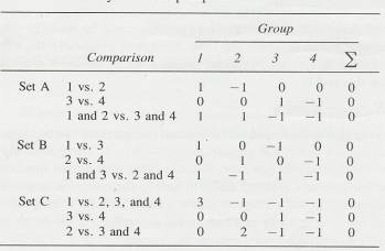
13.8.2.17 Formula
13.8.2.17.1
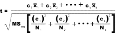
13.8.2.18 Variables Defined
13.8.2.18.1 c1, c2, ck=Coefficients assigned to the means
13.8.2.18.2
1, 2, 3=Means to be compared
13.8.2.18.3 MSwg=Obtained value from the ANOVA
13.8.2.18.4 N1, N2, Nk=N’s for the groups to be compared
13.8.2.19 Procedure
13.8.2.19.1 Prior to the experiment determine which groups you wish to compare
13.8.2.19.2 Numerator
13.8.2.19.2.1 Use the 1st table above to assign coefficient multipliers to the means of the chosen groups
13.8.2.19.2.2 Multiply the means for each group by the assigned coefficients and add the products
13.8.2.19.3 Denominator
13.8.2.19.3.1 Bracketed Area
13.8.2.19.3.1.1 Square each coefficient multiplier for each group and divide by the number in each group
13.8.2.19.3.1.2 Add the quotients
13.8.2.19.3.2 Multiply the MSwg by bracketed sum found in the steps above
13.8.2.19.3.3 Obtain the square root of the product of the previous step above
13.8.2.19.4 Divide the numerator by the denominator to obtain the t score. If your obtained t score is less than 1 it is not significant
13.8.2.19.5 Look up the t score in the back of a statistics textbook or use the Web reference below.
13.8.2.19.6
T
Distribution Tables
13.8.2.19.6.1
Internet Site
13.8.2.19.6.1.1 http://www.psychstat.smsu.edu/introbook/tdist.htm
13.8.3 A Posteriori Scheffé Test
13.8.3.1
The method we will present for making
a posteriori comparisons was devised by Scheffé (1953). The Scheffé method
allows you to make all possible comparisons among K groups. You can compare
each group with every other, and you can compare each group with the mean of
two or more groups. You can even compare a mean of two or more groups with the
mean of two or more other groups. You can make all these comparisons and still
be sure your  level is not above .05. In fact, it errs in
the direction of too many Type II errors.
level is not above .05. In fact, it errs in
the direction of too many Type II errors.
13.8.3.2 Keep in mind that this test is appropriate only if the overall F test produced a rejection of the null hypothesis.
13.8.3.3
In the Scheffé Test, two statistics
called F’ are computed and compared. F’ob is based on the data (observed) and
F’ is a critical value computed from a value found in the F table.
13.8.3.4
If F’ob is larger than F’ ,
the null hypothesis is rejected. To find the critical values
,
the null hypothesis is rejected. To find the critical values
13.8.3.5
Formula
Critical Values F’
13.8.3.5.1 F’.05=(K-1) F.05
13.8.3.5.2 F’.01=(K-1)F.01
13.8.3.6 Variables Defined
13.8.3.6.1 K=Number of groups in the original ANOVA
13.8.3.6.2 F’.05 & F’.01=Critical values for F for the original ANOVA
13.8.3.7 Procedure
13.8.3.7.1 Degrees of Freedom
13.8.3.7.1.1 Determine your degrees of Freedom for the numerator and denominator (df procedure)
13.8.3.7.2 Find the difference between the number of groups and 1
13.8.3.7.3 Multiply that difference by the F value (F.05 F.01) found by using the df for the numerator and denominator in the back of a statistics text book or by using the Web Reference below
13.8.3.7.3.1 Tables
13.8.3.7.3.1.1 Introduction
13.8.3.7.3.1.1.1 This reference can be used just as a table in the back of a statistics text book
13.8.3.7.3.1.2 .05 Level
13.8.3.7.3.1.2.1 http://www.ento.vt.edu/~sharov/PopEcol/tables/f005.html
13.8.3.7.3.1.3 .01 Level
13.8.3.7.3.1.3.1 http://www.ento.vt.edu/~sharov/PopEcol/tables/f001.html
13.8.3.8
Formula F’ob Test Hypothesis= H0:  1 -
1 - 3 =0
3 =0
13.8.3.8.1 Introduction
13.8.3.8.1.1 The formula for this test uses orthogonal coefficients, but the only requirement is that they sum to zero for each comparison. F values less than 1.00 are never significant.
13.8.3.8.2
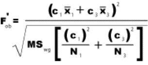
13.8.3.9
Formula F’ob Test Hypothesis= H0:  1 +
1 + 2 +
2 +  3/2-
3/2- 4=0
4=0
13.8.3.9.1
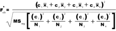
13.8.3.10 Variables Defined
13.8.3.10.1 F’ob=F score based on the data (observed)
13.8.3.10.2 c1, c2, ck=Coefficients assigned to the means
13.8.3.10.3
1, 2, 3=Means to be compared
13.8.3.10.4 MSwg=Obtained value from the ANOVA
13.8.3.10.5 N1, N2, Nk=N’s for the groups to be compared
13.8.3.11 Procedure
13.8.3.11.1 Numerator
13.8.3.11.1.1 Assign Coefficients for c value (They must add up to 0 For example #1= c1=-1 C2=1 or #2=c1=-1 c2=-1 c3=-1 c4=3)
13.8.3.11.1.2 Multiply the means for each group by the assigned coefficients and add the products
13.8.3.11.1.3 Square the Sum of the previous step
13.8.3.11.2 Denominator
13.8.3.11.2.1 Bracketed Area
13.8.3.11.2.1.1 Square each coefficient multiplier for each group and divide by the number in each group
13.8.3.11.2.1.2 Add the quotients
13.8.3.11.2.2 Multiply the MSwg by bracketed sum found in the steps above
13.8.3.11.2.3 Obtain the square root of the product of the previous step above
13.8.3.11.3 Divide the numerator by the denominator to obtain the (F’ob) score. If your obtained (F’ob) score is less than 1 it is not significant
13.8.3.11.4 Compare your (F’ob) with (F’.05) and or (F’.01). Your score must be larger to reject the null hypothesis.
13.9 Assumptions of the Analysis of Variance
13.9.1 For the analysis of variance and the F test to be appropriate, three characteristics of the data must be assumed to be true. To the extent that the data fail to meet these requirements, conclusions from the analysis will be subject to doubt.
13.9.1.1 Normality
13.9.1.1.1 It is assumed that the populations from which samples are drawn are normally distributed for the dependent variable. It is often difficult or impossible to demonstrate normality or lack of normality in the parent populations. Such a demonstration usually occurs only with very large samples. On the other hand, because of extensive research, some populations are known to be skewed, and researchers in those fields may decide that ANOVA is not appropriate for their data analysis. Unless there is a reason to suspect that populations depart severely from normality, the inferences made from the F test will probably not be affected. ANOVA is “robust.” (It results in correct probabilities even when the populations are not exactly normal.) Where there is a suspicion of severe departure from normality, however, use the nonparametric method explained in later Chapters.
13.9.1.2 Homogeneity of Variance
13.9.1.2.1 This means that the two or more population variances are equal. In ANOVA, the variances of the dependent variable scores for each of the populations sampled are assumed to be equal. In the first two figures of this Chapter (anova1 anova2), which we used to illustrate the rationale of ANOVA, show populations with equal variances. Several methods for testing this assumption are presented in advanced tests, such as Winer and Kirk. Again, the F test is reasonably “robust”; unless the variances depart greatly from each other, the conclusions reached with the F test will not be affected. If, however, the within-group variances are greatly different, it may be possible (and wise) to use some transformation that will make the variances more nearly equal. Ferguson[23] has an entire chapter (Chapter 25) on the nature and purpose of transformations. Another solution is to use a nonparametric method for comparing all pairs. See later Chapters
13.9.1.3 Random Sampling
13.9.1.3.1 Every care should be taken to assure that sampling is random and that assignment to groups is also random, so that the measurements are all independent of one another.
13.9.2 We hope these assumptions have a familiar ring to you. They are the same as those you learned for the t distribution. This makes sense; t is a special case of F.
13.9.3 The characteristics of populations are rarely known in the course of research. A distinct advantage of the analysis-of-variance technique is that moderate deviations from the first two assumptions seem to have little effect on the validity of the conclusions reached.
14 Analysis of Variance: Factorial Design
14.1
14.2 Factorial Design and Interaction
14.2.1 In this chapter, you will learn to analyse data from a design in which there are two independent variables (factors), each of which may have two or more levels. Table 11.3 illustrates an example of this design with one factor (Factor A) having three levels (A1, A 2, and A3) and another factor (Factor B) having two levels ( B1and B2). Such a design is called a factorial design. A factorial design is one that has two or more independent variables. In this chapter, you will loam to analyse a two-factor design. Intermediate and advanced-level textbooks discuss the analysis of three-or-more-factor designs. See Kirk (1968), Edwards (1972, Chapter 12), or Winer (1971).
14.2.2 Factorial designs are identified with a shorthand notation such as "2 x 3" or "3 x 5." The general term is R x C (Rows x Columns). The first number tells you the number of levels of one factor; the second number tells you the number of levels of the other factor. The design in Table 11.3 is a 2 x 3 design. Assignment of a factor to a row or column is arbitrary; we could just as well have made Table 11.3 a 3 x 2 table.
14.2.3 In Table 11.3, there are six cells. Each cell represents a different way to treat subjects. A subject in the upper left cell is given treatment A1 and treatment B1. That cell is, therefore, identified as Cell A1B1. Subjects in the lower right cell are given treatment A3 and treatment B2, and that cell is called Cell A3B2.
14.2.4 A factorial ANOVA is like two separate one-way ANOVAs-but better. It is better for several reasons (see Winer, 1971, Chapter 5), but we will emphasize that it is better because it also provides a test of the interaction of the two independent variables. Look again at Table 11.3. A factorial ANOV A will help you decide whether treatments A1, A2, and A3 produced significantly different scores (a one-way ANOVA with three groups). It will also help you decide whether treatments B1 and B2 produced significantly different scores (a second one-way ANOVA). The interaction test helps you decide whether the difference in scores between treatments B1 and B2 is dependent upon which level of A is being administered.
14.2.5 Table 11.3
14.2.5.1
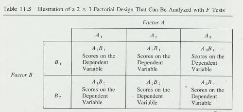
14.2.6 Perhaps a couple of examples of interactions will help at this point. Suppose a group of friends were sitting in a dormitory lounge one Monday discussing the weather of the previous weekend. What would you need to know to predict each person's rating of the weather? The first thing you probably want to know is what the weather was actually like. A second important variable is the activity each person had planned for the weekend. For purposes of this little illustration, suppose that weather comes in one of two varieties, snow or no snow and that our subjects could plan only one of two activities, camping or skiing. Now we have the ingredients for an interaction. We have two independent variables (weather and plans) and a dependent variable (rating of the weather).
14.2.7 If plans called for camping, "no snow" is rated good, but if plans called for skiing, "no snow" is rated bad. To complete the possibilities, campers rated snow bad and skiers rated it good. Table 11.4 summarizes this paragraph. Study it before going on.
14.2.8 Here is a similar example in which there is no interaction. Suppose you wanted to know how people would rate the weather, which again could be snow or no snow. This time, however, the people are divided into camping enthusiasts and rock-climbing enthusiasts. For both groups, snow would rate as bad weather. You might make up a version of Table 11.4 that describes this second example. It will help you follow our summary explanation below.
14.2.9 An interaction between two independent variables exists when the results found for one independent variable depend on which level of the other independent variable you are looking at. Thus, for Table 11.4, the rating of the variable weather (snow or no snow) depends on whether you plan to camp or ski. For campers, a change from snow to no snow brings joy; for skiers, the same change brings unhappiness.
14.2.10 In our second example there is no interaction. The rating of the weather does not depend on a person's plans for the weekend. A change from snow_ to no snow brings joy to the hearts of both groups. You can see this in the table you constructed.
14.2.11 Table 11.4
14.2.11.1
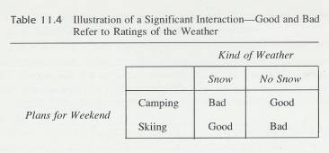
14.3 Main Effects and Interaction
14.3.1 In a factorial ANOV A, the comparison of the levels of Factor A is called a main effect. Likewise, the comparison of the levels of factor B is a main effect. The extent to which scores on Factor A depend on Factor B is the interaction. Thus, comparisons for main effects are like one-way ANOVAs, and information about the interaction is a bonus that comes with the factorial design.
14.3.2 Table 11.5 gives you some numbers to illustrate main effects and the interaction. Look at the comparison between the mean of B1 (30) and the mean of B2 (70). A factorial ANOVA will give the probability that the two means came from populations with identical means. In the same way, a factorial ANOV A will give the probability that the means of A (30, 40, 80) came from populations with identical means. Both of these comparisons are main effects.
14.3.3 Table 11.5
14.3.3.1
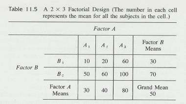
14.3.4 Notice that it is legitimate to compare B1 with B2. They were treated the same way except for one thing, B1 or B2. Both B1 and B2 received equal amounts of A1, A2, and A3. That is, half the subjects who received A1 were in the B1 group; the other half were in the B2 group. Thus, effects of the levels of Factor A are distributed evenly between B1 and B2. Similar reasoning shows that analysis of the main effect of Factor A is legitimate.
14.3.5 In Table 11.5, there is no interaction. The effect of changing from level A1 to A2 is to increase the mean score by 10 points. This is true at both level B1 and level B2.
14.3.6 The effect of changing from A2 to A3 is to increase the mean score by 40 points at both B1 and B2. The same constancy is found in the columns; the effect of changing from B1 to B2 is to increase the mean score 40 points, and this is true at all three levels of A. There is no interaction; the effect of changing from B1 to B2 is to increase the score 40 points regardless of the level of A.
14.3.7 It is common to display an interaction (or lack of one) with a graph. There is a good reason for this. A graph is the best way of arriving at a clear interpretation of an interaction. We urge you to always draw a graph of the interaction on the factorial problems you work. Figure 11.1 graphs the data in Table 11.5. The result is two parallel curves. Parallel curves mean that there is no interaction between two factors.
14.3.8 Figure 11.1
14.3.8.1
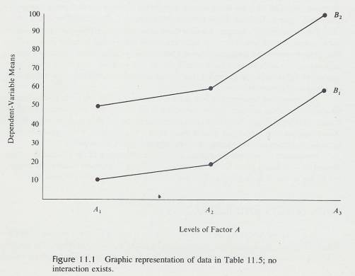
14.3.9 Figure 11.2
14.3.9.1
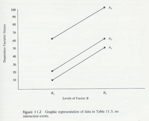
14.3.10 Table 11.6
14.3.10.1 A 2 x 3 Factorial Design with an Interaction between Factors (The numbers represent the means of all scores within each cell.)
14.3.10.2
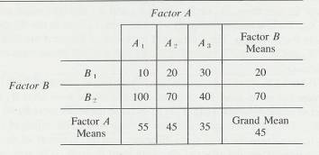
14.3.11 We can also graph the data in Table 11.5 with each curve representing a level of A. Figure 11.2 is the result. Again, the parallel lines indicate that there is no interaction.
14.3.12 Table 11.6 shows a 2 x 3 factorial design in which there is an interaction between the two independent variables. The main effect of Factor A is indicated by the overall means along the bottom. The average effect of a change from A1 to A2 to A3 is to reduce the mean score by 10 (main effect). But look at the cells. For B1 , the effect .of changing from A1 to A2 to A3 is to increase the mean score by 10 points. For B2, the effect is to decrease the score by 30 points. These data illustrate an interaction because the effect of one factor depends upon which level of the other factor you administer.
14.3.13 Figure 11.3
14.3.13.1 Graphic representation of the interaction of Factors A and B from Table 11.6.
14.3.13.2
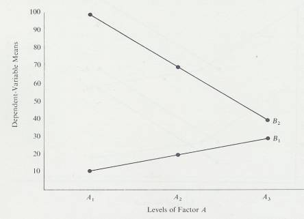
14.3.14 Figure 11.4
14.3.14.1 Graphic representation of the "rating of the weather" example indicating an interaction. Whether snow or no snow is rated highest depends on whether the ratings came from skiers or campers
14.3.14.2
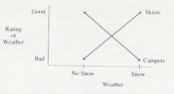
14.3.15 We will describe this interaction in Table 11.6 another way. Look at the difference between Cell A1B1 and Cell A2B2-a difference of -10. If there were no interaction, we would predict this same difference (-10) for the difference between Cells A1B2 and A2B2. But this latter difference is + 30; it is in the opposite direction. Something about B2 reverses the effect of changing from A1 to A2 that was found under the condition B1.
14.3.16 People often have trouble with the concept of interaction. Usually, having the same idea presented in different words facilitates understanding. Two good references are G. A. Ferguson, Statistical Analysis in Psychology and Education (4th ed.), New York: McGraw-Hill, 1976, pp. 245-246; and Roger E. Kirk, Introductory Statistics, Monterey: Brooks/Cole, 1978, pp. 325-328
14.3.17 This interaction is illustrated graphically in Figure 11.3. You can see that BI increases across the levels of Factor A but B2 decreases. The lines for the two levels of B are not parallel. '
14.3.18 Finally, we will graph in Figure 11.4 the example of rating the weather by skiers and campers. Again, the lines are not parallel.
14.3.19
14.4 Restrictions and Limitations
14.4.1 We have tried to emphasize throughout this book the limitations that go with each statistical test you learn. For the factorial analysis of variance presented in this chapter, the restrictions are the same as those given for a one-way ANOVA plus the following:
14.4.1.1 The number of scores in each cell must be equal. For techniques dealing with unequal N's, see Kirk (1968), Winer (1971), or Ferguson (1976).
14.4.1.2 The cells must be independent. This is usually accomplished by randomly assigning a subject to only one of the cells. This restriction means that these techniques should not be used with any type of correlated-samples design. For factorial designs that use correlated samples, see Winer (1971).
14.4.1.3 The experimenter chooses the levels of both factors. The alternative is that the levels of one or both factors be chosen at random from several possible levels of the factor. The techniques of this chapter are used when the levels are fixed by the experimenter and not chosen randomly. For a discussion of fixed and random models of ANOV A, see Winer (1971) or Ferguson (1976).
14.4.2 Table 11.7
14.4.2.1
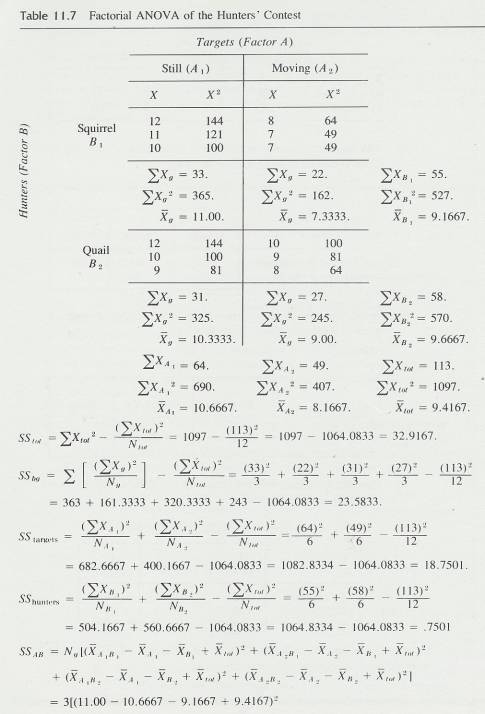
14.4.2.2
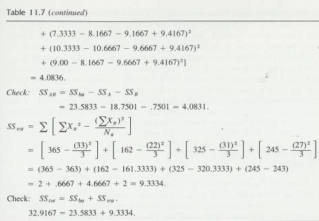
14.5 A Simple Example of a Factorial Design
14.5.1 As you read the following story, try to pick out the two factors and to identify the levels 'of each factor.
14.5.2
Two groups of hunters, six squirrel
hunters and six quail hunters, met in a bar. An argument soon began over the
marksmanship required for the two kinds of hunting.
14.5.3
"Squirrel hunters are just better
shots, " barked a biased squirrel hunter.
14.5.4
"Poot, poot, and'
balderdash!" heartily swore a logic-oriented quail hunter. "It takes
a lot better eye to hit a moving bird than to hit a still squirrel. "
14.5.5
"Hold
it a minute, you guys," demanded an empirically minded squirrel hunter.
"We can settle this easily enough on our hunting-club target range. We'll
just see if you six quail hunters can hit the target as often as we can. ".
14.5.6
"O.K.," agreed a quail
hunter. "What kind of trap throwers do you have out there?"
14.5.7
"What kind of what? Oh, you mean
those gadgets that throw clay pigeons into the air? Gee, yeah, there are some
out there', but we never use them. "
14.5.8
"Well,
if you want to shoot against us, you will have to use them this time," the
quail hunter insisted. "It's one thing to hit a still target, but hitting
a target flying through the air above you is something else. We'll target shoot
against you guys, but let's do it the fair way. Three of us and three of you
will shoot at still targets and the other six will shoot at clay pigeons."
14.5.9
"Fair
enough," the squirrel hunters agreed; and all 12 men took up their
shotguns and headed for the target range.
14.5.10 This yarn establishes conditions for a 2 x 2 factorial ANOVA with three scores per cell. The results of the contest are illustrated in Table 11.7. The dependent variable
14.5.11 Sources of Variance and Sums of Squares
14.5.11.1 Remember in the last Chapter you identified three sources of variance in the one-way analysis of variance. They were:
14.5.11.1.1 Total Variance
14.5.11.1.2 Between-groups variance
14.5.11.1.3 Within-groups variance
14.5.11.2 In a factorial design with two factors, the same sources of variance can be identified. However, the between-groups variance may now be partitioned into three components. These are the two main effects and the interaction. Thus, of the variability among the means of the four groups in Table 11.7, some can be attributed to the A main effect, some to the B main effect, and the rest to the interaction.
14.5.11.3 We will take these sources of variance one at a time, discuss the meaning of each , and show you how to compute them, using the data of Table 11.7 for illustration.
14.5.11.4 Total Sum of Squares
14.5.11.4.1 This calculation will be easy for you, since it is the same as SStot in the one-way analysis. IT is defined in the illustration formula below and is the sum of the squared deviations of all the scores in the experiment from the grand mean of the experiment.
14.5.11.4.2 Illustration Formula
14.5.11.4.2.1

14.5.11.4.3 Raw Score Formula
14.5.11.4.3.1

14.5.11.4.4 Procedure
14.5.11.4.4.1
( X tot2
14.5.11.4.4.1.1 Square the scores for each group and add the squared scores together
14.5.11.4.4.1.2 Add the sum of squared scores for each group together
14.5.11.4.4.2
( X tot)2
14.5.11.4.4.2.1 Add the scores for each group together
14.5.11.4.4.2.2 Add the summed scores for each group together and square the sum
14.5.11.4.4.3 Add the total number of scores for each group (N tot) and divide the sum of the previous step by that sum (N tot)
14.5.11.4.4.4 The figure obtained in the above step is the Total Sum of Squares (SStot)
14.5.11.4.5 Hunters Contest Example
14.5.11.4.5.1 SStot=1097-(113)2/12=32.9167
14.5.11.5 Between-Groups Sum of Squares (Between-cells sum of squares)
14.5.11.5.1 In order to find the main effects and interaction, you must first find the between-groups variability, and then partition it into its component parts. As in the one-way design, SSbg is defined in the illustration formula below. A “group” in this context is a group of participants treated alike; therefore; for example, squirrel hunters shooting at still targets constitute a group. In other words, a group is composed of those scores in the same cell.
14.5.11.5.2 Illustration Formula
14.5.11.5.2.1

14.5.11.5.3 Raw Score Formula
14.5.11.5.3.1

14.5.11.5.4 Procedure
14.5.11.5.4.1 Sum the scores for each group, square the sum and then divide each squared sum by the number of scores for that group
14.5.11.5.4.2 Add the quotients from the previous step
14.5.11.5.4.3 Add the summed scores for each group and square the sum and divide by the total number of scores for all the groups
14.5.11.5.4.4 Find the difference between the sum in step # 2 and the quotient in step # 3
14.5.11.5.4.5
14.5.11.5.5 Hunters Contest Example
14.5.11.5.5.1 SSbg=(33)2/3+(22)2/3+(31)2/3+(27)2/3-(113)2/12=23.5833
14.5.11.5.6 After SSbg is obtained, it is partitioned into its three components: the A main effect, the B main effect, and the interaction.
14.5.11.5.7 The sum of squares for each main effect is somewhat like a one-way ANOVA. The sum of squares for Factor A ignores the existence of Factor B and considers the deviations of the Factor A means from the grand mean.
14.5.11.5.8 Illustration Formula Factor A
14.5.11.5.8.1

14.5.11.5.9 Illustration Formula Factor B
14.5.11.5.9.1
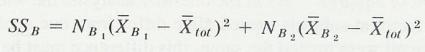
14.5.11.5.10 Computational Formula A Main Effect
14.5.11.5.10.1 Computational formulas for the main effects also look like formulas for SSbg in a one-way design
14.5.11.5.10.2
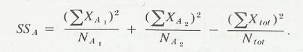
14.5.11.5.10.3 Hunters Contest Example
14.5.11.5.10.3.1 SStargets=(64)2/6+(49)2/6-(113)2/12=18.7501
14.5.11.5.11 Computational Formula B Main Effect
14.5.11.5.11.1
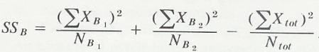
14.5.11.5.11.2 Hunters Contest Example
14.5.11.5.11.2.1 SShunters=(55)2/6+(58)2/6-(113)2/12=.7501
14.5.11.5.12 Variables Defined
14.5.11.5.12.1 Na1=Total number of scores in the A1 cells
14.5.11.5.12.2 Na2=Total number of scores in the A2 cells
14.5.11.5.13 Sum of squares Formula
14.5.11.5.13.1
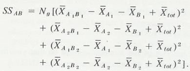
14.5.11.5.13.2 Hunters Contest Example
14.5.11.5.13.2.1 SSab=3[(11.00-10.6667-9.1667+9.4167)2
14.5.11.5.13.2.2 +(7.3333-8.1667-9.1667+9.4167)2
14.5.11.5.13.2.3 +(10.3333-10.6667-9.6667+9.4167)2
14.5.11.5.13.2.4 +(9.00-8.1667-9.6667+9.4167)2]
14.5.11.5.13.2.5 =4.0836
14.5.11.5.14 Since SSbg contains only the components SSA, SSB, and the interaction SSAB, we can also obtain SSAB by subtraction. This serves as you check.
14.5.11.5.15 Formula
14.5.11.5.15.1
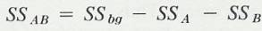
14.5.11.5.15.2 Hunters Contest Example
14.5.11.5.15.2.1 SSAB=23.5833-18.7501-.7501=4.0831
14.5.11.6 Within-Groups Sum of Squares
14.5.11.6.1 As in the one-way analysis, the within-groups variability is due to the fact that subjects treated alike differ from one another on the dependent variable. Since all were treated the same, this difference must be due to uncontrolled variables and is sometimes called error variance or the error term. SSwg for a 2X2 design is defined as
14.5.11.6.2 Illustration Formula
14.5.11.6.2.1
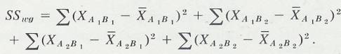
14.5.11.6.3 Computational Formula
14.5.11.6.3.1
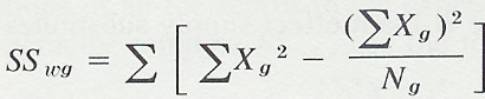
14.5.11.6.3.2 Hunters Contest Example
14.5.11.6.3.2.1 SSwg=[365-(33)2/3] +[162-(22)2/3]+ [325-(31)2/3]+[245-(27)2/3]=9.3333
14.5.11.6.3.3 Hunters Contest Computational Check
14.5.11.6.3.3.1 32.9166=23.5833+9.3333
14.5.11.7 Error Detection
14.5.11.7.1
The computational Check for a factorial ANOVA is the same as
for the one-way classification: SStot=SSbg + SSwg.
As before, this check will not catch errors in  x or
x or  x2.
x2.
14.5.12 Degrees of Freedom, Mean Squares, and F Tests
14.5.12.1 Now that you are skilled at calculating sums of squares we can proceed with the rest of the analysis of the hunters’ contest. Mean squares, as before, are found by dividing the sums of squares by their appropriate degrees of freedom. Degrees of freedom for the sources of variance are;
14.5.12.2 Formula Degrees of Freedom
14.5.12.2.1
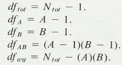
14.5.12.2.2 Hunters Contest Example
14.5.12.2.2.1
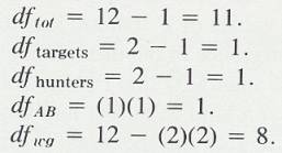
14.5.12.3 In the equations above, A and B stand for the number of levels of Factor A and Factor B, respectively.
14.5.12.4 Error Detection
14.5.12.4.1 dftot=dfA+dfB+dfAB+dfwg
14.5.12.5 Hunters Contest Mean Squares Example
14.5.12.5.1
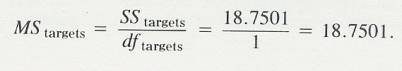
14.5.12.5.2
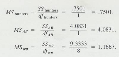
14.5.12.6 Hunters Contest F score Example computation
14.5.12.6.1 F is computed, as usual, by dividing each mean square by MSwg.
14.5.12.6.2
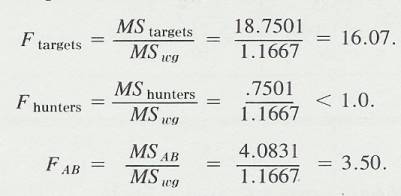
14.5.12.7 Again, you should refer to a F table in the back of a statistics text book or to the Web reference below to determine the significance of these F values.
14.5.12.8 F Distribution Web References
14.5.12.8.1 Tables
14.5.12.8.1.1 Introduction
14.5.12.8.1.1.1 This reference can be used just as a table in the back of a statistics text book
14.5.12.8.1.2 .05 Level
14.5.12.8.1.2.1 http://www.ento.vt.edu/~sharov/PopEcol/tables/f005.html
14.5.12.8.1.3 .01 Level
14.5.12.8.1.3.1 http://www.ento.vt.edu/~sharov/PopEcol/tables/f001.html
14.5.12.8.2 Calculating p Value
14.5.12.8.2.1 Introduction
14.5.12.8.2.1.1 This Web reference takes your F score and degrees of freedom and determines a p-value which is the probability that the difference between groups is due to chance alone
14.5.12.8.2.2 Instructions
14.5.12.8.2.2.1 Place the F score into the parameter box, the (dfbg) (Numerator) into the degrees of freedom box and the (dfwg) (Denominator) into the number of cases box in the F test generator link below
14.5.12.8.2.2.2 The p-value is the probability that the difference between groups is due to chance alone
14.5.12.8.2.2.3 If this score is greater than .05 or .01 you can reject the null hypothesis
14.5.12.8.2.3 Help Reference
14.5.12.8.2.3.1 http://home.clara.net/sisa/signhlp.htm
14.5.12.8.2.4 F Test Generator
14.5.12.8.2.4.1 http://home.clara.net/sisa/signif.htm